Most of the time, I prefer style over substance. In today’s Web 2.0 world, rounded corners and subtle gradients keeps me pretty happy. But some of the worst players of Web 2.0 standards or any design standards for that matter are from Microsoft enthusiast communities. Some of the sites I hate to love include: ActiveWin, AeroXP, Bink, JCXP, LiveSide and Neowin. Your mileage may vary.
But it’s not all wrinkles and HTML 4.0 out there, there’s some great looking sites out there including MSTechToday, Windows-Now, Windows Connected, Shell:revealed and honorable mention to On10.
Whilst it is still true, content should come before design, but once you have content, why not top off some great content with a great design that’s easy to read and use? Most of the time, these sites have some really in-depth content, but because they don’t pay enough attention to formatting and styling, it’s hard to read and I end up giving up reading it all together.
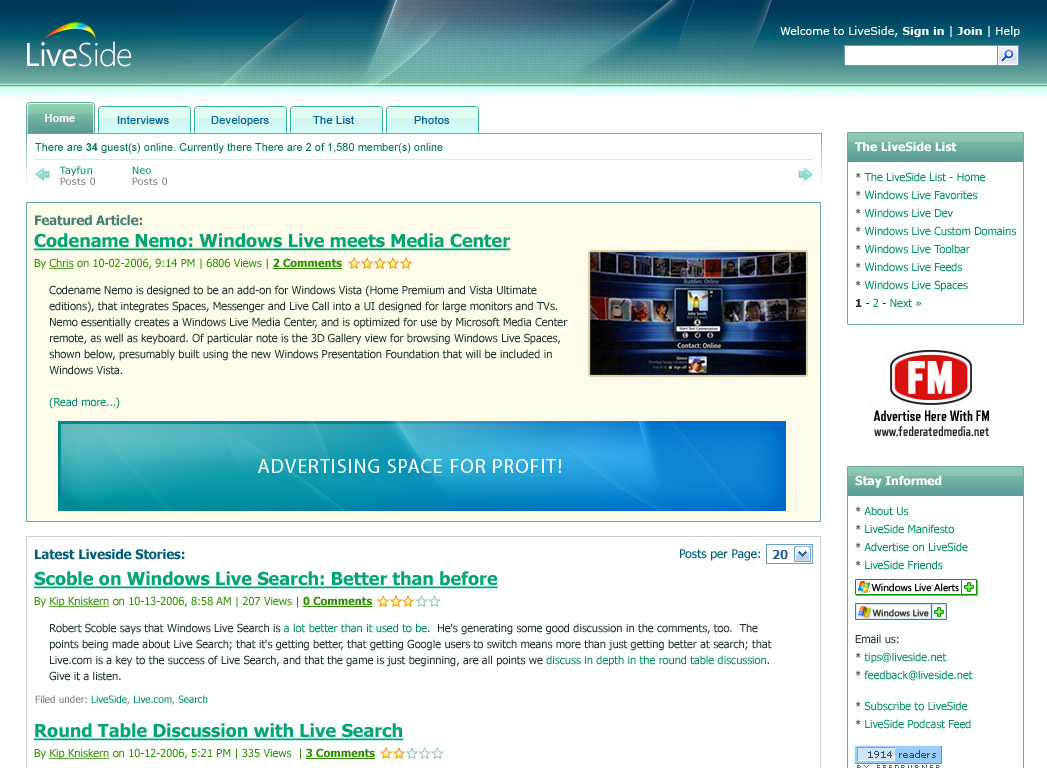
And to demonstrate, I have taken a few hours away from my group assignment time to work on this mockup for LiveSide. If I fail, you’ll know why. And hopefully some will enjoy it even.
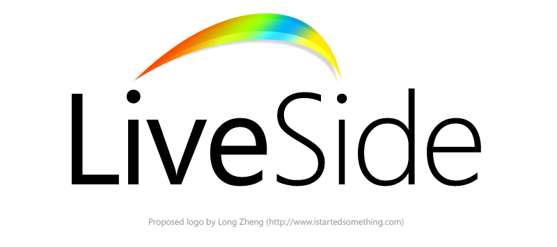

I’m happy to give away the logo and website design to LiveSide for free, if they want it. Only because I think they do publish some really good insider news and provide great insight into the Windows Live venture.
What does everyone else think?
Added: honorable mention to On10.
Awesome logo 🙂
And great design too, just a few things that don’t feel ‘right’:
– Not enough padding on the main content.
– The menu tabs don’t fit in with other parts, like the side block headers.
Other than that, thumbs up 😀
Thanks for the feedback Rowan. I agree with you on all counts. But I’m not too worried about padding on the content for now, it can be easily fixed in HTML. The tabs are definitely ‘weird’, but I don’t have any alternatives at the moment. 🙁
Well, as a suggestion, try making them look like the block headers with the solid background and no double border, it might work.
Well i appreciate what you’re getting at Long, but it certainly doesn’t bother me… Your Liveside mockup looks good, but for me, such design concerns really make no difference. Content>>>>>>>>>>>>Design. Nevertheless, horses for courses, as they say 🙂
I agree almost completely with Rowan. It is at present, a very nice design, one of which most clients would pay big bucks for. Kudos, Long.
pretty cool. looks like a space.
i agree with the padding thing, and the tabs on top… i was thinking iframes, but apparently those are pretty 90s now…
Hey Long, thanks for the critique of our site design. You definitely have some interesting concepts going there. While I agree that our logo probably needs a little reworking, the theme is a different story for the time being.
When we were working on Version 2 of LiveSide, we actually had a prototype design that used Flair, much like your’s does. We all really liked it and probably would have gone with it, but the Flair elements used in Windows Live are copyrighted by Microsoft and we would have probably gotten in some trouble over that. Just not worth the hassle really.
Just thought that I would share some thoughts on why we settled on the design that we currently have. I passed this on to our design guy, so he’ll take a look at some of the things that you did. Thanks for reading!
Just so u know, I put forward a design for Liveside.net that looked alot like live.com does at the moment, in the darker blue. The liveside team rejected it tho due to copyright reasons.
O btw I designed the current design very quickly loosely based on there old design.
Most of my work was converting the system from ViruaNews to Community Server
What is the font name of these logo ? it’s realy good.
& nice work mann!
@Harrison Hoffman: Thanks for the reply. I had a lot of thought about the flare and copyright issue. One of the reasons I went with a greenish tint was because I didn’t want people to think this was an official Live page, which is usually blue. The flare on the other hand, I didn’t think Microsoft trademarked. Since if they did, I’m sure Apple would have sued them right out of the water. Everything is copyrighted, but these flare are not the same flare used in Live.
I’m glad you’re already developing on something, and I look forward to it.
@Emexci: The font is Segeo, one of the new Windows Vista fonts.
First, thanks for the attention, it’s much appreciated. Harrison commented on the copyright issues facing a design such as yours, and it goes beyond that. Not only do we not want to get sued or taken down, we also want to make it clear that we are not affiliated with Microsoft or Windows Live. We are an independent site, and want to make it clear through our (admittedly not very Web 2.0) design as well as our content. Which brings us to the second point, that none of us being web design professionals (except for Nick, who we contracted to do some work for us, mostly with migration from our earlier site – we think he did a great job), we have chosen to focus on content first and bells and whistles later. We spent a lot of time migrating, we all do this in addition to our real jobs and schoolwork, and we’re looking forward to continuing to improve.
ps I kind of like our logo – especially when you don’t squash it. 😛
What is this “flare” business?
Man, I’m disappointed on10.net didn’t get at least honorable mention, but that’s ok I think it still needs some work as well. Its all about finding the time for design cycles.
I have been able to spend time lately on the Channel9 redesign and I’m looking forward to releasing those screenshots soon.
I agree LiveSide should avoid the Vista wash, though, to distinguish their independance.
@Kip Kniskern: I didn’t squash your logo 😛
@Rowan: It’s the curves you see on all Windows Live branded website headers.
@Adam Kinney: I forgot about On10, but it looks great. Added! 🙂
@Long Zheng
Thanks mann
You know what all those sites need? More brown! It’s the new black I tells ya.
Hi Long, can u give me a email or something, liveside is about to turn 2.1, and the theme is going to be updated.