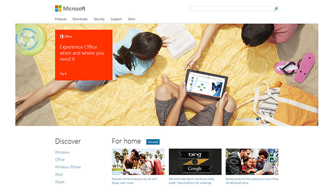
Nishant Kothary, a web strategist at Microsoft, goes behind the scenes of the new Microsoft.com from the first conversation with his wife, the project manager.
Although he doesn’t go through the technical aspects of the website, he dives deep into the psychological reasoning and how the design team overcame falling into the trap of relying too heavily on telemetry and usability studies. Instead, they had the freedom to “design from the gut”.
“In rethinking the user experience, we didn’t want to simply offer up X number of programmable slots. We got together as a team to discuss how to best create an experience to tell our product stories, meet the needs of our customers, and how we wanted to have a beautiful experience across any device. We drew learnings from analytics and previous A/B testing, but at the end of the day it was strategy by gut, tweaking by data.” said Benson to me when we met in the RedWest campus of Microsoft a few days ago in reference to the impressive hero graphic that spans the top of the page. It’s easy to understate the significance of his statement in the absence of context. But consider that the new hero graphic is a huge departure from the information architecture of the last few versions of the site. The image below speaks a thousand words that amount to: go with your gut.
The problem with the site is that it is only there to get one (1!) single click. One click and you are already gone to a completely different website.
From the new home page to actual product information you may have to go to three or more completely different websites by Microsoft. Most sites are simple “hubs” or welcome pages without any content on it.
True, but did you notice in his article that there’s a Microsoft employee, Michael Ruggiero, who is the Development Manager for the home page? The fact that there’s a manager for one single screen speaks to its importance and value to the company. I’m sure the rest of the site(s) will come soon.
I tried to point out that there is no such thing as a Microsoft site. There are only a ton of different HTML files who all look and function differently.
Sure the new home page design is very nice and the approach is innovative and nice. But it gives a very bad impression on the company when you are tossed in completely different web sites the minute you click any link on that page. Total logo confusion, different page widths, different page alignments, different menu systems. There isn’t even a link in the menu to Windows 8, something you would think people would be interested in getting information on, and I can’t even figure out how to get there by clicking “all programs”. What’s the point of renewing just one page, why not wait until you have even a little more.
Exactly! The thing I really like about Apple’s website is CONSISTENCY. I understand that Microsoft hosts a bunch of different websites but I don’t think it will take too much effort for them to make them consistent, at least with the font size, color schemes and page width.
Why does microsoft.com have a link to the “Bing it on” challenge, yet that seems to have disappeared completely from the web and just redirects me to bing.com?