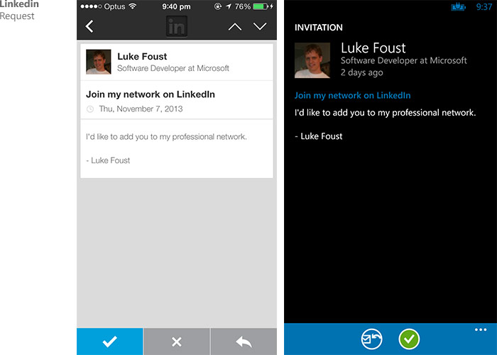
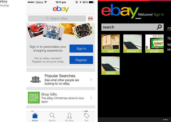
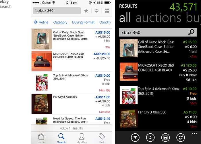
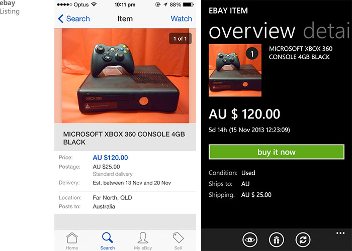
As iOS app developers embrace the new flat UI conventions of iOS 7, many popular apps got a flat-design makeover. At the same time many of these apps also have a sibling Windows Phone app.
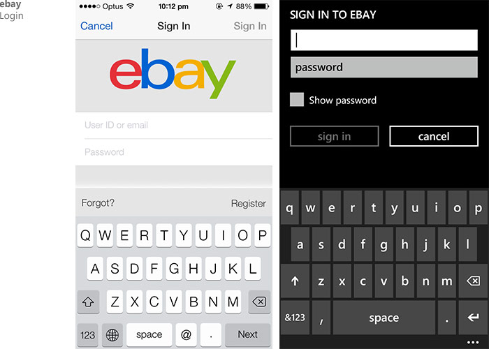
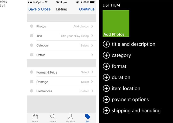
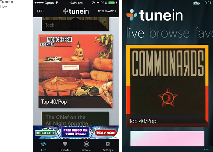
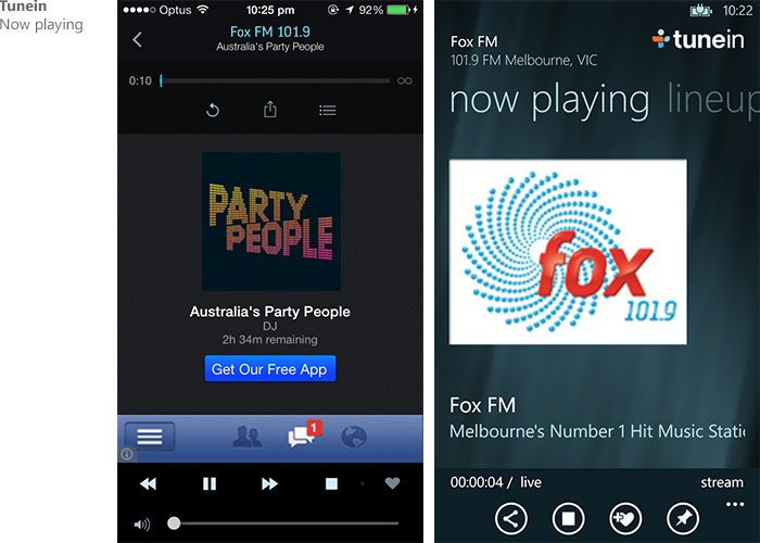
As the two platforms have a slightly different interpretation of “flat design”, I’ve been meaning to compare the similarities and differences of third party apps trying to conform to the respective UX guidelines.
Here is a quick list I put together. I hope to add more apps to this over time.
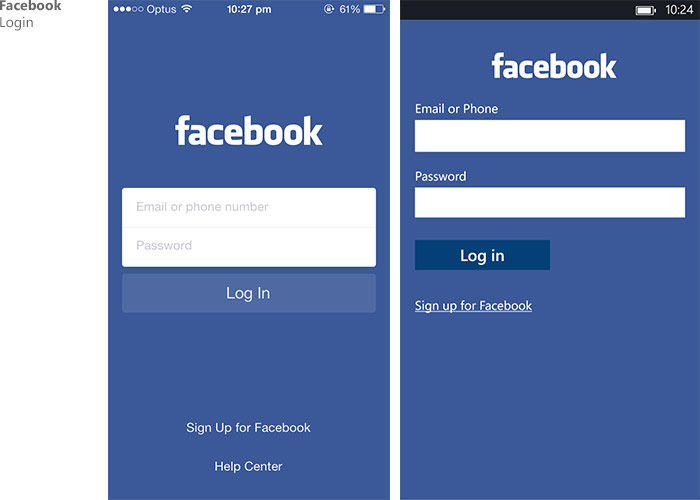
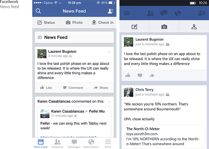
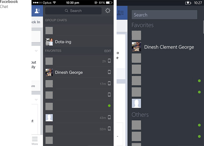
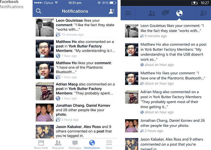
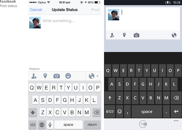
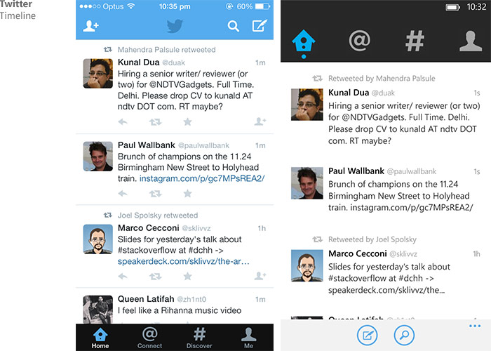
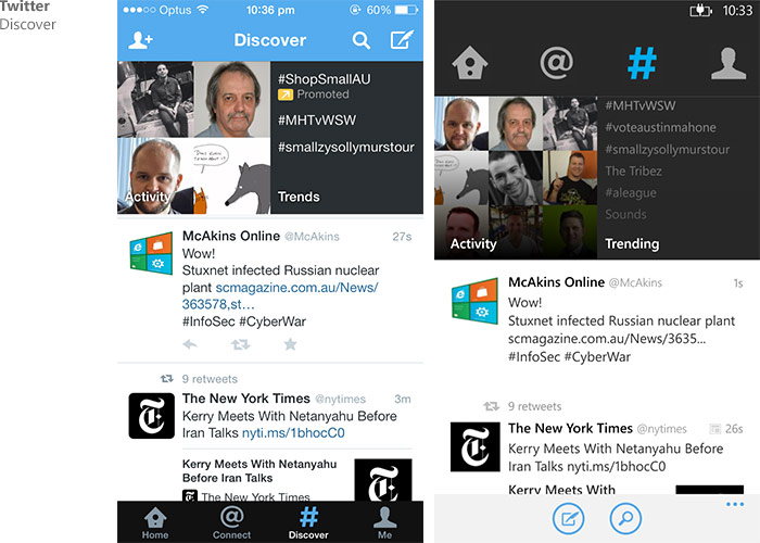
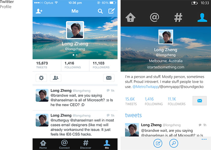
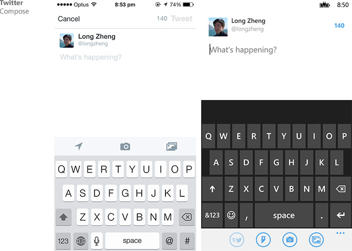
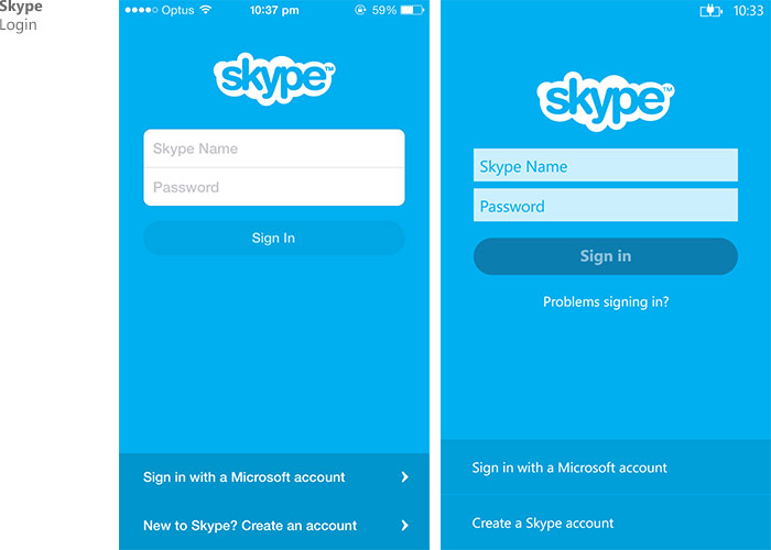
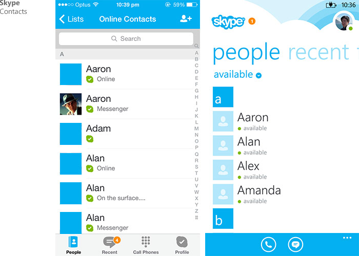
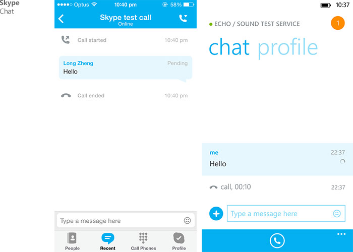
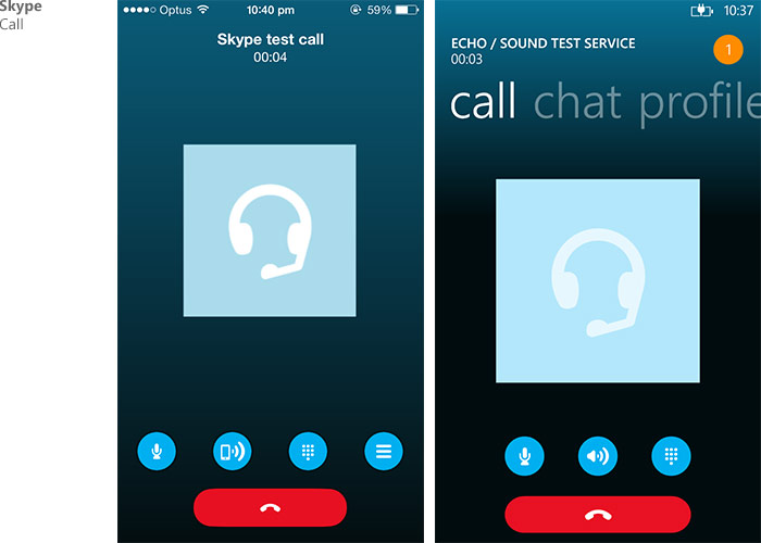
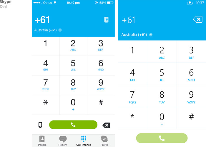
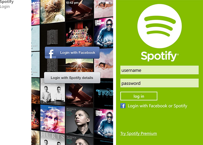
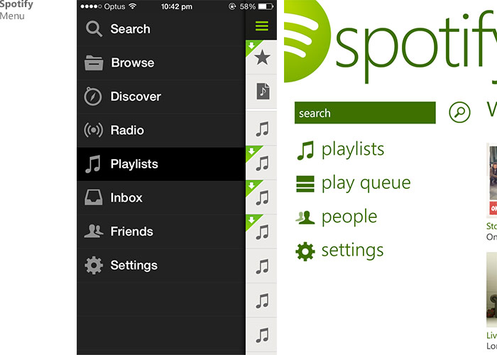
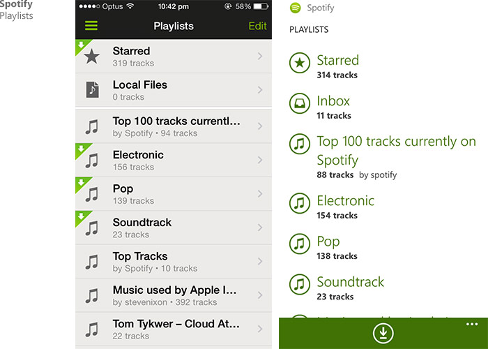
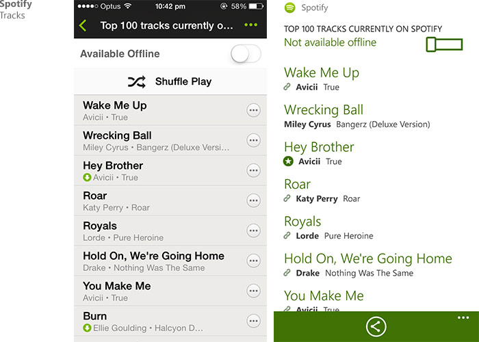
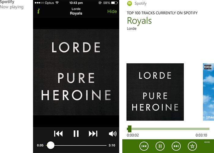
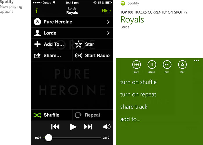
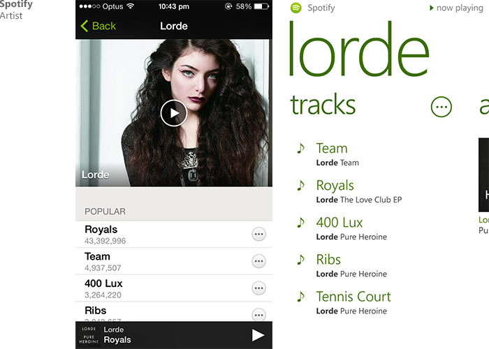
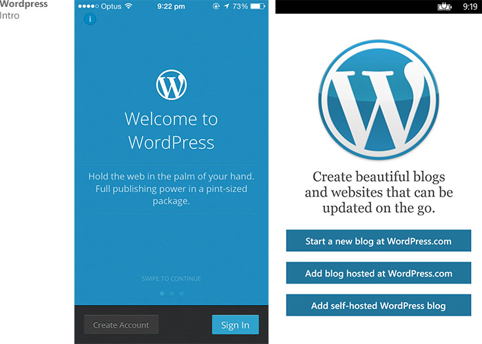
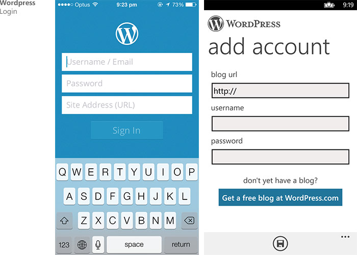
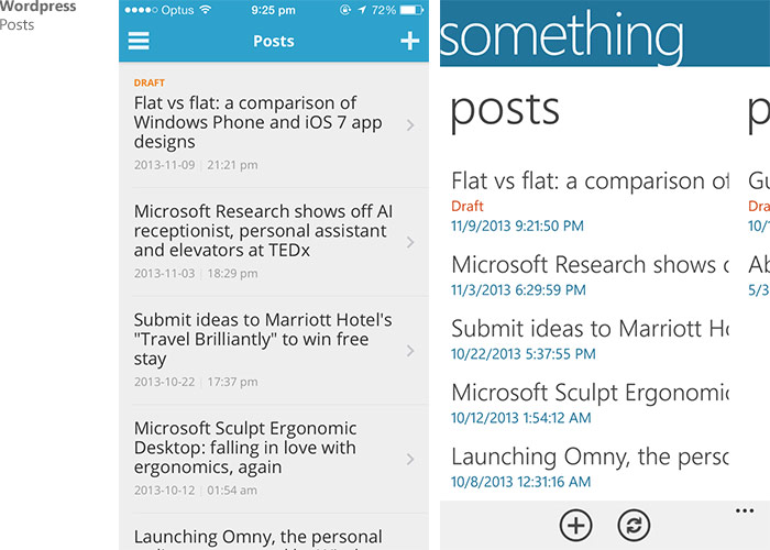
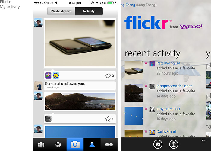
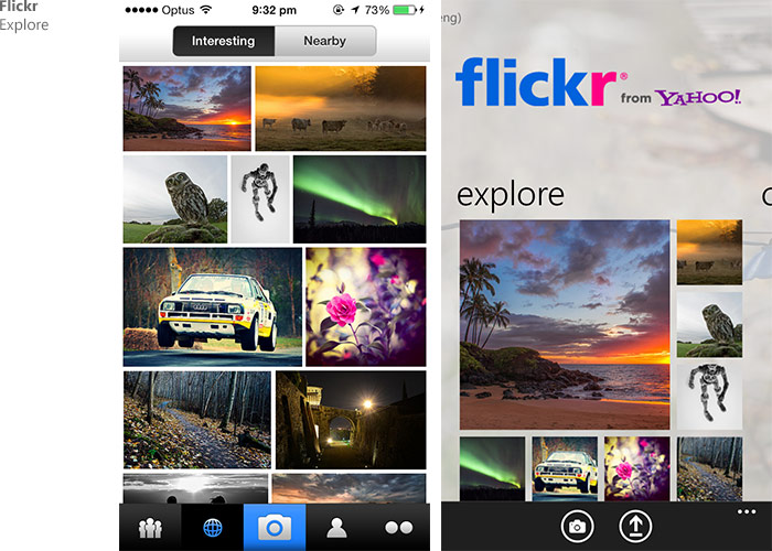
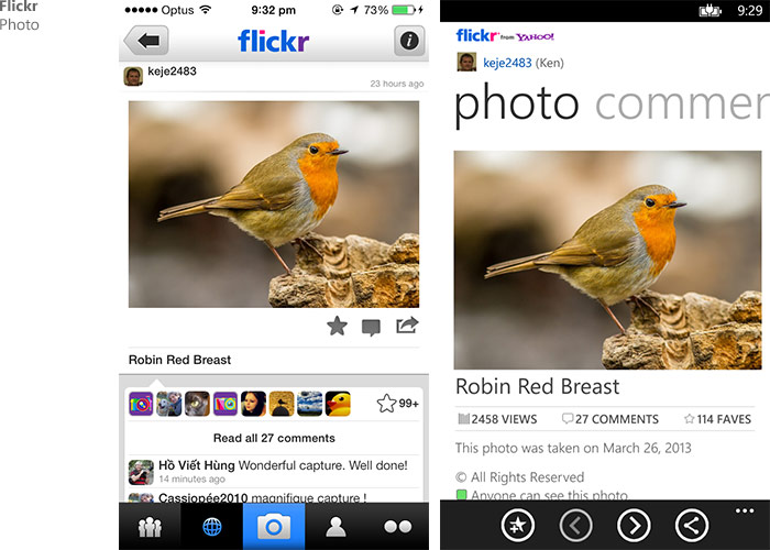
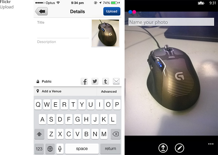
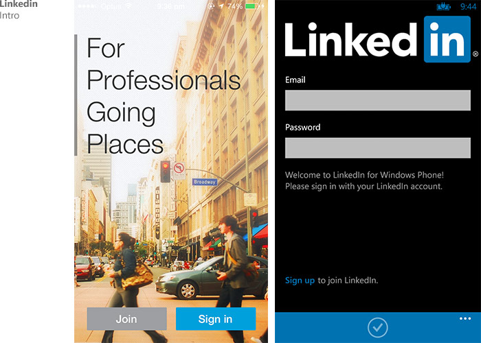
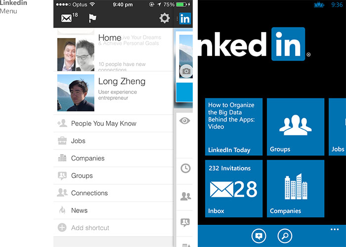
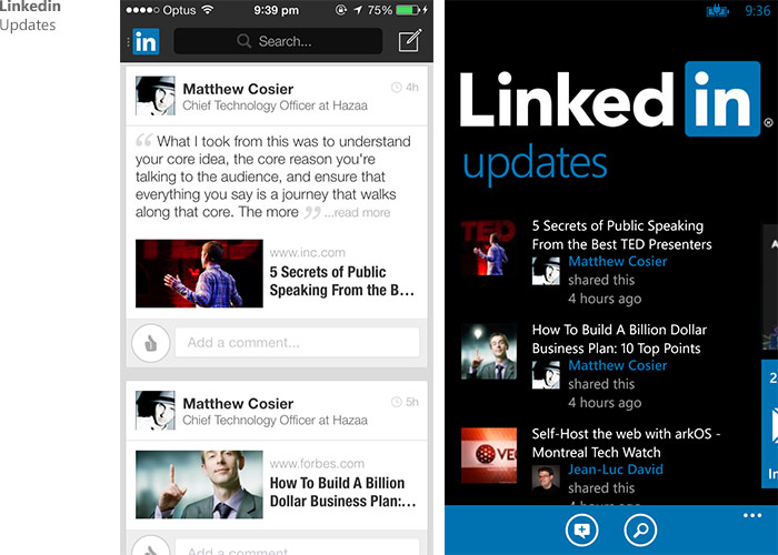
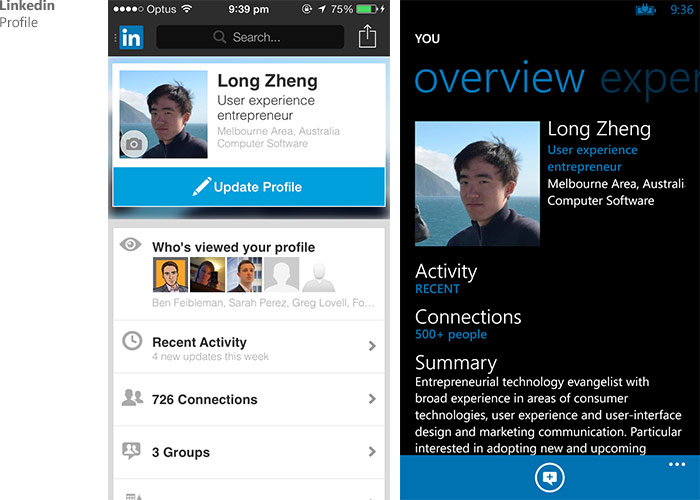
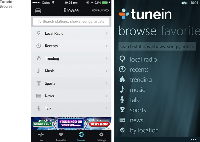
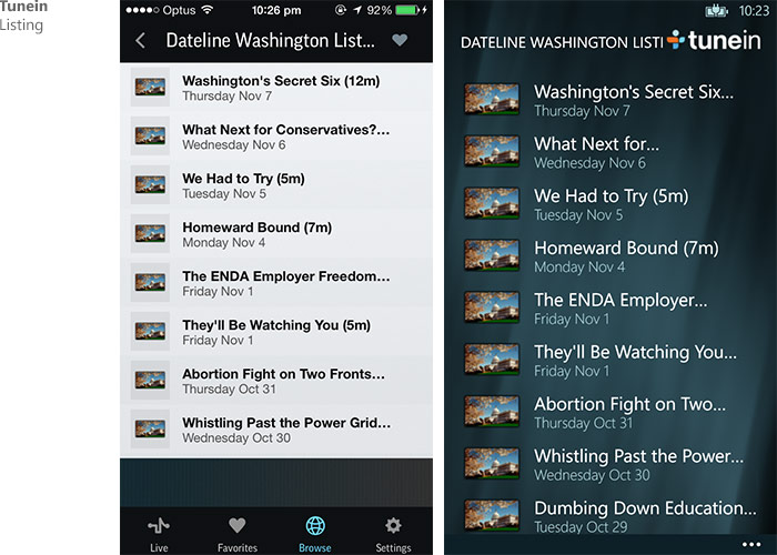
Apple wins.
LMAO there are always people like you cannot see through the surface.
I don’t know, I own a Surface Pro and it’s pretty opaque.
Not really. MS wins actually
We’ve got a Windows Fanboy here – check the rest of the comments for his butt-hurt.
No one wins. It’s all in your preference. I prefer Apple because of a lot of reasons. But I think Windows Phone is gorgeous too.
In my preference.
For the most part (not you Spotify) I think the Windows Phone versions look nicer but mostly could still do with the odd tweak to improve it. The smaller issues no doubt the result of a much smaller group assigned to the Windows Phone versions of these apps.
Skype and Facebook however have Windows Phone versions which look more polished.
Spotify may look shittier, but they get access to their queue! It always pisses me off that one of the things that sets spotify apart from the many other music apps on the desktop is the ease access/manipulation of both queue and play history. AND THEY JUST LEAVE IT OUT OF THE PHONE APP.
I think a better comparison would be first party apps as
1. For iOS, the whole concept is new and people are still figuring out the design language.
2. For Windows Phone, these huge third party apps are rather an afterthought (Facebook app is made by MS, twitter isn’t even shown on twitter’s official app page, Flickr hasn’t been updated in ages)
Better comparison would be with dedicated developers such as 6tag or Mehdoh vs instagram and tweetbot or first party office vs iWork etc
iOS7 > Win but both look very similar. Both are kinda sad and boring. Apple has lost its distinctive identity, which will be reminded as Ive & Cook unforgivable mistake.
WP>iOS 7 they don’t both look similar and flat is not sad and boring. yes your right Apple lost its distinctive identity.
We’ve got a Windows Fanboy here – check the rest of the comments for his butt-hurt.
Alan – online and Alan – on the surface. LOL.
I don’t think Facebook and Twitter’s Window Phone app can represent WP’s design philosophy.
But the Skype app is a very good example.
Yeah, they both don’t fit in that well. They represent their own brand design, but unlike some apps like Spotify, they don’t find a balance of their own brand and the OS design at the same time.
When ever I said Apple iOS 7 looks a lot better then Windows. Others just keep telling me I am a fanboy or I hated Microsoft. NO! How would anyone not see Apple’s Flat looks a lot better?
I hated Flat. As soon as i saw Windows 8 i thought it was the ugliest thing ever. Some people do enjoy it though and think Flat are great. It wasn’t until Apple’s version of Flat do i fall in love with the flat design.
I really wish some designer could explain to me why Apple’s Flat looks better. Because to this date i still dont understand why.
Sorry Apple flat does not look better in my personal opnion, it looks ugly, its just no no, what’s with the blend gradient and flat, its not done right, I just don’t buy it from Apple like you do. you need to properly understand why, Windows 8 is not the ugliest thing ever, some blinded people perceived it as “yuck”. no, its great, its flat. Apple version of flat is gradient its not pure flat flat, some parts of ios 7 is flat, to me iOS 7 is a blend of gradient and flat and I don’t see you as a MS hater, but I respect your opinon, some people prefers Apple flat and some prefer MS flat which I personally prefer. MS had more experience than Apple in that for years, way before Windows 8 came in the market, MS has been implementing flat minimalistic swiss design in technologies since 2006 – AKA Metro Design, Before Windows 8 (Windows Media Center 2006, Zune 2006, Zune HD Zegoe UI 2009, Windows Phone (7/8 – 2012)2010, The Xbox 360 Dashboard 2011, Windows 8/RT 2012 and Now Xbox One and All Microsoft corporate logo, logos products and services, products and websites and services etc. and yes they even have been doing this since MSN Encarta back in 1995 the early days of MS Metro flat design back in the mid 90s. Flat is not new and Im not saying Microsoft invented it, they have not. They have more experience than Apple in implementing them in technology software’s (not hardware). That’s why I prefer MS one. sorry. I respect your opinion though.
We’ve got a Windows Fanboy here – check the rest of the comments for his butt-hurt.
You sound like you’re just throwing out graphic design buzz words you’ve heard on the internet. “Flat” is a general term and not something with a specific set of rules and boundries. MS’s metro design isn’t ugly at all. Even so the atheistics of each OS is a matter of opinion. What we should really be looking at is how each design affects the usibility of the apps on the device. If the app is pretty it won’t mean anything if it’s not intuitive and easy to use.
It doesn’t matter how long MS have been implementing “flat” design elements, their apps and OS’s have always been overly complex and clunky. Mind you I don’t have much experience with metro and this is purely my opinion. Apple has always been a company that waits until it knows it can do something better and then implements it into its hardware and software. That’s just what they did with ios7. The apps are easy to maneuver through and the flat design elements see to add to the already intuitive feel of the OS itself.
So call Apple’s designs ugly all you want. Beauty is indeed in the eye of the beholder. But when it comes to the designs adding to over all ease of use of the OS, Apple has Microsoft beat every time.
Even though I’m an WP8 user, I thing the iOS7 is cleaner and nicer than WP8. I also do find the 3rd party WP8 to be a lot nicer than official app aka 6sec and 6tag.
Im was a past iOS user and WP apps look better than that iOS 7 copycat. yes 3rd party WP8 developers take pride unlike some developers who develop for WP. Love the 6SEC AND 6tag way better looking than some official WP apps and even better than iOS 7 official 3rd party apps (instagram, vine etc.)
There is such an incredible amount of wasted space in all these Windows Phone apps it’s just painful to see. Those massive banners take like a third of the screen area.
Not all windows phone apps are wasted space, its these wasted space developers. and the style of metro is not a waste of space and its not painful to use. sound like you haven’t used a WP.
We’ve got a Windows Fanboy here – check the rest of the comments for his butt-hurt.
Disagree, Windows Phone apps are not waste of space, some are because of those lazy ass 3rd party developers that don’t update WP apps and the style of metro is not a waste of space, its different to what you see, those massive banners are to take the pivot of the style of WP app, like gesture based movements in a flowing design unlike static iOS/Android apps. so they are not painful to use. since you have not used a WP before.
I think i agree with you.But for different reasons.
1.No matter what other people say Metro is undeniably polished than ios.
2.Metro is not ugly.
Metro getting bashed could be due to :
There is just very few component :tiles and sidebars.
additions like homescreen ,a separate section for widgets and launching apps as well as viewing VITAL INFO.
There are more problems:
Tiles are bigger therefore consuming more space which results in
Few XL tiles are bigger than 4 icons of android appdrawer
More scrolling=more time.
3.Apple’s design is more of Evolution and Petty over Revolution and Significant.
They are afraid to step out of their comfort zone.
Moreover people cant back their oponions.
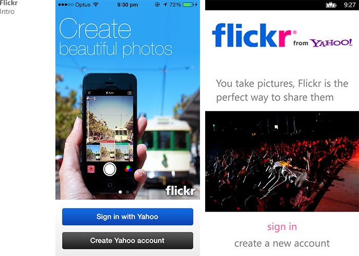
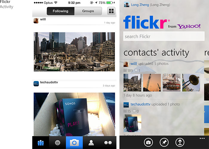
Flickr, LinkedIn and eBay apps on Windows Phone are probably the worst apps in terms of both design and functionality. All three haven’t had a major update since WP7 days. These apps needs to take a page from Facebook and Twitter’s re-designed WP apps and move away from the panorama home screens.
agree. these developers need to take the right appropriate design for WP. some designed like Magazine and Book apps should use panorama home screens, not all the social apps, it depends how they implement it well.
We’ve got a Windows Fanboy here – check the rest of the comments for his butt-hurt.
Great comparsion, but it´s a pity that images are saved in JPEG with notable artifacts instead of 24bit PNG.
The key point here is that after 2 years of “Metro” UX somewhat silent bashing, Apple finally embraced it to a point where it will be ubiquitous in its ecosystem. Ironic.
And on top of this, iOS 7 accelerometer enhanced wallpapers and lock screen were in fact introduced by one of the founding member of the “Metro” styling: the Zune HD. 4 years ago. Double ironic.
I wonder why WP keyboard is so big in terms of height. Does not seems to make the typing experience easier on a significant way.
The blank bar (in the screenshots at least) isn’t usually as blank as it looks there. Normally, that’s where ‘Wordflow’ gives you autosuggested words.
Yeah, but I was talking about the keys itself, very tall in comparison. Other keyboards like Swype follow this style, but is not clear if there is any improvement on doing so.
I find the comments here interesting that everyone says that the iOS counterparts look better. Except for eBay, Flickr, and LinkedIn, I personally refer the WP versions in every case.
Awaiting comment from Warz…
yes Warz is a retard, trying to stop me from commenting my preference and he attracts me for loving the windows phone more than iOS, hes more a fanboy, an Apple iSheep faggot. What a pathetic fool, he should get a life
I am usually pretty biased towards Microsoft, and I don’t find either one remarkably better than the other. They seem about the same. Flat. Easy to read and navigate. Both could work for me and I have never owned anything from Apple. FWIW, CocktailFlow has one of the very best Metro UI designs I’ve seen so far. I don’t know whether there is an iOS version of that.
Yes your right in a sense. but to me they don’t look the same because they are flat. iOS use flat look but sticks to the same paradigm as the begging of iOS (since 1.0 same UI layout) while WP takes it to a different level in terms of app design.
We’ve got a Windows Fanboy here – check the rest of the comments for his butt-hurt.
Long,
I think the comparison would look a lot better if the images weren’t compressed so heavily. Some higher fidelity screenshots would be better IMO.
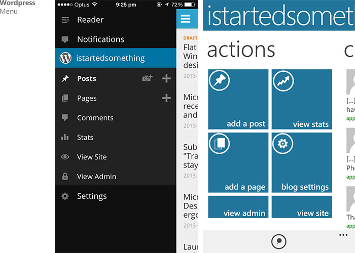
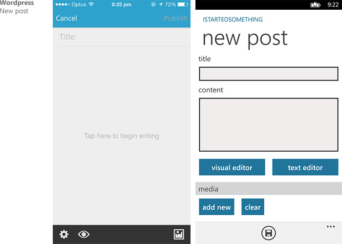
Look at the WordPress app (Post) and u will see exactly what’s wrong with Metro (Wasted Space) vs iOS. You cannot even read the entire post headings.
Cool comparison! What really strikes me when i see the comparisons is how much space is wasted in almost all WP apps. This is something that i really only noticed in a few apps before. It is really odd that so much space is wasted since the information is supposed to be the center of focus in WP. My Lumia720 now got degraded to a buggy music-player and i switched back to my laggy Sony Xperia S that at least has all apps i need and a high-res screen.
Disagree, there is no such thing as wasted space, they have different designs, you need to learn more about Content over Chrome, your choice to go back to laggy malware fragmented android, with apps look like 2007 and some apps that mimic iOS and that horrid Holo UI. If I was you, I would have installed the next windows phone by now, because updates are available that’s why we have a thing called software updates to clear out the bugs. No OS is perfect, each have its high and flaws. iOS 7 is more wasted and contrast is too white, its binds people eyes out, that’s more wasted space.
Maybe we could get a redesign of Skype on Windows? It is terrible compared to the Mac version
I never liked the Win8 design. I do like flat design but i think in some way they did it wrong.
Yes WP design is nice, Apple is the one who did it wrong.
I love the WP8 experience. There are some apps that need updating, but overall I think its more consistent and polished than iOS7. I also believe that the native apps (camera, notes, calendar, etc) look far superior to their iOS7 counterparts…
Windows Phone versions, is best not iOS, hands down period, end of discussion, move on
and “Warz” cant stop the others who like WP version best. So….
@Thehumanmachine is a best example of an Apple typical iSheep, that comment is old, WP and new windows does not look clunky or heavy in any shape or form and its more than pretty, its simple and easy to use and you don’t need to dig in like iOS, its 2014, not 2003 and its not 2007. You need to get your eyes tested and first of all Im just pointing out that MS now wins in simplicity and has experience than Apple in minimalistic designs, check out previous MS products i.e Zune HD back in 2009, all typography over glossy sugar icons that is on Apple iPods in the past, now they are talking some insprations from Microsoft, I did not say MS invented minimalistic and typography, but they were the first ones to implement it and they implemented it well Zune HD, Windows Phone, Xbox, W8 etc, where as iOS 7 is gradients with a flat colour look with rainbow colours – Johnny Ive Style, that doesn’t cut it for me, learn some real minimalistic “flat” designs, don’t tell me, what “flat” should look like. Apple used to not always been a company that waits until it knows it can do something better and then implements it into its hardware and software, not anymore, its MS now. so get over it. Im not calling Apple’s designs ugly. Beauty is indeed in the eye of the beholder and that’s Microsoft Metro design, not iOS 7 design and when it comes to the designs adding to over all ease of use of the OS, Microsoft now beat Apple every time. So try a new MS product and you will be shocked, don’t believe in typical “old image” of MS, we don’t look at that perspective view of MS anymore, its 2014, not the 90s and the 2000s anymore. end of story.
Lol Windows apps looks like they are made by graphic interns…
Lol ios look like it was made out of 3rd class designers with no degree it graphic design
windows wins 🙂
I guess iOS won in 2013, may be a new comparison now would be fun to see how iOS copied WP.