I was browsing Apple’s new website today when something grabbed my attention. One of the screenshots on an iOS 8 page had an Australian address. “Oh that’s cute” I thought. As a designer, I understand the pain and effort localisation requires and I always appreciate the extra attention to detail, especially when it comes to localising bitmap images.
I quickly started to wonder just how much localisation does Apple actually do for the Australian website (which caters to just only 0.33% of the world’s total population). So I docked the AU and US sites side by side and started to browse.
I was pleasantly surprised.
If you ignore all the plain-text localisations, as you’ll see from the side-by-side examples below, I have never seen this depth of localisation for bitmap images before.
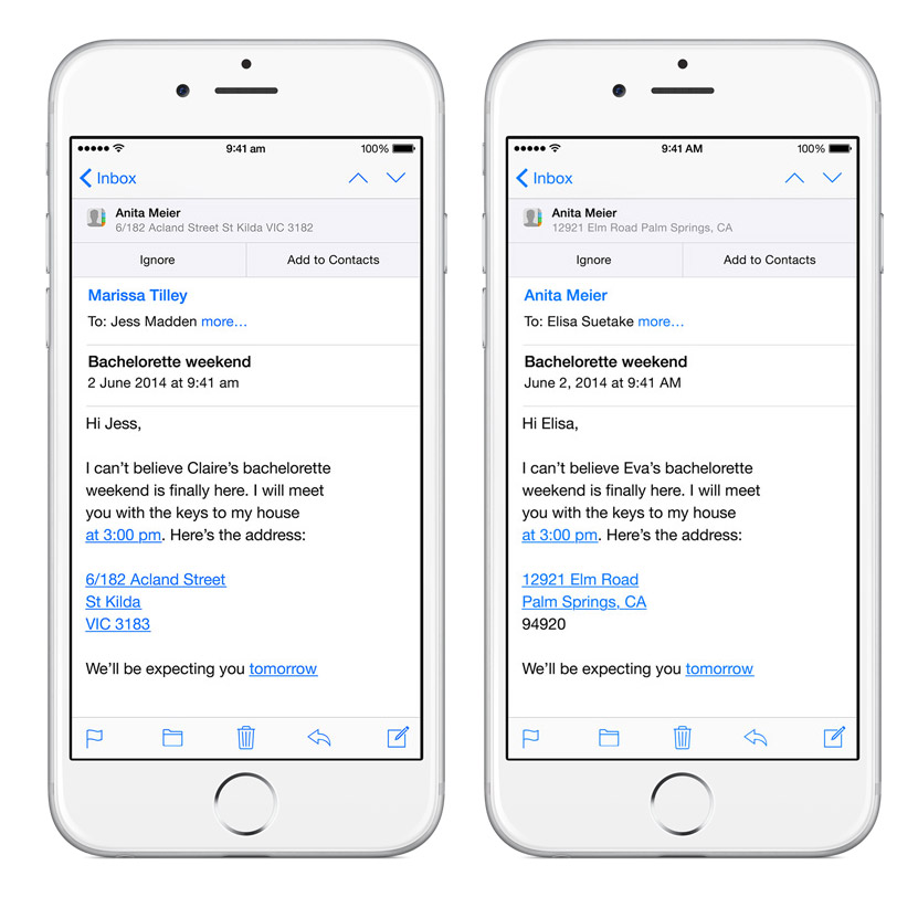
(Left: Australia, Right: US) Common in all of these screenshots, the time has lowercase periods and the date is in the D/M/Y format. More notably, the address is changed from “12921 Elm Road, Palm Springs, CA 94920” to “6/182 Acland Street, St Kilda, VIC 3183” (which is actually a real address in Melbourne). Many of the names below are also changed, although I have no evidence to suggest “Marissa”, “Jess” or “Claire” are more Australian.
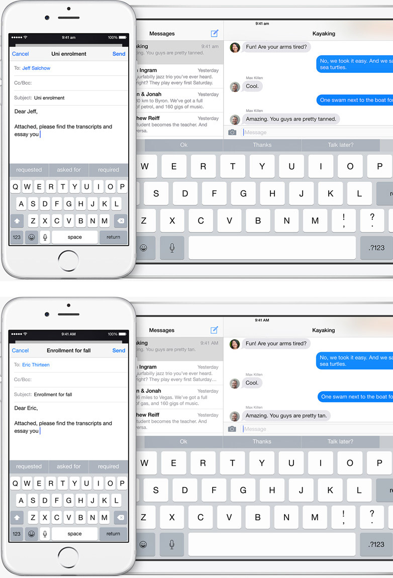
(Top: Australia, Bottom: US) Australian slang shortens “university” as “uni”. We also use the “enrolment” spelling. The iPad in the background also mentions “Byron” instead of “Vegas”, in “km” instead of “miles”, and “petrol” instead of “gas”. The words “tanned” and “tan” are also changed.
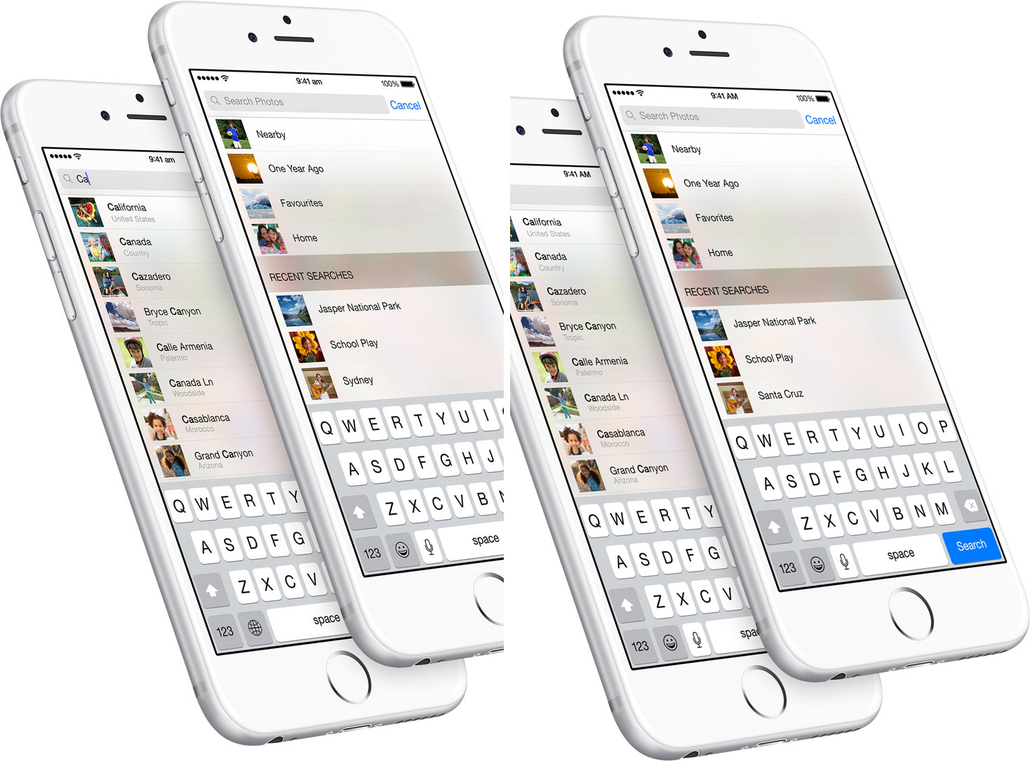
(Left: Australia, Right: US) The location “Sydney” is used instead of “Santa Cruz”. “Favourites” instead of “favorite”.
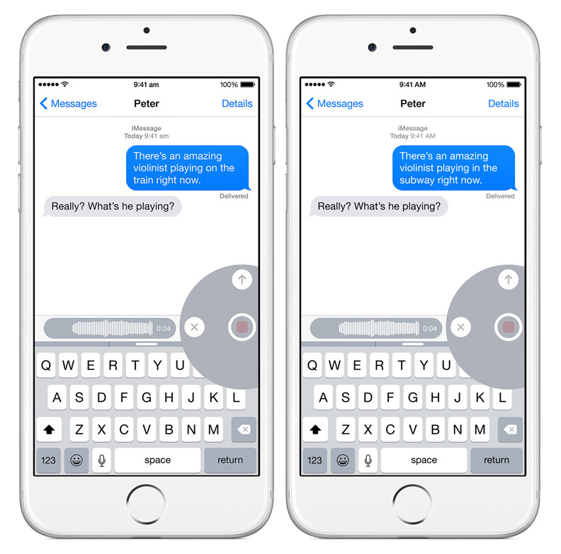
(Left: Australia, Right: US) Subways aren’t that common in Australia so it is changed to “train”.
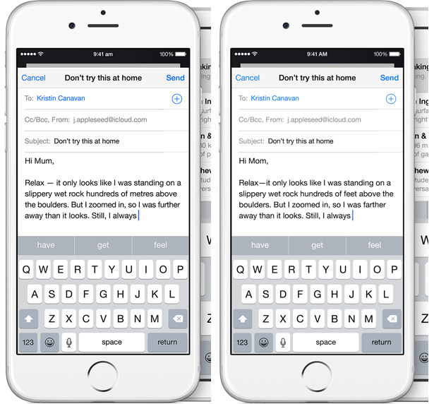
(Left: Australia, Right: US) “Mum” instead of “Mom”. Metric unit “metres” instead of “feet”.
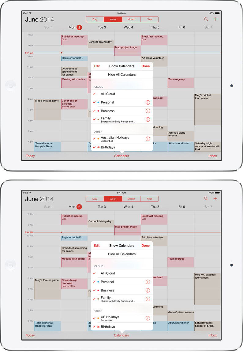
(Top: Australia, Bottom: US) “Appointment” instead of “meeting”. “Cricket”, an Australian favourite instead of “baseball”. “Wentworth Park” is also a real Australian sporting complex instead of “SFDS”. Naturally the calendar has “Australian Holidays” instead of “US Holidays”.
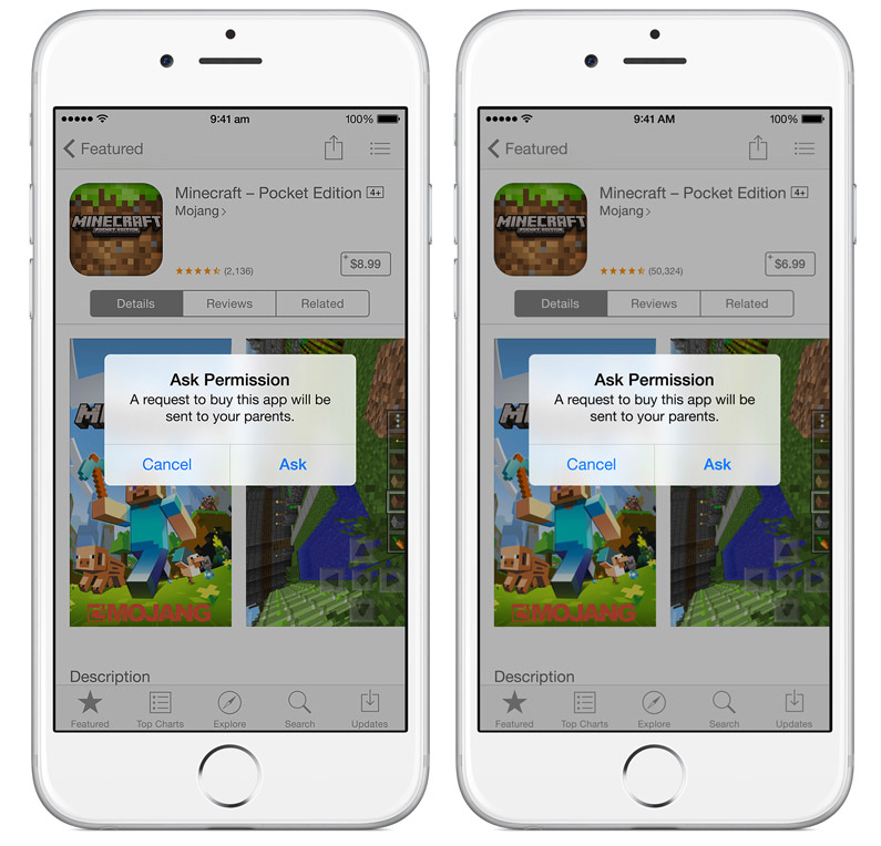
(Left: Australia, Right: US) Even though the words are the same here, the number of app reviews and app price is appropriately adjusted for the Australian App Store.
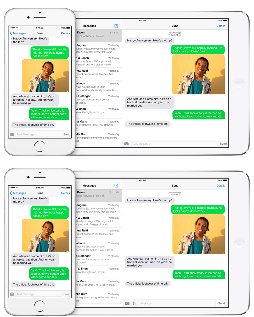
(Top: Australia, Bottom: US) “Holiday” instead of “vacation”. “Glasses” instead of “frames”. We also don’t have number-based street names so “Roberts Street” instead of “21st Avenue”.
Surprisingly however, the United Kingdom Apple website which serves the second largest native-English market (0.88% of the world’s population) does not seems to get any special regionalisation treatment. For example no effort has been put to localise the Palm Springs address from the default US one. (Update 22 Sep: the UK website now seems to have received a localisation update as well).
Perhaps there’s some special connection Apple has with Australia which could explain why Apple launched iTunes Radio in Australia only second after the US.
Whoever did this at Apple, I tip my hat to you.
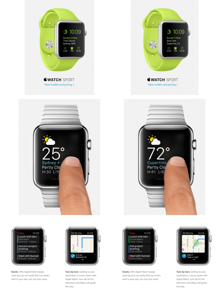
Update (11/4/15): A year later, the tradition lives on with the Apple Watch website.
As a Norwegian I am used to Apple localizing most product images. Thought, their website usually is in English under the Norwegian for upwards to a month after a large site update before the Norwegian content is in place. I guess this is more surprising for the difference between American and Australian English even though Norway is a way smaller market than Australia. Its also mostly a huge waste of human effort, I am afraid.
Fun fact: In Norwegian, the train in the “there’s an amazing violinist playing on the train right now” is changed to “the square”. And the “Really? What’s he playing” is “what’s SHE playing”.
No hints given on why the recipient would have such an interest in exactly what’s being played or why they would assume the violinist’s gender in the first place.
In the first image they forgot to change the top Anita to Marissa!
Haha, I notieced that too!
Nice catch, population wise we may be small, but as a percentage of Apple’s global sales, we’re much higher than 0.33%.
my wild guess… the localisation manager for Apples Australian web site puts a bit more effort into it than their UK counterpart.
From what I have seen advertised at their web site they have localisation managers (can’t remember what the exact term was) for every market.
a warm welcome to all primary school children.
haha, nicely said 😀
In the “Don’t try this at home!” set of images, they also changed “farther” (US) to ” further”(Australia). I thiiink “further” is grammatically correct (but I’m also half asleep).
LMAO no… “farther” is grammatically correct.
Except it’s not called “bachelorette weekend” in Australia.
Yeah it’s called a bunch of annoying cunts.
One word: Interns.
In the first screenshot they have Anita Meier instead of Marissa Tilley. They forgot to photoshop that i guess.
0.33% of world’s population DOES not translate in 0.33% customer base. 2nd – all named diferences are a day’s work for an average web content manager. Even in a restaurant, a good waiter will offer you a candy “on the house”. Tickles your ego and makes you feel special and increase the tip next time. This is very common practice. So yeah, Apple is good at taking money from people. And make thrm feel honored to give away named money. Nothing new here…
Google often does that, even on a very local level e.g. showing flight information from a bigger city around you (I remember that from a Google Now demo picture showcasing one of the Nexus phones), that would change depending on whether you were in England, Wales etc.. I remember the Welsh version even had a local reference in the text. Often I see ads that are different for British and American audiences. It’s nothing new really.
Yeah, but Apple did it, which makes it new.
Yes they always focus on details. I’ll say AU and US are still count as “similar” cultures. If you look at iOS 8 page for China, for example, they localise every single detail. It’s remarkable.
Great research Long. Mind blown.
The same situation is here in Poland. We have special translations in iOS8 and event though there’s a few well known polish persons mentioned in “Walkthrought” mode on the phone. Looks like Apple’s investing a lot of time to become more understandable on smaller markets.
I work on the Localization and Release Engineering team as a production artist and actually worked on most of the graphics in this article. I can tell you 1) we’re contracted graphic designers not interns and 2) it’s really an incredible feeling knowing we’re recognized 🙂
Awesome. Are there any other cool changes I missed?
Jordan, great work. It’s nice to see such attention to detail. Is all the work done manually or is there any automation involved? Would love to discuss the workflow in more detail if possible. I’ve been working on something semi-automated with InDesign for localised screens in the past.
I am from the UK and the address is in Swansea not Palm Springs. They have catered for us!
Thanks for the heads up.
owesome .
For France, they made an effort about names, titles, texts … but the address is still in Palm Springs, not in France. Almost perfect.
Nice of you to have noticed it and write an article about these personalized pages.
NB : excuse me for bad english
I’m from India and this shit ain’t happening here.
I’m really impressed by the level of care put into Apple’s websites (I’ve looked at the UK and US websites before to compare them) and in iOS. I’m kind of wondering why OS X still has only one English variant (American, called generic ‘English’) at this point, considering everything that’s being done with website localisation and iOS.
Apple is also known to use the Unicode Common Locale Data Repository: http://cldr.unicode.org/#TOC-Who-uses-CLDR-
Wow! The dev team really does think of everything! I was amazed, considering I live in Melbourne too.