Vista SKU features guide

Update: Since the release of Windows Vista, this information is now out-of-date. For the most accurate comparison, please visit the official Microsoft Windows Vista editions comparison page.

This information comes from the Windows Vista Product Guide, which is a summary of all the features found in Windows Vista.

Of course, Microsoft has already announced the many versions or SKUs, people began speculating what each version might contain and how will it be marketed. Now the speculation can end as the official feature-set for each version has been released.

Interesting points to note:

  • Dual core (and presumably multi-core) support can be found on all versions, including Home Basic. However, multi-CPUs is only limited to high-end versions.
  • An all-language (36 languages) user interface package is available on Enterprise and Ultimate editions.
  • Virtual PC Express is included on Enterprise and Ulimate. Sounds like a scaled-down version of the virtual machine application built into Windows.
  • Aero interface available on all version except Home Basic.
  • A set of new “premium” games is included in Home Premium and Ultimate packages.

The secret informations about Vista is slowly being released as there are just over 6 months until RTM.

Leaves and water droplets wallpaper

The wallpaper that Charlie Owen had in his Vista 5355 screenshots were his own originals. Taken at Deception Falls. Pictured below.

Due to heavy demand, Charlie has posted the wallpaper in several high-resolutions for public enjoyment.

1280 x 800 (2.85 MB) | 1280 x 1024 (3.62 MB) | 1366 x 768 (1.75 MB) | 1680 x 1050 (4.64 MB) | 1600 x 1200 (5.1 MB) | 1920 x 1200 (5.92 MB)

It’s a little too busy and green for my tastes, but many people seems to enjoy it. Thanks to Charlie for making it publically available.

Vista 5355 Screenshots

Charlie Owen posted some new and tasty screenshots for Windows Vista. They seem to be much newer than any CTP screenshots and their build number/date Build 5355.vbl_media_ehome.060330-2100 seems to reflect that.

I have enlarged them for easier viewing to spot the details. There seems to be alot of new icons and the UI seems much more polished.


The Vista-‘flare’ is very prominent here. There seems to be a new icon in the address bar before “Control Panel”. Can’t really make out what it is, but usually that is the “Computer” icon. Some of the icons in the control panel itself seems to be updated, and the text layout is cleaned up.


Obvious UI refresh to Internet Explorer 7 in Vista. Purpleish-blue hue on the tabs bar, although I still personally prefer the grayish look for IE 7 March Beta in XP. Scrollbar also looks different, very dark gradient.


New wallpaper perhaps? Also notice how the Windows orb extrudes on the bottom from the taskbar, reflecting how it extrudes on the top if you place the taskbar on the bottom. Volume icon seems to be different, although the image isn’t clear enough to tell.


There seems to be a blue line below the menu (file, edit) bar. Looks quite weird, could be just poor image quality and compression.


The whole start menu feels a lot darker, which is a good thing. The transprency in the black has been reduced, offering better visibility for the text. Other than that, new icons for Calculator, Windows Ultimate Extras, Windows Photo Gallery (spelt Galery) and Windows Sidebar! Can’t wait to see them in high-resolution. Also the “clear” button in the search box seems to bright orange, didn’t notice that before.

Obviously these images weren’t published for enlargement or public review, however the Vista UI is shaping up nicely and is more polished than ever. Can’t wait for April/May/June CTP!

Waiter! Why is there bittorent in my browser?

The craze for AllPeers has started.

Most web 2.0 applications makes you think “why didn’t I think of that”. This one made me thought “what the f*** are these guys thinking”.

The idea of the AllPeers is to share multimedia content on the internet using peer-to-peer. The idea is similar to Microsoft Max, except its implementation I cannot digest. The application, sits within Firefox, yet it’s not a website.

I don’t know if I’m pointing out the obvious here, but why would you limit yourself to just a segment of the market of internet users? Regardless of how much market share Firefox has, it will never be 100%, nor would any other single browser.

And for crying out loud, it’s a browser, not an operating system. Why, would I launch my browser, to launch another application — that is not a webpage, to share my photos? Wouldn’t it have made more sense, to build a cross-platform native application that allowed that?

And what happens if Firefox changes dramatically, like Firefox 3.0 intends. Why would you build software on such a rapid-developing ‘platform’ that was made to view webpages? It all seems quite silly to me.

Where the M400 lacks

Just a little over a week’s use of my new and very expensive Toshiba Portege M400 tablet PC now, I’ve gathered a list of issues that have caused annoyances or dissatisfaction to the product.

The screen hinge does not provide the desired support for pen-use in laptop mode. Although this is more of a general tablet PC issue than this specific model, due to the nature of the convertible mode, a single rotatable screen hinge cannot offer the same support as you would find on non-tablet notebooks. It makes it very hard to ink comfortable in laptop mode where the screen can be easily pushed back with every force of the pen strokes. To counter this, I hold the back of the screen firmly using my palm.

The screen does not always resume from standby. This problem has also been reported on some forums. This problem occurs when you are resuming from standby, and sometimes the screen does not become active. Although fixable by rotating the screen to tablet mode and then back to laptop mode, it is still an inconvienience the handful of times it occurs. I believe this is a graphics driver problem however, and not Toshiba’s.

In portrait tablet mode, the viewing angle is poor. Because in portrait mode, you are viewing the LCD panel from the side, the horizontal viewing angle is no longer important, but the vertical viewing angle is crucial. The vertical angle affects by reducing visibility of content on the left and right side in portrait mode. Sometimes it is highly distractive, and to read the left and right content, you will have to physically pan the device left and right to achieve better visibility.

Last but not least, the lack of an standard optical drive. This device did not come cheap, and it certainly did not come with any accessories. For it very high pricing, it was hard to accept it did not come with any carrying case or additional accessories, however what is even harder to accept is the fact it didn’t bundle with an optical drive. A standard DVD slimbay drive would have costed me just under 10% of the unit price.

These are just some of the major issues I have found that has impacted on my satisfaction of this product. If you are considering purchasing a Toshiba Portege M400, please consider the above issues before your purchase.

Google Pen review

The much anticipated Google writing tool, Google Pen, is now available to the general public after an intensive invite-only beta testing process. I’m going to give you an in-depth review of what seems to be another piece of Google-world-domination puzzle.

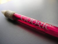
The pen comes in several bright flavours: orange, pink, purple, green and blue. Whilst Google didn’t buy Bic, they have licensed its retractable medium point technology, and basically rebranded it as Google. It sports a milky white rubber grip aimed to assist in holding this oversized wide-body pen.

The Google brand certainly doesn’t fall short. In big, ugly and serif letters, a stenciled version of the Google logo is printed on the wide-body. Even on the enormous wide-body, the Google logo doesn’t fit on a single curved surface, instead to view the entire logo, you have you rotate the pen by nearly 10 degrees in the vertical directions. If you thought that wasn’t enough, Google insists that you never forget their URL, and in smaller black letters, “www.google.com” is printed on the clip. I was surprised to find that the pen didn’t mark “Google this word” under each word you write.

The quality of the black ink is somewhat disappointing. On paper, the ink appears fairly faded compared to generic Bic pens. When you start writing, the ink is coarse and unsaturated, however this improves gradually as you continue writing.

The clip appears very tight and fragile. You can lift it perhaps 5mm before the tension in the plastic builds up to breaking point. The retractable clicker is small and round, forcing an uncomfortable force in to your thumb ever click. The noise is also above acceptable levels, in my opinion, it would certainly not pass any ARPCNA (Anti Retractable Pen Clicker Noise Association) certifications.

In conclusion, Google delivers another average-quality rebranded product that will send the world into a frenzy and signal another wave of Anti-Microsoft hatred.

Obligatory photos: