Update: Please visit the Windows UX Taskforce website to submit your entries.
 Most of us who use Windows Vista have probably come across a couple of user-interface quirks during our times – some of which irritate you more than others, some are more obvious than others. With the development of Windows 7 speeding full-steam ahead, I thought this might be an opportunity as good as ever to make these problems known to Microsoft and hopefully get them all resolved.
Instead of going at it alone, I thought this is the perfect opportunity to harness the wisdom of the crowd. Therefore I’m asking you to submit any UI quirks you know of in Vista and I’ll help compile a list of them together, including but not limited to legacy icons, legacy styles and malformed layouts. Include with it a brief description of the problem (and possible alternative if appropriate).
I can’t promise you that all bugs will be fixed but I will push them to someone at Microsoft who has been said to “get things done”. Without a further ado, I’ll kick it off with a couple of examples.
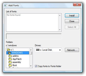 1. Add Fonts
Problem: Generally outdated. Uses Windows 3.1-era folder views. Cannot select individual font file – lists all fonts in folder.
Suggestions: Not only update styling, but add new functionality. Search. Font management – activate/deactivate. Export/backup functionality.
Impact: Medium
Severity: Low
Fixed: Dialog removed in Windows 7
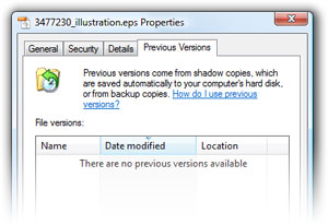 2. Previous Versions
Problem: XP-style icon.
Suggestions: Update icon.
Impact: Low
Severity: Low
Fixed: Icon updated in Windows 7
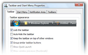 3. Taskbar properties – Taskbar
Problem: Taskbar preview image appears distorted.
Suggestions: Better preview image, use live view of actual taskbar.
Impact: Low
Severity: Low
Fixed: No
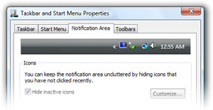 4. Taskbar properties – Notifications Area
Problem: Taskbar preview image has incorrect “Sidebar” icon.
Suggestions: Update preview image.
Impact: Low
Severity: Low
Fixed: Tab removed in Windows 7
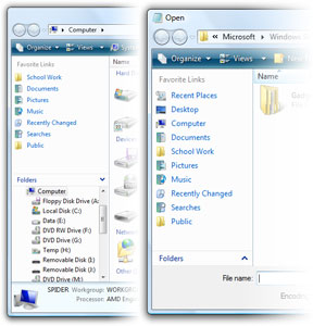 5. Favorite Links inconsistent
Submitted by dhan
Problem: The order of Favorites links changes between Explorer and File operations dialgos. e.g. Notepad File>Open
Suggestions: The order should be maintained as set by user
Impact: Medium
Severity: Medium
Fixed: Apparently fixed
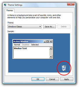 6. Theme Settings with wrong icon
Submitted by reactionary007
Problem: Choosing “Windows Classic” in Theme settings shows a legacy Recycle Bin icon – facing wrong direction.
Suggestions: Update preview image.
Impact: Low
Severity: Low
Fixed: New method of changing themes
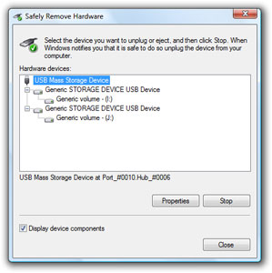 7. Safely Remove Hardware
Submitted by Nicholas Piasecki
Problem: Overly complex, hostile dialog is painful when your computer comes with one of those 6-in-1 card readers (as does mine), an external hard drive, and a USB thumb drive. Unchecking “display device components” leaves unhelpful, undistinguishable entries. Takes up to 3 clicks to eject a device, so most people just pull out their USB drive when das blinkenlights are off.
Suggestions: Show mounted thumb drives on my desktop, and allow me to right-click > eject them or drag them to the Recycle Bin.
Impact: Medium
Severity: Low
Fixed: No
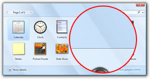 8. Aero Glass jaggy
Submitted by reactionary007
Problem: The right most reflection in Aero Glass is jaggy
Suggestions: Update reflection bitmap
Impact: Low
Severity: Low
Fixed: No
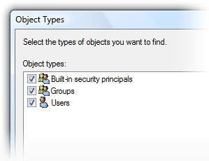 9. Object Types icon
Submitted by dhan
Problem: Icons not properly sized in Objects Types dialog (security > Advanced > Owner > Edit > Other Users and Groups > Object Types. You see black and distorted outline around all User icons.
Suggestions: Update icons.
Impact: Low
Severity: Low
Fixed: No
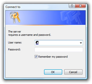 10. Username/Password dialog
Submitted by Jason Cox
Problem: Dialog is using a Windows XP style
Suggestions: Update the dialog
Impact: Low
Severity: Low
Fixed: No
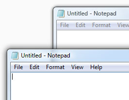 11. Active/Inactive window borders
Submitted by Michael Ciarlo
Problem: The active Window and Inactive Window on Windows Vista’s top-left AERO corners do not have the same roundness.
Suggestions: Correct roundness
Impact: Low
Severity: Low
Fixed: No
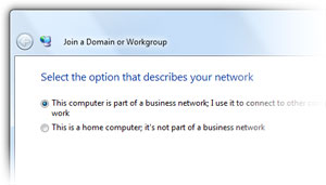 12. Join Domain or Workgroup icon
Problem: Dialog has Windows XP-style icon
Suggestions: Update icon
Impact: Low
Severity: Low
Fixed: No
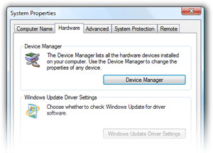 13. System Properties
Submitted by Michael Mc
Problem: Device Manager has Windows XP-style icon
Suggestions: Update icon
Impact: Low
Severity: Low
Fixed: No
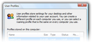 14. User Profiles
Submitted by Michael Mc
Problem: User Profiles has Windows XP-style icon
Suggestions: Update icon
Impact: Low
Severity: Low
Fixed: No
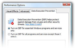 15. Performance Options
Submitted by Michael Mc
Problem: Data Execution Prevention has Windows XP-style icon
Suggestions: Update icon
Impact: Low
Severity: Low
Fixed: No
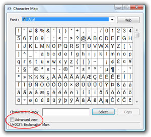 16. Character Map
Submitted by GBytes
Problem: “Advance View” on top of it’s own Status bar. Scrollbar missing style.
Suggestions: Update style
Impact: Low
Severity: Low
Fixed: No
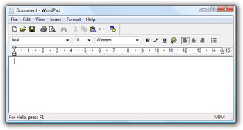 17. Wordpad
Submitted by GBytes
Problem: Windows 95 style?
Suggestions: Update style
Impact: Low
Severity: Low
Fixed: No
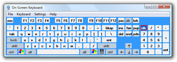 18. On-Screen Keyboard
Submitted by GBytes
Problem: Oh-Screen Keyboard needs some design update. Some text are not properly aligned (see “esc” key, and F9,F10, F11, F12). Windows XP icon.
Suggestions: Update style, icon.
Impact: Medium
Severity: Low
Fixed: No
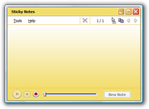 19. Sticky Notes
Submitted by GBytes
Problem: Windows XP style colors and window control buttons.
Suggestions: Update style.
Impact: Low
Severity: Low
Fixed: No
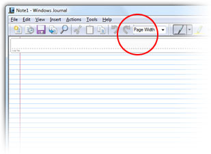 20. Windows Journal
Submitted by GBytes
Problem: Windows Journal, has the “Page Width” drop down, miss aligned on the tool bar, it goes over a separator.
Suggestions: Correct control placement.
Impact: Low
Severity: Low
Fixed: No
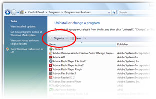 21. Program and Features
Submitted by GBytes
Problem: Remove “Organize” button in “Program and Features” panel found in Control panel, their is no options in the menu, it’s useless.
Suggestions: Remove button
Impact: Low
Severity: Low
Fixed: No
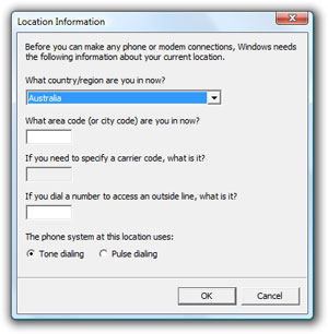 22. Phone and Modem options
Submitted by GBytes
Problem: In the Control Panel, the “Phone and Modem Option” Panel, is simply Windows 2000 look, it doesn’t even have Vista buttons.
Suggestions: Update style
Impact: Low
Severity: Low
Fixed: No
 23. Taskbar on left
Submitted by GBytes
Problem: When you move the Task Bar on the Left side of the screen, the Task Bar background should be flip (to have the black to “white” gradient facing the other way)
Suggestions: Gradient gloss should be on right.
Impact: Low
Severity: Low
Fixed: No
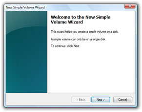 24. New Disk Volume wizard
Submitted by Michael Mc
Problem: New volume wizard is not a Windows Aero wizard, though it does have a more Vista-like image at the left.
Suggestions: Implement an Aero wizard.
Impact: Low
Severity: Low
Fixed: No
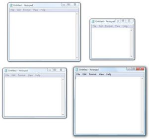 25. Active window
Submitted by Don
Problem: Using Windows Aero color scheme, the visual cues that indicate which window is active are too subtle.
Suggestions: Allow users to set properties of window items (e.g. Active Title Bar, Inactive Title Bar) when using Windows Aero color scheme.
Impact: Medium
Severity: Low
Fixed: No
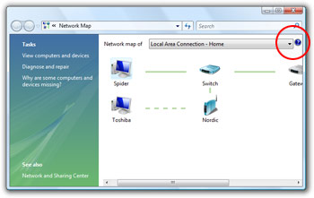 26. Network Map
Submitted by Anon
Problem: There is a different Help icon in the Network Map from what is in every other window.
Suggestions: Correct icon.
Impact: Low
Severity: Low
Fixed: No
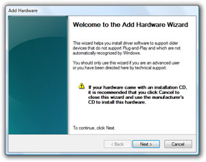 27. Add New Hardware
Submitted by Anon
Problem: Add Hardware still use the old style.
Suggestions: Use Aero wizard style.
Impact: Low
Severity: Low
Fixed: No
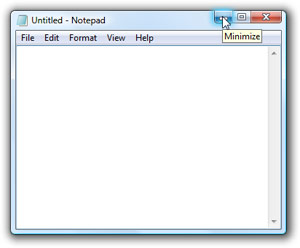 28. Window Control tooltips
Submitted by Anon
Problem: The tooltips for the min/max/close buttons are different from all the others.
Suggestions: Use Aero style tooltips.
Impact: Low
Severity: Low
Fixed: No
Submitted by wojtekmaj
Problem: Dragged Desktop icons has aliased text labels.
Suggestions: Anti-alias text labels.
Impact: Low
Severity: Low
Fixed: No
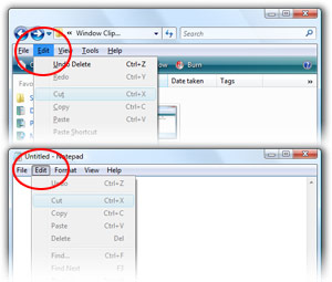 30. Menu Bar
Submitted by Antonio
Problem: The menus – shown by alt button – are highlighted in blue and don’t use the correct theme, which is grey and has rounded borders.
Suggestions: Consistent highlight style.
Impact: Low
Severity: Low
Fixed: No
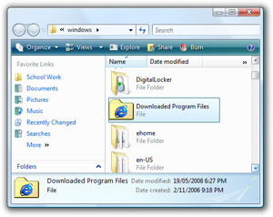 31. Downloaded Program Files
Submitted by Mike Steel
Problem: Windows 95-style icons.
Suggestions: Update icon.
Impact: Low
Severity: Low
Fixed: No
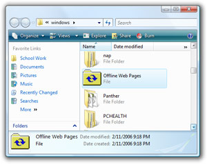 32. Offline Web Pages
Submitted by Mike Steel
Problem: Windows 95-style icons.
Suggestions: Update icon.
Impact: Low
Severity: Low
Fixed: No
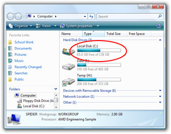 33. Computer
Submitted by Mike Steel
Problem: Should show percentage of free space on storage devices; for example “Windows Vista (c:) – 30,0 GB free of 60,0 GB (50%)”.
Suggestions: Add percentage to details.
Impact: Medium
Severity: Low
Fixed: No
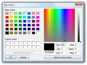 34. Edit Colors
Submitted by Nikolaus
Problem: From Windows 95.
Suggestions: Should be updated visually and also add support for HSL/HSV/etc color selections.
Impact: Medium
Severity: Low
Fixed: No
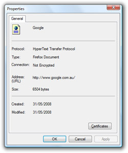 35. Internet Explorer page properties
Submitted by Matt Sharpe
Problem: Icon in ‘Properties’ dialog of web page in Internet Explorer (File Menu -> Properties) is prehistoric.
Suggestions: Update icon. Background should also be white.
Impact: Low
Severity: Low
Fixed: No
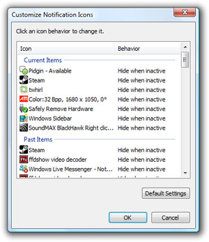 36. Customize Notification Icons
Submitted by Joey
Problem: List becomes overpopulated with legacy icons.
Suggestions: Needs a “Clear” button to empty out the older entries or the whole list all together
Impact: Medium
Severity: Low
Fixed: No
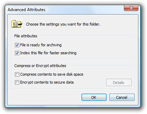 37. Advanced File Attributes
Submitted by Brian Shapiro
Problem: Advanced Attributes in the Properties dialog for files still has a Windows 98-era icon.
Suggestions: The best way to deal with this is by revamping the entire UI by which file properties are displayed–hopefully learning from media management programs; but otherwise, the icon just needs to be updated.
Impact: Low
Severity: Low
Fixed: No
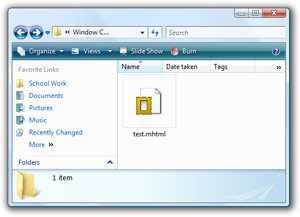 38. MHTML files
Submitted by Brian Shapiro
Problem: The icon for MHTML files does not exist in Vista icon format; and the largest size is 32×32.
Suggestions: Update icon sizes.
Impact: Low
Severity: Low
Fixed: No
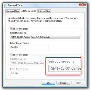 39. Grayed out text labels
Submitted by Brian Shapiro
Problem: Grayed out text labels are not anti-aliased.
Suggestions: Anti-alias grayed out text labels.
Impact: Low
Severity: Low
Fixed: No
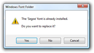 40. Add Fonts
Submitted by Brian Shapiro
Problem: Installing 100’s of fonts which happen to have duplicate versions of Windows fonts – forces you to hit “Yes” over and over again.
Suggestions: Add “Yes to all” and “No to all” buttons
Impact: High
Severity: Low
Fixed: No
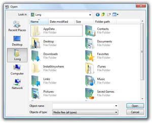 41. Legacy Open dialogs
Problem: Some applications use legacy “Open file” dialogs.
Suggestions: Force all applications to use Aero style dialogs.
Impact: High
Severity: Medium
Fixed: No
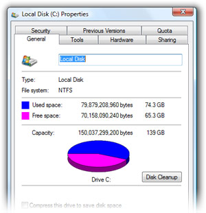 42. Disk Properties
Submitted by ScottSo
Problem: When you view the properties of any kind of storage drive, it shows remaining storage in a pie chart that looks like it was created in Excel 2000. The colors are ugly as sin and the pie chart isn’t used anywhere else in Vista.
Suggestions: Update pie chart colors/style or use variation of bar graph in Computer view.
Impact: Medium
Severity: Low
Fixed: No
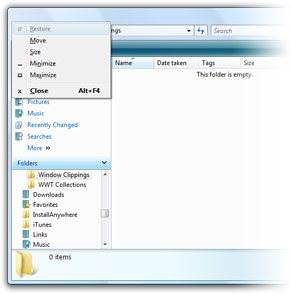 43. Folders List
Submitted by Ed
Problem: When focus is in the Folders pane of Windows Explorer, pressing alt+spacebar to bring up the control menu flashes the control menu instead, making it inaccessible.
Suggestions: Correct behavior.
Impact: Medium
Severity: Low
Fixed: No
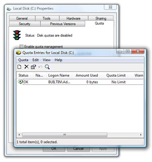 44. Disk Quota
Problem: Disk Quota tab has legacy and weird icon. Quota management console has Windows 95-styles and icons.
Suggestions: Update icon with more appropriate design. Update Quota console style.
Impact: Low
Severity: Low
Fixed: No
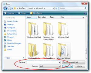 45. Common file dialogs
Submitted by Sven Groot
Problem: Inconsistent font in open/save file dialogs – common file dialogs. Bottom panel of open/save dialogs uses legacy fonts (MS San Serif) whilst top uses Segoe UI.
Suggestions: Correct behavior.
Impact: Medium
Severity: High
Fixed: No
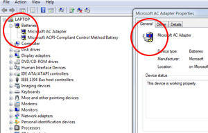 46. Device Manager Batteries
Submitted by atte
Problem: Battery icons in Device Manager are outdated
Suggestions: Update icons.
Impact: Low
Severity: Low
Fixed: No
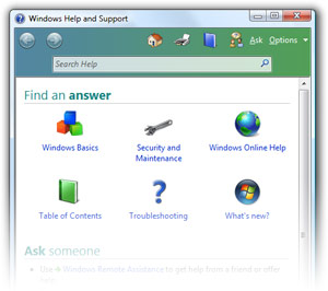 47. Help and Support
Submitted by Michael
Problem: Not consistent with the Windows Vista AERO UI.
Suggestions: Follow Aero design guide.
Impact: Medium
Severity: Medium
Fixed: No
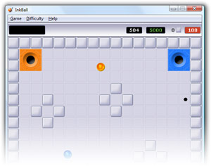 48. Inkball
Problem: Legacy style – uses Luna styled toolbars and ‘blocks’.
Suggestions: Update to Aero Glass look and feel.
Impact: Low
Severity: Low
Fixed: No
Post your finds in the same format as above in the comments below. I will add them to the list once I screencap them and verify them, or you can also provide a screenshot yourself. Your turn.
Problem: The order of Favorites links changes between Explorer and File operations dialgos. e.g. Notepad File>Open
Suggestions: The order should be maintained as set by user
Impact: Medium (useability)
Severity: Medium
Fixed: No
———————–
Problem: Favorites links are mixed with places bar in File operations dialogs
Suggestions: Get rid of the places bar and replace it with Favorite links
Impact: Medium (useability)
Severity: Medium
Fixed: No
————————
Problem: Replace legacy file operations dialogs (old XP/2k style)
Suggestions: The file operations dialogs should be consistent
Impact: Low
Severity: Low
Fixed: No
Haven’t verified this in a while – may have been fixed in SP1 – but I believe the themes dialog has a recycle bin icon from the beta phase rather than the final icon used (in the example screenshot). It might be when you select Windows Classic – can’t remember. I’m on XP right now so can’t look.
Also, when I turn on Aero Glass on my laptop – the streaks through the glass – one of the streaks is all Jaggy – it is one closer to the right side of the screen.
those are the 2 issues i’ve seen.
Safely Remove Hardware
http://piasecki.name/remove-hardware.jpg
Problems: Overly complex, hostile dialog is painful when your computer comes with one of those 6-in-1 card readers (as does mine), an external hard drive, and a USB thumb drive. Unchecking “display device components” leaves unhelpful, undistinguishable entries. Takes up to 3 clicks to eject a device, so most people just pull out their USB drive when das blinkenlights are off.
Suggestions: Show mounted thumb drives on my desktop, and allow me to right-click > eject them or drag them to the Recycle Bin. That’s Mac-like, but it’s better than this dialog.
Impact: High
Severity: Low
Fixed: Not that I know of
Problem: Icons not properly sized in Objects Types dialog (security > Advanced > Owner > Edit > Other Users and Groups > Object Types. You see black and distorted outline around all User icons.
Suggestions: The folder icon should immediately update upon any file operations
Impact: Medium
Severity: Medium
Fixed: No
Screencap: http://cid-e6cda34c9644beff.skydrive.live.com/self.aspx/Public/badIcons.JPG
@reactionary007
Yes the recycle bin icon is not the new one, only when you click on the !Windows Classic” theme however. “Modified and “Windows Vista” show the Vista SP1 recycle bin icon.
Posted by dhan:
Problem: Replace legacy file operations dialogs (old XP/2k style)
Suggestions: The file operations dialogs should be consistent
Impact: Low
Severity: Low
Fixed: No
I think this should be changed to at least a medium inpact level on usability. There’s just too many versions out there.
@dhan:
I’m stealing your format 🙂
1. Username and Password dialog
Problem: Dialog is using a Windows XP style
Suggestions: Update the dialog so that it is consistent with Windows Vista/Seven
Impact: Low
Severity: Low
Fixed: No
————————
2. Context menus
Problem: Sometimes right-click context menus switch between different themes
Suggestions: Make all OS context menus use the OS theme.
Impact: Low
Severity: Low
Fixed: No
The active Window and Inactive Window on Windows Vista’s top-left AERO corners do not have the same roundness.
Problem: With Windows Explorer, create a folder named ‘A’ (for example) and inside it create another folder named ‘B’. Put some files inside ‘B’. Now LEFT-click on the ‘B’ folder on the folder tree on the left of Explorer. Now RIGHT-click on the ‘A’ folder and select ‘Delete’. You’ll get a ‘Destination folder access denied’ and it becomes impossible to delete ‘A’ when ‘B’ (or any subfolder) is selected. You’ll need to select ‘A’ in order to delete it.
Suggestions: Revert to the XP behaviour when ‘A’ could be deleted without selecting it first.
Impact: Low
Severity: Low
Fixed: No
Screencap: http://cid-60987b6b27405345.skydrive.live.com/self.aspx/Images/Explorer%20bug.jpg
Here we go then…
Problem:
Advanced system settings features numerous outdated icons. E.g. Hardware tab > Device manager, Advanced tab > Performance options > DEP, Advanced tab > User profiles settings, Remote tab.
Suggestions:
Scrap the need for the advanced system settings by integrating the settings elsewhere, where they belong.
Impact: Low
Severity: Low
Fixed: No
@Nicholas Piasecki
There is a simplier way to remove hardware.
Instead of rightclicking on the icon, left click once on it and you will get a option to turn off the device that you want to turn off.
/Markus
Problem: Organize->Layout->Navigation Pane. No shortcut for this. Single most annoying thing that bugs me.
Problem: Everytime I connect a flash drive (USB, card reader) Windows Media Player asks if I wish to set it up as a sync device. No way to turn that off.
To Markus Larsson: Yes, but you still only get the drive letter. If you have several external drives, you don’t know which one you’re are disconnecting. In my opinion, the drive label should be presented in addition to the drive letter, so you know which device you’re disconnecting without going to ‘Computer’ to check which one is.
Don’t forget the Vista Volume Mixer problem, with SetPoint.
Also, Lack of easy access to the recording level bar in the Volume Mixer, it is very annoying to open the sound panel and change recording input and volume.
CharMap has “Advance View” on top of it’s own Status bar.
Windows DVD Maker is unable to generate a video 16:9 (only the menu). If you put a widescreen video it is shrink the side for a 4:9 display (so everything is thin and extra tall) even thus you specified 16:9 in the options.
Windows Calendar, Search bar not on title bar like Windows Vista Shell and IE.
Windows Contact, shows extension “.contact” at each file if you set Vista to show all extension files. I know it is supposed to do that. But not in that folder in my opinion. Specially that you KNOW that these are contacts.
Bug: Windows does not save folder view settings properly.
Bug: When you press Ctrl and double click on a folder, to open it on a separate window, the “Folder” section on the left column of a the folder pop-up, even thus you hide it.
Annoying: Windows Update does not show progress bar, however when you minimize it while it is downlaoding and installing update it goes to the tray (which is fine) however it shows the a percentage, it would be nice to have that info in Windows Update panel.
Windows Photo Gallery must be able to edit Jpeg, png’s, gif and bmp pictures, not just jpeg (and I think bmp’s).
Windows Movie Maker shows Windows Photo Gallery design, however they use a menu bar (design inconsistency).
WordPad, has Windows 2000 look. It should have Office 2007 look.
Oh-Screen Keyboard needs some design update. Some text are not properly aligned (see “esc” key, and F9,F10, F11, F12).
Skicky Notes, has XP close, minimize, maximize button, and it REALLY does not match Vista Aero design.
Windows Journal, has the “Page Width” drop down, miss aligned on the tool bar, it goes over a separator.
BUG: Windows Vista has difficulty getting the Live Preview (task bar preview and 3D Flip) from program design like Winamp.
Annoyance: Windows Media Player 11 is choppy (slow) when you scale the window of the program, it should be smooth.
Bug in Windows Media Player 11, if you position your mouse on the corner of the window to scale it, however you get it close (not touch it) of the button to make Windows Media Player 11 smaller (compact), you cannot scale scale, despite seeing the cursor to allow you to do such thing.
“Default programs” Panel, the Help button is used everywhere, they can place it next to the minimize/maximize/close buttons. Or AT LEAST make it not shift few pixels to the left/right/top/bottom between panels. Keep the same coordinates. Such thing just shows how the person that program this simply did not care and present a case of “je m’enfoutism” (in french meaning “I just don’t care!”)
In “Default programs” Panel \ Set Associations, a search bar will be very nice to have. And have a alphabetical groups.
In “Default programs” Panel \ Auto Play, the ability to set Windows Media Player to play DVD movies.
Remove “Organize” button in “Program and Features” panel found in Control panel, their is no options in the menu, it’s useless.
Add to “Program and Features” on the Detail panel the installation path of where the program was installed.
Fix the bug with “Digital Locker Assistance” in “Program and Features”, I don’t’ know about you, but I get a transparent window (floating border)
In the Control Panel, the “Phone and Modem Option” Panel, is simply Windows 2000 look, it doesn’t even have Vista buttons.
Remove: Extras.. it just makes people frustrating, by simply having too few of them, and most of them are junk.
Windows Explorer: Open Command Window Here
Problem: In Windows Explorer:
– Hold down the Shift key and right-click on a folder in the file list (right pane).
Open Command Window Here appears in the popup menu.
– Hold down the Shift key and right-click on a folder in the folder tree (left pane).
Open Command Window Here DOES NOT appear in the popup menu.
Suggestion: Add Open Command Window Here to the context menu for folders in the folder tree.
Implact: Low
Severity: Low
Fixed: No
Add: When you move the Task Bar on the Left side of the screen, the Task Bar background should be flip (to have the black to “white” gradient facing the other way)
Um, I just posted this one but it doesn’t seem to have shown up. (Remove if the other one does surface.) :s
Problem:
New volume wizard is not a Windows aero standard wizard, though it does have a more Vista-like image at the left.
Suggestions:
Implement an aero standard wizard.
Impact: Low
Severity: Low
Fixed: No
Screenshot: http://cid-5419cc60b796f6a4.skydrive.live.com/self.aspx/Public/non-aero.png
Problem: Display Properties, Screen Saver, Theme, and other misc. windows are exactly the same as they were in XP. They open in windows with a tab at the top, there is only one tab in this window.
Suggestions: Either remove the tabs, or more preferably, put all of these settings back into one window with multiple tabs, which makes everything much easier to do.
Btw, is this list just for UI flaws or is it for general problems too?
To OneFingerSnap
I agree, we need more information.
But many computer users don’t know about the left click, they use the cumbersame right click.
In “Computer”, remove “Map Network Drive” on the green Shell bar, I don’t have fun with it everyday, I think it could be removed, OR have the ability to edit that bar.
To Markus Larsson,
I’ll post the drive label issue as a separate problem, when I have the time.
Thanks for your comment
Previous Versions – XPero has areally created properly Vista-like icon, so thats half solved: http://img114.imageshack.us/img114/712/prevverwu4.jpg
Too hard to see which window is active.
Problem: Using Windows Aero color scheme, the visual cues that indicate which window is
active are too subtle.
Suggestion: Allow users to set properties of window items (e.g. Active Title Bar, Inactive
Title Bar) when using Windows Aero color scheme.
Impact: Medium
Severity: Medium
Fixed: No
Regardings your thoughts on fonts, allow installation/removal/activation/deactivation of fonts by a non admin
There is a different Help icon in the Network Map from what is in every other window.
The search box in Windows Mail is on the menu bar.
There is no search box in Wordpad etc.
Some wizards like Add Hardware still use the old style.
There are about a million different “Show Details” icons.
The UAC windows uses the Windows Vista Basic UI.
Windows like Screen Saver, Sound, Theme, Display Settings etc still use the old UI and should be completely integrated into Explorer.
The tooltips for the min/max/close buttons are different from all the others.
The toolbar buttons on some windows fade in an out, like IE, and others don’t like WMP and Explorer.
Long:
I think you should sticky this post somehow (if you haven’t already). Also is it possible to create a feed for the comments?
There is a program named “Vize: Vista GUI enhancer” made by XPero. It replaces most of the non-Vista icons, animations and bitmaps that Microsoft is still overlooking.
http://www.winmatrix.com/forums/index.php?showtopic=14928
1. Go to any folder you like with >1 file
2. Cut first file from this folder
3a. Then sort files in this folder by something else than it is sorted now
3b. OR drag cut file in other place i the folder than it is now
4. Now transparent is other file, file on the same place where cut file was.
ps. Sorry for my english
1. Drag an icon on your desktop.
2. A “ghost” icon under your mouse has no-cleartype text.
1. Windows Explorer and Internet Explorer
Problem: The menus – shown by alt button – are highlited in blue and don’t use the correct theme, which is grey and has rounded borders.
Suggestions: Update the ui.
Impact: Low
Severity: Low
Fixed: No
2. Windows Explorer and Internet Explorer
Problem: Address bar behaviour.
Suggestions: The Address bar shows rounded border at its right when activating the list. It should be rectangular.
Impact: Low
Severity: Low
Fixed: No
3. Windows Movie Maker, Windows Media Player, Windows Calendar, Windows Dvd Maker
Problem: Toolbars need consistency of color and shape. Generate confusion.
Suggestions: Use the same black color, make the toolbars similar. These application need consistency. Some of them seem somewhat unfinished.
Impact: Medium
Severity: Low
Fixed: No
4. Paint, Wordpad
Problem: Old and ugly user interface.
Suggestions: Update toolbars. Design new user interface. Add functionality.
Impact: Medium
Severity: Low
Fixed: No
5. Contacts
Problem: Integration.
Suggestions: Contacts management should be integrated with Windows Live.
Impact: High.
Severity: Low
Fixed: No
6. Live Previews
Problem: Not working.
Suggestions: The preview system doesn’t work with Office 2007 when multiple documents are opened. It’ displays a grey image with an ugly icon at the middle surrounded by the glass theme.
Impact: Medium
Severity: Medium
Fixed: No
7. Internet Explorer
Problem: Download progress popup inconsistency.
Suggestions: This window should be similar to the move-files or delete-files- or copy-files windows with the green-blue bar animated on top.
Impact: Medium
Severity: Low
Fixed: No
8. Management console
Problem: Poor design.
Suggestions: The mini-application like computer management which use the Management Console show a poor desing. Should be and act like the Connection and Sharing Center. The actions pan is inconsistent.
Impact: Medium
Severity: Low
Fixed: No
9. Windows Explorer
Problem: Folder visualization and type.
Suggestions: Windows Explorer occasionally change or forget folder settings.
Impact: High
Severity: High
Fixed: No
the more details option on copy and move file operations should respect last state. I always want to see more details, and don’t want to have to click the down arrow on every dialog.
Taskbar previews should scale in some ration to deskop size. on dual 24 inch monitors, the previews are far too small to be of any use.
Nice found with that sidebar icon, didn’t notice myself.
Well, I think the most important fix should be the folder view settings. It should be possible, AND made easy to say that I want this layout for this directory, and this layout for another. And this for new layouts.
Right now, most of my directories open as a picture folder, what is not that big of problem, but they somehow removed the column of last edited. But because they added like three columns, I first need to remove some first, to be able to click on that last edited column.
And not for forget, the focus problems you see in many scenarios. Like since SP1, when I remove a file, the remove dialog appears at the bottom. (so you don’t see it).
I also think that the glass ui we have now, shouldn’t be changed. I really like it in general use, and people start to get used with it. Another huge change in layout would be dramastic.
This is not really part of your request, but if you can, please push MSFT to redo the entire look, feel and functionality of the Network Control Panel. For example, the whole concept of network profiles that are prevalent in OSX really needs to make an appearance in Windows. It’s so hard to find the MAC address of a wireless card in Vista through the UI. There’s no way to have proxies associated with a profile either since it’s bundled as part of the browser. OSX really nailed the network configuration and setup, so if MSFT needs a hint, steal this page from AAPL.
The following folders have old Win95 style icons:
c:\windows\Downloaded Program Files
c:\Windows\Off Line Web Pages
Windows Explorer: Details View – use “Auto fit” for column width (as in Excel), or make it an option for all folders.
In Windows Explorer – Computer view – show percentage of free space on storage devices; for example “Windows Vista (c:) – 30,0 GB free of 60,0 GB (50%)”
When locking computer, return the view to the “main” Welcome screen, with transparent a lock icon (or something) over user’s personal icon. Now when several people are using the same machine one must always first choose “Switch user”. Why?
By default all services not needed should be disabled. I have no printer – why is Print Spooler running? Why is Telephony running? I donät have a modem.
I don’t want to lose any performance or memory by having useless crap running because in some test group some old lady thought it might be a good idea. Please bring back the power to power users – don’t design the product by committees, and don’t design Windows as all users are first time users who need to be treated like idiots.
You have an amazing pillar – WPF. Why isn’t it used anywhere? And no, the few games in Vista don’t count. Use it, and make Windows beautiful and smooth (using animations etc).
hate to break it to you, but eyecandy sells. Remember WIn95? It really wasn’t that much more advanced than Win3.1, but compared to it 95 was beautiful. See OSX? The OS really isn’t anything special, but it is beautiful because of all the animations etc. SO USE WPF!!!
I finally – please bring back an proper installer where you can actually choose what to install (only “ofrced” option should be “Windows Core files”), I want to able to choose f I want Paint, Wordpad, screensavers etc.
“Choose Color” Dialog
Ancient Win95 Dialog – should be updated visually and also add support for HSL/HSV/etc color selections.
Impact: Medium
Severity: Low
Fixed: No
@OneFingerSnap and @Markus Larsson
Hum, I never realized the left-click option existed–in who knows how many years of using Windows. (Actually, I never left-click on system tray icons.)
I know I can go into My Computer, right-click the drive, and hit Eject, but for some reason I always forget that that option is there. Mostly because I don’t think of ejecting a thumb drive or external drive like ejecting a floppy or a CD … the latter involves something physically ejecting/launching out of the computer; for USB devices, a more accurate word or analogy should be used.
And despite all that, I still think the dialog that comes up on a right-click is horrendous. =) Add the drive letters, add the device names, and get rid of all the worthless tree-level stuff; it’s a programmer’s view, not a user’s view.
Make sense?
You can probably fix some of these icons problems yourself, by replacing a few files in C:\WINDOWS. Someone should write a batch script and bundle it with some updated icons – then many of the problems could easily be fixed without relying on a company that has proven unreliable in the past in listening to its customers. Microsoft had all these years to work on Vista, and they didn’t even bother to go through and look at the UI for inconsistencies. And if they did, there’s absolutely no reason something this trivial shouldn’t have been fixed.
Safari for Windows.
What can I say? Crap?
Impact: High
Severity: High
Fixed no.
Control Panel
Problem: Seemingly random mix of new, Vista style, were the options are included in the original window (like personalization, default programs) and old XP style popup windows (Folder Options, Tablet PC Settings) Solution: Standardise all options to the newer Vista style
Impact: Medium
Severity: Medium
Fixed: No
Nicholas Piasecki, OneFingerSnap and Markus Larsson, you can select device in Computer and then press eject from toolbar; dont know that works with cameras.
Windows Photo Gallery:
Problem: Despite sharing a similar design to WMP 11, though the WMP 11 bottom glass section can be “grabbed”, allowing the user can click and hold that area to move the whole window, the same section in Windows Photo Gallery is not. It’s a design inconsistency. If the window designs are similar, at least make them function similarly.
Suggestion: Make that bottom glass section capable of being used to move the window, just like in WMP 11.
Impact: Low
Severity: Low
Fixed: No
Problem: Cant detach Quick Launch from Taskbar
Solution: Restore the ability to drag Quick Launch out of the taskbar and place it at a seperate location
Impact: Low
Severity: Low
Fixed: No
1. For “Safely Remove Hardware”, show a balloon notification in all cases (when removing device from anywhere, Explorer, taskbar etc).
2. Stop showing a tab when there is a single tab in a dialog box. e.g. http://novice2expert.com/images/windows-vista/31671/21783.jpg.
For more hits and misses Long, you can see the Shell Revealed forums by Microsoft. There are a huge number of posts on half-finished things and last-minute UI glitches.
Forgot to add: New common dialogs for choose color and choose/format font.
To customize my Windows User experience i use the software listed below.
Desktop Media: get automatic desktop shortcuts when you plug in your USB drive or other media
http://www.freewaregenius.com/2008/05/27/desktop-media-get-automatic-desktop-shortcuts-when-you-plug-in-your-usb-drive-or-other-media/
Taskbar Shuffle: re-order taskbar button and tray icon.
http://www.freewebs.com/nerdcave/taskbarshuffle.htm
Apologies if this has already been posted already but you cant publish a screen shot if it but it is extremely annoying.
Problem: Windows Vista ignores the selected view mode for a window and the size of the windows in explorer. At times Vista will auto change the icon view mode and go back to the default window size, this is extremely annoying in general and for users with high resolution displays.
Solution: Simple stop Vista from trying to guess what is the best view mode to use and add a control panel icon for standard explorer window behaviour so a user can set the global icon view mode and desired window size that can be used. A return to defaults option can also be displayed on said screen.
Impact: High
Severity: Low
Fixed: No
1. Bring back full file types functionality.
2. Bring back Explorer buttons and customizability (what is this if not a major UI issue?)
3. Make the status bar in Explorer always show disk space like it did in XP.
4. Do whatever it takes to support full-screen command prompt.
5. Provide an option to group or show network icons separately.
6. Provide an option for full-row selection in Windows Explorer.
7. Provide an option for autosort/autoarrange/autorefresh in Windows Explorer.
8. Provide an option in power options to ask the user every time what action to take when pressing the hardware power button.
9. Add Shutdown menu back to Task manager.
10. Bring back Context-sensitive help in Compiled Help (CHM) format.
The menu if enabled in Windows Media Player looks absolutely horrible.
Forgot to add that with Windows Vista and the view mode it will still try to change the view icon mode even if you have “remember each folders view settings” enabled and their are complicated registry hacks out there to try and stop it from doing it so please, please get this one fixed as it looks so sloppy.
http://www.vistax64.com/tutorials/70819-windows-explorer-folder-view-settings.html
Problem: Icon in ‘Properties’ dialog of web page in Internet Explorer (File Menu -> Properties) is prehistoric.
Suggestions: Get a new icon in there.
Impact: Low.
Severity: Low.
Fixed: No.
How about a true “Classic” desktop like Win2K/98/95. Not the psudo classic mess in Vista.
How about a way to disable the stupid jumping files/and folders in Windows Explorer. Can’t we have a simple true “Classic” style like Win2K/98/95?
How about every window/drop down/ and property menu all layed out the same, no matter what utility/app/program (MS programs anyway) you have open.
How about a “Search for Computers” that’s easy to find and use?
Talking about in Internet Explorer (File Menu -> Properties), the background of the tab should be white, not gray.
Also remove that only tab.
Problem: Taskbar Notification, icons area under customize dialog box
Suggestions: Needs a clear button to empty out the older enteries or the whole list all together
Impact: Low
Severity: Low
Fixed: no
Problem: Window Shadows. The are too bold and ugly. They need to be less. Open a window while on the desktop and then click anywhere on the desktop. The shadow will become less. That’s the kind of shadow I’m looking for.
Impact: Low
Severity: Low
Fixed: No
Dialog box is not big enough to display text. Some text gets truncated.
Problem: I hate this!
Suggestion: All dialog boxes should be resizable. All!
Impact: Medium
Severity: Medium
Fixed: No
Problem: Because Windows Explorer and Internet Explorer were once integrated, the drop down list in Windows Explorer lists website addresses you’ve entered in IE and the drop down list in Internet Explorer lists disk paths you’ve entered in Windows Explorer. This is doubly inconsistent now that you access the drop down list from a breadcrumb explorer. The breadcrumb interface has no relationship to website addresses.
Suggestions: Only paths entered in Windows Explorer should show in Windows Explorer; and only paths entered in Internet Explorer should show in Internet Explorer. Perhaps, if the user enters website addresses in Windows Explorer, they should show up, and disk paths in Internet Explorer, they should show up; since you should probably still be able to launch either from either application, as you can from the Run command. This way, we’re not taking a functional feature out of Windows if the person uses it that way. In the end, what matters is the drop down boxes are application specific.
Impact: Low
Severity: Low
Fixed: No
————————
Problem: Advanced Attributes in the Properties dialog for files still has a Windows 98-era icon.
Suggestions: The best way to deal with this is by revamping the entire UI by which file properties are displayed–hopefully learning from media management programs; but otherwise, the icon just needs to be updated.
Impact: Low
Severity: Low
Fixed: No
————————
Problem: The icon for MHTML files does not exist in Vista icon format; and the largest size is 32×32.
Suggestions: Update the icon.
Impact: Low
Severity: Medium (looks bad)
Fixed: No
————————
Problem: Address toolbar for the taskbar is malformed; the ‘go’ arrow is not centered in a square, since the address box does not retain the same size as it does in explorer
Suggestions: Either make the address text box taller to squeeze into the available space, or adjust the ‘go’ button so its properly aligned.
Impact: Low
Severity: Medium (looks bad)
Fixed: No
————————
Problem: There are a few problems with how Saved Searches are managed when set as the source for a toolbar on the taskbar; this has to do with the quirks in how Saved Searches are updated in Explorer. When they’re expanded they don’t automatically update to include new contents. But if they’re collapsed, and you click on the extender, you see the updated list. This means that clicking the extender acts as an updater. The toolbar is always and only updated when you click on the extender. This also means that if you start the toolbar with an empty search, there is no extender, and it can thus never be updated. Folders on the other hand automatically update. The difference is how Explorer manages Saved Search updates. If you create a new file that would be included in the search it doesn’t instantly appear in the Saved Search explorer window. You have to click on the folder in the folder tree in order to update it.
Suggestion: I guess it depends completely on the fact that the toolbar inherits behavior from Explorer. One thing they could think about is changing the behavior in Explorer. The best and simplest solution is to offer an ability to Refresh a folder toolbar through the right click context menu. This inherits the Refresh command from Explorer.
Impact: Low
Severity: Medium
Fixed: No
Problem: In old Control Panel pages, grayed out text in controls like text boxes and combo-boxes are anti-aliased, but grayed out text in labels aren’t. For reference, look at the ‘Additional Clocks’ page in the Date and Time control panel.
Suggestions: Hopefully move all of these control panels to the new style. Otherwise find a way to make the grayed out look more consistent
Impact: Low
Severity: Low
Fixed: No
Problem: error moving/deleting files from time to time and Vista stating files cant be moved/deleted because they are being used by another application, but it doesnt tell you which app is using the files…and just continues giving an error.
Impact: medium
Severity: medium
Fixed: No
the only way i can think of fixing is rebooting…and then i can move or delete my files…
peas
cityboy
The preview pane is so narrow, you can hardly see a real preview when it comes to PowerPoint presentations. Maybe they should enlarge it a bit without cluttering explorer, or add controls such as zooming in and out when the preview pane is resized and narrow.
__________
I don’t know if this is really a problem but the recent items only shows a number of items. I know it was designed to display the most recent ones but they should also add an potion like “show more recent items”, or simply, instead of showing the recent items in a cascading rectangular thingy, they should integrate it with the start menu like where the programs are displayed. In that way, you can quickly browse for recent items and even search for a specific item you recently downloaded, modified, saved, etc. Also they should not limit filetypes in the Recent Items menu. Include installers, pdf’s, etc.
__________
Add an option to add a search bar on the taskbar.
__________
I don’t know but Computer doesn’t display memory status of my flash drive. They should fix this and include different devices such as memory cards.
__________
Windows Movie Maker – add new features. What I can say with WMM in Vista is, only the looks is enhanced, not the functionality. Also, they should integrate an imported media organizer, it’s so hard to browse through the folders where your imported media has been all cluttered.
__________
Windows Photo Gallery – where are the picture slideshow themes such as the one with the pictures falling on the beach sand?
I think that’s all for now.
Problem: Taskbar toolbars don’t resize correctly when the toolbar is changed from being locked to unlocked. If add a folder as a toolbar, initially you’ll see it as collapsed. If you unlock the toolbar to resize it, and then try to shrink it to its smallest size, it will not stay at the smallest size when you lock the toolbar again; you’ll see a bit of a file icon poking out. Similarly, try this: have two folder toolbars, and have it so that in locked mode the one on the left is expanded a great deal. Unlock the taskbar, and close the toolbar on the left. When you lock the toolbar again, the toolbar on the right will expand to the size that the one on the left was at. It looks like there are two problems here: that the total length of all the toolbars is calculated, and that the dragbars are now wider, and are not calculated.
Suggestion: Fix the problem or else the toolbar system is completely broken and useless.
Impact: Medium
Severity: High
This has annoyed me for YEARS:
Problem: Lunch a 2nd app and quickly return to a window you’re working in. The new app loads then grabs the screen (back) even though you’ve re-selected the first app.
Suggestions: If you explicitly return to an app, new ones should launch and wait in the background. They should only take focus if you do nothing.
Impact: Medium
Severity: Medium
Fixed: No
Problem: Lack of drag-and-drop functionality on the breadcrumb bar; you should be able to drag from or drop to one of the breadcrumb dropdowns, or from the bar itself.
Suggestions: Add this functionality; it just gives the user more options.
Impact: Medium
Severity: Low
Fixed: No
__________
Problem: Installing 100’s of fonts which happen to have duplicate versions of Windows fonts – forces you to hit “Yes” over and over again. For a designer – this can sometimes take 15 minutes. It has been like this since Win 3.1 and earlier!
Suggestions: Add “Yes to all l No to all” buttons when Replace? comes up
Impact: Medium
Severity: Low
Fixed: No
Problem: No font information accessible to Windows Explorer in the Font folder
Suggestion: It would be ideal if we could have columns in the Font folder for things like “Font family” and “Font style”; these should also be accessible in the Font Properties window. This information is in the font file, and are accessed in programs like WordPad, so Explorer should be able to access them also.
Impact: Low
Severity: Low
Fixed: No
Problem: Explorer doesn’t remember the viewing settings on folders, chooses views seemingly at random in new folders and shows contents of a totally different folder for a split second when opening some folders.
Impact: Medium
Severity: Medium
Fixed: No
Problem:
I am 34, unemployed, over-weight and still live in my parents basement and eat breakfast, lunch and dinner with them at their table.
I have no friends of my own and am now ‘hanging-out’ with the friends and acquaintances of my parents. I have even joined their bowling league and have been accompanying them on cribbage nights.
I have a degree in comp sci, but I graduated college in 1998 and have never had a job since graduating. I have sent my resume out to hundreds of places over the last 2 years, but no one has even called me back once regarding a position.
I will work cheaply fixing all these windows bugs, please contact me asap. I am a really smart guy and can fix these problems easily due to my superior intellect.
How about allowing us to edit what appears in the Open and Save file dialogs on the left.
Prevent ANY window from stealing the focus of the current application.
I don’t care if it’s a dialog, a pop-up or whatever.
What I’m doing is more important than what Windows tries to “inform” me.
When you view the properties of any kind of storage drive, it shows remaining storage in a pie chart that looks like it was created in Excel 2000. The colors are ugly as sin and the pie chart isn’t used anywhere else in Vista. A variation of the bars under the drive icons in the Computer folder view would be much better.
To Leonardo: Amen Brother!
Kudos to Long for your continued efforts! Muy apreciado!
Windows Explorer
Problem: When focus is in the Folders pane of Windows Explorer, pressing alt+spacebar to bring up the control menu flashes the control menu instead, making it inaccessible.
Impact: Low
Severity: Low
Fixed: No
Windows Explorer determine that a folder is a Music folder or a Photo folder when only ONE of the dozens of files in the folder is a multimedia file and sometimes when none of the files is a multimedia file, changing then the folder template making difficult the files organization due to the bad columns selection by the template.
The same can be seen sometimes with Programs and Features in Control Panel, it lost its style or template and shows only the Name column.
Windows MUST have A more intelillent Folder template selection by Windows Explorer, it would be great an option to LOCK the folder look.
Concerning fonts, it’d be a /really/ useful feature if they had a Live Preview of each font in the listing, or a ‘folder feature’ where you can catergorise the fonts into different groups to make things a lot easier.
Long Zheng,
What we really need is a Wiki page for this.
I’d also like a Wiki page for adding or improving minor features; like for example above, me and someone else both had suggestions for improving font management; and I think Microsoft should adapt Office’s character map into Windows complete with assignable shortcut keys and combination shortcuts for accented characters. Microsoft is prone to neglect adding minor features like this that would make the OS better.
Oh, and perhaps having useful software included in Windows, such as the Powertoys, Office Viewers, and maybe a Windows Live version of Paint.NET as provided from Microsoft Downloads. Maybe some file-editing tools as well, such as a basic image-manipulation program (Paint? Good for spriting, not for fixing up images) or even a basic voice-recording tool (Like the one provided already, only with more features and a better UI)
“Shadow Copies” dialogbox is old style, can’t be resized. The drives in the list don’t really fit. A pain to see, a pain to use it.
Inconsistant font in open/save file dialogs – common file dialogs
Problem: the new Vista-style common file dialogs use the Segoe UI font for the address bar and file list (the entire top bar of the dialog) but the buttons and drop downs at the bottom use MS Sans Serif. That’s two different fonts in the same dialog. This is especially jarring for users of Japanese systems (and I expect other Asian languages that got an updated font in Vista have the same problem) as the top part uses the new Meiryo font while the bottom uses the old, bitmapped, non-anti-aliased MS UI Gothic font (these two fonts look incredibly different as you can see here: http://www.ookii.org/misc/fonts.jpg, sorry for the low quality screencap).
Impact: Low
Severity: Low
Fixed: No
Problem: Battery icons in Device Manager are outdated
Suggestions: Migrate icons to match new Vista / 7 style.
Impact: Low
Severity: Low
Fixed: No
Screen: http://img50.imageshack.us/img50/4382/batteriesbg2.png
the Calculator app keys should have a different animation when you click to an animation that’s more of a click than a fade. The current fade makes it seem slow.
Impact : Low
Severity : Low
Fixed: No
———————-
Explorer should show the size of folders as well as individual files, perhaps the search indexer could keep an “index” of the sizes of files in the folder and at least show the approxiamate total size of all items in the folder.
Impact: Medium
Severity: Medium
Fixed: No
vista still uses xp’s tahoma font (on some explorers and setings) even though the basic font in vista is Segoe UI.
—————————–
Battery meter doesn’t alarm when battery is low or critical. only shows a pop up.
—————————-
Windows’ Disk Defragmenter doens’t show what’s going on, only shows a circular mouse pointer. bring back xp’s style of defragmenting.
—————————-
When inserting flash drives, windows doesn’t show the memory status while they show it on hard drive partitions
—————————-
Preview Pane is space consuming.
—————————
When opening Documents, Music, Pictures, etc. and minimize them on the taskbar, the icons is only a yellow folder. (SOMETIMES THIS HAPPENS)
————————–
PHOTO GALLERY: When selecting a picture (1 click only).. there’s dotted lines appearing beside the blue hovered box.
————————-
When resizing border padding to 1 on theme properties, borders are quite choppy (dots are appearing.)
————————
There is still some icons that uses XP’s style.
————————
-That’s all for now
Problem:
Windows sidebar is not resizable. With high resolution it is barely usable.
Suggestions:
Either make the size totally adjustable or have 2-3 options for size (Width of the sidebar).
Impact: Medium
Severity: Low
Fixed: No
_________________________________________________________
Problem:
Changing the DPI above the 2 default sizes causes the sidebar gadgets to totally run off the screen.
Suggestions:
I think everything in the side bar should be vector based.
Impact: medium
Severity: Low
Fixed: No
_______________________________________________________
Problem:
UAC Prompts too much
Suggestions:
Two options
1) Allow the application to list all of its actions at once and you check mark them.
2) Allow a time limit when the UAC prompts. when a specific process is given full access say for 30 sec.
Impact: High
Severity: High
Fixed: No
____________________________________________________
Problem:
gadgets in the sidebar disappear unless you click on the side bar again.
Suggestions:
Seems to be a bug in how the sidebar renders the gadgets. I have seen this on 4-5 different systems.
Impact: Medium
Severity: Medium
Fixed: No
Problem:
Icons that haven’t been updated (Searching flashlight, Outlook toolbar icon (in Visual Basic), yellow exclamation mark (Control Panel > Bluetooth Devices > Options), batteries icon (in Device Manager), Phones & Modem Options icons, keyboard icon (Control Panel > Keyboard > Hardware), mail icons (Control Panel > Mail > Account Settings)
Suggestions:
Update them – especially that ANNOYINGLY OLD searching flashlight animation.
Impact: Medium
Severity: Low
Fixed: No
_________________________________________________________
Problem:
Sync Center and Windows Mobile Device Center
First, why are they separate? This is redundant and confusing.
Second, Windows Mobile Device Center is TERRIBLE and FAILS CONSISTENTLY. Several times I have plugged in my WM6 smartphone and the PC refuses to recognize that it is even connected. I have to go to network adapters, uninstall and reinstall Microsoft Windows Mobile Remote Adapter network adapter for it to function.
Third, syncing is generally slow.
Fourth, I have Vista and a WM6 smartphone and I can’t use Bluetooth DUN ***OR*** Bluetooth PAN to access the Internet via my phone’s data connection. I have to manually attach my phone to my PC w/ a USB cable. What the hell?! I could in XP w/ my WM2003 smartphone!
Impact: High
Severity: High
Fixed: No!
_______________________________________________________
Problem:
Volume mixer has many “Name Not Available” labels for volume controls.
Suggestions:
Either remove these unnecessary volume controls or label them.
Impact: Medium
Severity: Low
Fixed: No
____________________________________________________
Problem:
WPF
Suggestions:
Use it in Windows. Mac OSX and other graphical systems make Windows look outdated and, in general, crappier.
Impact: High
Severity: Low
Fixed: No
____________________________________________________
Problem:
The unnecessary transparent Aero frame around windows wastes pixels. Also, windows won’t stay in the position you placed them after closing them.
Suggestions:
I know the OS is called “Windows” but the approximately 15 or 20 pixels are wasted by this option and makes the “window” look bulky IMO. As for windows not staying in the last position they were placed in, have the option to automatically arrange windows or keep them in previously placed positions
Impact: Med
Severity: Low
Fix: No
Number 1 & 17 are what bother/annoy me the most.
Go to, Control Panel–>Hardware & Sound–>Device Manager – It has two options:
1) View hardware and devices
2) Update device drivers
Both open the same Device Manager. It would be nice if ‘Update device drivers’ check for updates for devices installed in the computer and give a popup whether update is required or not, else its just redundant behavior and confuses the user.
If you have Microsoft Outlook installed, go to – Control Panel->User Accounts and Family Safety->Mail
The dialog box does not hold Vista style, it still use the old style buttons.
The text on the View tab in Folder Options is only half shown. The buttons overlap the text.
For my previous entry of the Driver Updates – If you go System Properties–>Advanced System Settings, You get another window with few tabs. There is a Hardware tab which has Windows Update Driver Settings which can be shown for Control Panel–>Hardware & Sound–>Device Manager->Update device drivers
as noted above
Word pad: Should be updated with the office 2007 icons. Match the vista UI with glossy bars and aero glass.
Notepad: just ditch notepad and stick to word pad. word pads new UI and new features can enable or disable the toolbars
Paint: Paint is fine, I’m surprised they did a refresh of the icons in vista.they look real nice. I just hope they actually ad paint.net or some kind of new program in 7 such as a basic version of expression with option to upgrade to the more advance versons for a small price.
hard disc info: Right click your drive, chose propties the disc info shows an older 8 bit , 2D color scheme. this should be updated to a 3D, as well as a link to show more info in a 3D UI
Task manager: Never knew 98 had this (its deep with in your windows folder on 98), but this needs to be updated. Ditch the tabs and the “geeky” green dos UI, get some links and some 3D action. The option to send other users messages is often ignored and should just be removed.
Let’s stick with user interface quirks and not how Windows should work.
oh one more thing
hover your mouse over the close, minimize and maximize buttons, you get the XP era info cards
@.Chris: Look at numero 28 😛
@ long,
sorry, wasn’t there when I posted it, or if it was i missed it…..
and sorry I got a bit off topic…
The Windows Vista demos are of low resolution and of low quality. Make it high quality so that when viewed in full screen looks good.
@ Chakkaradeep
is that really necessery? They were made in the beta days, so they should have gotten then updated but who really sits there all day and watches them
Problem:
Windows Help and Support
Suggestions:
Not consistent with the Windows Vista AERO UI. Everything that can be wrong with the AERO UI is here at one place. (Back and Forward buttons, no use of the Windows Vista Explorer toolbar etc.)
Impact: Medium
Severity: Medium
Fixed: No
@Chris A new user will watch them and It does appear in the Welcome Screen once Vista is installed.
Windows Media Player menu buttons not conforming to Aero Style menu – here is a screenshot of Windows Explorer menu buttons compared with WMP menu buttons – http://i33.photobucket.com/albums/d74/chaks_2k/wmp-menus.png
Brilliant idea! I hope they do listen, thanks Long!
Hard Disc info
Problem: Disc graphic is in an older 95 or older era with 8bit 2D graphics
Suggestions: update to a glossier, 3D bit graphic with a link to show advance info about the drive.
Impact: Low
Severity: Low
Fixed: No
http://img137.imageshack.us/img137/4529/capturegd4.jpg
Long, why don’t you put together a quick page to submit problems for you to review and place on this post rather than using comments?
@ducky: I wasn’t expecting so many entries so fast, but not I’ve worked through the most obvious ones they shouldn’t be as much work now.
Problem: Active dialogue interruptions
If one is entering data into an Active Window, and another window pops up (e.g. a Reminder, alert notification, or website popup) This both occludes the active window, and reacts to any keyboard/mouse input. Often this interrupts, even displays something as critical as a password (from the previous active window) or responds to a button event which the user didn’t intend.
Suggestions: Notify the user, perhaps with a Toast Pop-up, which doesn’t display as the active window, that another dialogue requires input. Leave the new pop-up in the background (occluded if necessary), but the toast pop-up remains up until the user completes their Active Window entry, and switches to the new notification. Leave the active window as the active window, until the user switches away from this.
Impact: Medium
Severity: Low
Fixed: No
.
Problem: The cursor changes to the XP cursor style when you insert a CD that starts loading.
Impact: Low
Severity: Low
Fixed: I don’t know.
Problem: Some programs do not use AA for font Rendering.
Impact: High
Severity: Medium
Fixed: No
http://img152.imageshack.us/img152/7633/84736693xs2.jpg
Problem: Some programs like the Adobe Suite, do not use Aero glass for their internal Windows. Also the dimensions of the close button are messed up in Illustrator for the welcome screen.
Impact: High
Severity: High
Fixed: No
Suggestions: Force all programs to use Aero Glass with proper Minimize/Maximize/Close buttons.
http://img152.imageshack.us/img152/7803/47586672jv0.jpg
http://img67.imageshack.us/img67/3038/68497116wk8.jpg
Oopsie.
Problem: When an option on the toolbar at the top is made unavailable in apps like Windows Mail and Photo Gallery the fonts are not anti-aliased.
Impact: Low
Severity: Low
Fixed: No
Suggestions: Ensure all fonts are rendered correctly.
This is all well and good, but does anyone actually think these issues aren’t already “known to Microsoft”? With thousands of employees and thousands of beta testers, chances are pretty good that these issues have all been raised.
At the end of the day when shipping Vista, if they had to choose between a functionality or security bug and a UI consistency bug, they’d fix the functionality bug.
For Windows 7, if they have to choose between implementing their new features (and fixing bugs in those new features), and fixing these inconsistencies, they’re going to work on the new features. Unfortunately, bugs like these are of such low priority overall that they continually slip off the list from one release to the next.
Yes, it would be great if the whole Windows team would take maybe just a week and spend it on polishing these low-hanging fruit. But if they had such a week, there would always be more important things to fix than these.
Can i just say; THIS IS A BRILLIANT IDEA! and i hope, with a bit of pressure, we’ll get at least 90% of this can be sorted. Adding multi-fonts is just unbearable. I thicken the font stuff they should do a complete revamp and re-do it for the modern age! What worries me is that they will change the theme and icons in Windows 7 (for marketing purposes) and we’ll be back to square one with inconsistencies..
@hoopskier: You’re 100% right in saying these problems are already known to Microsoft. This isn’t as much as to ‘find bugs’ as to find out which bugs annoys users the most. These bugs are still in Windows because they weren’t important enough. This list adds a degree of significance to those problems are otherwise ‘last things we fix’.
Problem: Ease of Access Center buttons in Control Panel (for Magnifier, On-Screen keyboard etc) have a blue border when clicked on
Suggestions: Change them to be Aero style buttons (or anything that looks better than a blue border)
Impact: Low
Severity: Low
Windows Defender.
Problem: the pop-up info box that appear when you turn on or off Windows Defender show a image of a blurry/pixilated security center icon image.
Suggestion: update security center icon image
Impact: Low
Severity: Low
Window Color and Appearance.
Problem: Taskbar color is faded when Turning off transparency and selecting a bright colors.
Suggestion: need more color intensity for the taskbar.
Impact: Medium
Severity: Low
Windows Sidebar
Problem: The search box in the “Gadgets” dialog is non-standard.
Suggestion: Add a standard search box.
Impact: Low
Severity: Low
Internet Explorer
Problem: Address Bar’s drop-down button should be square and should fit the size of the bar (like the one in Computer.)
Suggestion: Update drop-down button in IE.
Impact: Low
Severity: Low
Computer
Problem: There is a small space between the magnifying glass and the rest of the Search box which “deactivates” the mouse-over effect.
Suggestion: Make sure the entire box uses the same effect.
Impact: Low
Severity: Low
Computer
Problem: The “X” button which appears after entering text into the search box is not centred in the “button” that appears when you mouse-over it. The entire button also needs to be moved 1px to the right to meet the side of the search box.
Suggestion: Centre the button and align it with the search box.
Impact: Low
Severity: Low
Internet Explorer
Problem: “Long” web pages, such as this one, cause the vertical scrollbar’s scroll box to lose its style and become too small to be useful.
Suggestion: Set a new minimum size for the scroll box (see the one in Firefox).
Impact: Medium
Severity: Low
@John Sedlak:
You can. It’s in the Links folder of your profile.
@Michael Ciarlo:
I’m not seeing the difference in roundness on my system or in Long’s screenshot.
Word 2007: inverted cursor in XP-style!
http://img77.imageshack.us/img77/254/mousehl5.jpg
Bluetooth icon in fsquirt.exe (%SystemRoot%\system32\fsquirt.exe) is ugly and outdated.
There we go:
Volume Mixer gone mad:
http://666kb.com/i/az4fkfez9hsktzixv.jpg
They know the problem but didn’t find it (or didn’t want to find it) – man that is embarassing!
Such UI glitches must be avoided!
Windows Media Player Dialogs:
http://666kb.com/i/az4fluuqlhvlg9bqb.jpg (just an example)
No Aero style, difficult to understand, frustrating (especially the one with “plugins disabled because of incorrect program exit” with no option to reenable all *waah* – somtimes you have to kill WMP because after explorere.exe restart you can’t exit it correctly when you use the minibar…)
Windows Explorer:
http://666kb.com/i/az4fp8xp7veqlgnfn.jpg
It is weird that the all controls have the same margin to the outer aero border except the top controls (search bar has more margin to right, navigation controls to left) – i hated it from day 1…
And don’t forget all those explorer crash restarts – man those “kickass” 🙁
MS Outlook:
Not directly UI related, but why can’t I shutdown Outlook correctly with an IMAP account? It runs in background and when i shutdown windows, the next time I use it it says that Outlook didn’t shutdown correctly and it is checking the database 🙁
Long, maybe something like ubuntu brainstorm (http://brainstorm.ubuntu.com/) ? Of course if you can, have time 😉 Would be a nice community-like action…
@PocketKocurek:
that’s a great idea. it would certainly ease up Long somewhat.
with a community built to handle this, we could have mods to handle duplicates and such.
i think this idea would be considerably more manageable if it’s more than one person handling the effort.
Spell check.
On the On-screen keyboard I type “Oh-Screen Keyboard needs…”, “Oh” is a typ., Sorry about that.
You should update your test to “On”.
Spell check.
On the On-screen keyboard I type “Oh-Screen Keyboard needs…”. “Oh-Screen” is a typo. Sorry about that.
You should update your text to “On-Screen”.
PERFORMANCE MONITOR
PROBLEM
Invoking Performance Monitor results in a UAC approval prompt, presumably because it is part of Management Console. However most enquiries are read only and so do not constitute a security threat.
SUGGESTIONS
Delay the UAC prompt until a system change is requested.
IMPACT
Reduces user frustration with UAC.
SEVERITY
Low.
WINDOWS NETWORK DIAGNOSTICS
PROBLEM
Windows Network Diagnostics attempts to view online files when the primary network link has failed.
SUGGESTIONS
a. Check the network status and display a commonsense message if unavailable.
b. PLAYSOUND “THERE’S A HOLE IN MY BUCKET, DEAR LISA.”
IMPACT
Reduces credibility of M$ diagnostic tools.
SEVERITY
Low
Great idea, but I think making a consistent UI should be top priority. How can I take MS’s design guides seriously when the examples in the guide of bad design are still in the OS?
As for my suggestion, there are lots of icons in Control Panel’s classic view that do not follow the Vista icon guidelines. Impact and Severity are low, suggestion is to update the icons.
Text color of desktop shortcut labels
Problem: Vista offers no simple way to change the color of shortcut text labels on the desktop, which can result in making them completely unreadable. This happens because the text color adapts to contrast with the last chosen desktop background color, but not with the actually used desktop wallpaper.
Example: if you have white shortcut labels with drop shadows turned off, and if you then install a whitish desktop wallpaper, the white shortcut labels on the whitish background will become unreadable or even invisible. In this example, the solution is not very obvious: in the Personalize > Desktop Background dialog, you may change the shortcut text labels to black by selecting a white desktop background color first, and then switch to the selected wallpaper.
Suggestions: In the Personalize > Desktop Background dialog, include a menu that enables the user to directly select his own desired color for desktop shortcut text labels.
Impact: Medium
Severity: Low
Fixed: No
Great idea. I have some things that annoy me:
A:
Tool tips for the quick start area in the taskbar are in front of the other icons and hiding them. Should be above the taskbar (like the tool tips for Network and Sound on the right).
B:
The icons in the notification area on the taskbar should get a hover effect. It is sometimes difficult to see, if you click the right icon.
C:
You can’t close the menus in the new Explorer command bar. A second click should close a menu.
D:
There are no keyboard shortcuts to access the command bar in Explorer and other Vista apps.
E:
The new menus in Explorer (like the Organize menu or the breadcrumb bar) should open on mouse button press, not on button release. It is not possible to click, hold and release on a command as it works in legacy menus, the start menu and in Office 2007. Usability!
F:
UI animations: Almost every element has a “fade in” effect but not a “fade out”. Should be the other way around (as in Office 2007): elements should pop up by clicking on them (feels fast) and should fade out after activation (feels nice but does not slow down the workflow).
G:
Colors for “hovered” (right word for it?) and selected items in the Explorer should get better contrasts to each other and to the background. It could be difficult to see which item is selected and which one only has a hover effect (especially when working in bright day light or with a video projector).
H:
Only the view icons in Explorer’s command bar got drop shadows. Every icon should have a drop shadow.
I:
Inconsistence behavior: You can’t move the window of the Photo Gallery by clicking in the lower glass area. This works for Media Player and the add new Gadget dialog for the sidebar. Glass areas should always enable to move a window.
J:
Text on glass elements is difficult to read. The “cloud” behind the text is ugly. Better solution: Reflections behind the text should increase contrast. Btw this would allow to get rid of the useless reflection of a “horizon” on the glass borders. We have seen better solutions on early Longhorn concepts.
Rendering issues:
K:
Sometimes there is a distorted drop shadow behind small characters on the labels of the desktop icons (like behind the “r” in “Computer”).
L:
There is a shadow on the left border of the transparent taskbar. Appears when a tool tip on the taskbar fades in and disappears when you hover over the blue orb.
1. Permission editor (primarily visible for files) is way complicated and from the NT 4.0 era. It needs to be re-designed from scratch.
2. Fix tab order in new Aero file open/save dialogs: by default focus is on File name and if user presses Shift-Tab it’s expected to jump to the file list, but instead, if the file list is in Details mode, focus goes to list header, which is wrong and requires user to press Shift-Tab once again.
It irks me that there’s no option in the Sound setup control panels (and in Media Center, for that matter) for 2.1 channel sound….which is a very popular format for speaker manufacturers.
Number 21 isn’t right. There are options in the Organize menu in the Program and Features window like Undo, Close and changing the layout.
@ tino, still it doesnt offer that much so its going to stay
UAC dialog box appears in Windows basic theme rather in Aero,even if aero is the theme selected for your desktop.
Please fix this
Inconsistent “Safe to Remove” Notification
Problem: When using the Safely Remove Hardware icon in the taskbar, a dialog box appears to inform you that the device is safe to remove. However, if you remove a device by right-clicking on it in Explorer, a notification balloon is shown instead of the dialog.
Suggestions: Replace the “Safe to Remove” dialog with the notification balloon, as it is less intrusive.
Impact: Low
Severity: Low
Wow 🙂
Can’t believe no one has mentioned this yet:
Registry Editor
Problem: Application icon dates from Windows 95.
Suggestions: Update icon.
Impact: Low
Severity: Low
Fixed: No
@ rm20010
I think they should rework the regestery from scratch. do we even need a regestery? what do macs use?
So, I’ve got a little time to post my comment in the right format and with some screenshots. (Hope this helps. Feel free to delete my previous post and sorry for my bad English, Long).
A:
Tool tips on quick start items
Problem: Tool tips for the quick start area in the taskbar are in front of the other icons and hiding them. Suggestions: Should be above the taskbar (like the tool tips for Network and Sound on the right).
Impact: Medium
Severity: Low
http://farm4.static.flickr.com/3234/2539569106_05835a0d79_o.jpg
B:
Missing hover effect on notification icons
Problem: The icons in the notification area on the taskbar should get a hover effect. It is sometimes difficult to see, if you click the right icon.
Suggestions: Hover effects like on other taskbar items.
Impact: Medium
Severity: Low
C:
Menus in the command bar
Problem: You can’t close the menus in the new Explorer command bar.
Suggestions: A second click should close a menu.
Impact: Medium
Severity: Medium
D:
Keyboard shortcuts for command bar
Problem: There are no keyboard shortcuts to access the command bar in Explorer and other Vista apps.
Suggestions: A second click should close a menu.
Impact: High
Severity: Medium
E:
Menu elements in command bar and breadcrumb bar
Problem: The new menus in Windows Explorer and new Vista apps (like the Organize menu or the breadcrumb bar) should open on mouse button press, not on releasing the button. It is not possible to click, hold and release on a command as it works in legacy menus, the Start menu and in Office 2007.
Suggestions: Should work like the Start menu and the legacy menus. It’s important for fast file operations (like copying via the “Organize” menu or switching folders in the breadcrumb bar).
Impact: High
Severity: High
F:
UI animations
Problem: Vista’s ui “feels” slow. Almost every element has a “fade in” effect but not a “fade out”.
Suggestions: Should be the other way around (as in Office 2007): elements should pop up by clicking on them (feels fast) and should fade out after activation (feels nice but does not slow down the workflow).
Impact: Medium
Severity: High
G:
Colors for Explorer items
Problem: It could be difficult to see which item is selected and which one only has a hover effect (especially when working in bright day light or with a video projector).
Suggestions: Colors for “hovered” (right word for it?) and selected items in the Explorer should get better contrasts to each other and to the background.
Impact: Medium
Severity: Low
http://farm4.static.flickr.com/3077/2539569174_93c00e8fba_o.jpg
H:
Icons inside the command bar
Problem: Only the “View” icons in Explorer’s command bar got drop shadows.
Suggestions: Every icon should have a drop shadow.
Impact: Low
Severity: Low
http://farm3.static.flickr.com/2359/2538747041_dc849a5bb9_o.jpg
I:
Inconsistent window behavior on glass
Problem: You can’t move the window of the Photo Gallery by clicking in the lower glass area. This works for Media Player and the add Gadget dialog for the sidebar.
Suggestions: Glass areas should always enable to move a window.
Impact: High
Severity: Medium
http://farm4.static.flickr.com/3109/2539569232_7300e79668_o.jpg
J:
Text on glass elements is difficult to read.
Problem: The “cloud” behind the text is ugly.
Suggestions: Reflections behind the text should increase contrast. Btw this would allow to get rid of the useless reflection of a “horizon” on the glass borders. We have seen better solutions on early Longhorn concepts.
Impact: Medium
Severity: Low
http://farm4.static.flickr.com/3080/2539569296_9873a132f9_o.jpg
K:
Rendering issue on desktop icon labels
Problem: Sometimes there is a distorted drop shadow behind small characters on the labels of the desktop icons (like behind the “r” in “Computer”).
Suggestions: Fix it.
Impact: Low
Severity: Low
http://farm3.static.flickr.com/2261/2538747199_9aeb8880ec_o.jpg
L:
Rendering issue on the taskbar
Problem: There is a shadow on the left border of the transparent taskbar. Appears when a tool tip on the taskbar fades in and disappears when you hover over the blue orb.
Suggestions: Fix it.
Impact: Low
Severity: Low
http://farm3.static.flickr.com/2079/2539574778_fb8b96f105_o.jpg
@.Chris, If they do that, then not only no software will work, but also setups won’t work.
Already Vista had a super hard time. Microsoft will have to do a major transition plan that could spread on 1 or 2 release of Windows.
REPOST: UI issue: The text on the View tab in Folder Options is only half shown. The buttons overlap the text.
Long’s right, but its also not that Microsoft doesn’t know about a lot of these problems, its that I’m sure many of you have also noticed a lot of problems also but didn’t think of all of them right away when adding comments here. Its possible Microsoft has an issue list somewhere, but its probably not organized enough to bring out the most glaring issues to their attention.
@GBytes:
that problem can be easily addressed. all we’d need is a system through which registry calls are redirected to .INI files.
the registry was created to be the opposite of this scenario, when back in WinFW days everyone was sticking their INI files in the system directory.
the registry is nothing more than a hive of INI entries. we need to go back to the good ole days. imagine how much easier it would be to troubleshoot a tons of issues; all you’d need to re-install something would be to delete the INI files and have the application create it on the first run.
ikyouCrow,
Its not that simple, the registry contains a lot of OLE information; that has to either be in a central location, or referenced to from a central location. So if you delete the application directory, you’re still going to need to remove something in the system directory no matter what.
I was hoping that WinFS would be completed and we could have the best of both worlds, by using indexed and cross-referenced XML settings files.
Problem: When using a theme other than the default blue theme (such as the black theme), not all of the colors change. Most especially apparent with the black theme, there is a blue line across the right and bottom edges which clearly did not get changed from the blue theme.
Suggestion: The correct behavior (no blue in my black)
Impact: High (everyone who uses a different theme should see it)
Severity: Low (just cosmetic)
Problem: Internet Explorer icon in Volume Mixer is small (16 x 16 ?). Does not match AERO icon style.
Suggestions: Update icon.
Impact: Low
Severity: Low
Fixed: No
Screen: http://img49.imageshack.us/img49/2899/volumemixertq7.png
Just my opinion:
A lot of these observations are pretty good but I would say we as a “task force” need to focus on UI inconsistencies and simpler problems instead of taking on subjective UI problems. For example “Safely Remove Hardware” I would agree is unintuitive but this type of thing is very subjective and we cannot assume we have the right solutions for the majority of people. What was suggested was just one person’s idea and might not be what everyone wants. I would not like an icon to show up on my desktop every time I plug in a USB drive and I would not like the behavior of having to drag my USB key icon into the trash to disconnect it. I believe this advice is very subjective and similar advice should not be included in this list. If a piece of UI is unintuitive and a majority agree on it then we can include it but if not then it is just an opinion.
Problem: Screensaver preview uses an outdated CRT monitor with a squashed image if using a widescreen resolution.
Suggestions: Use an updated image that changes depending on the resolution aspect ratio or computer type (laptop, desktop, etc.); get rid of the image altogether and just have a preview area; revamp the screensaver interface to one similar to the wallpaper window with live previews of each screensaver.
Impact: Medium.
Severity: Low.
Fixed: No.
—-
Problem: Window Taskbar icon changes and remains as a folder icon with a large green arrow once the user navigates to a different folder if the Folders bar is activated.
Suggestions: Make the Taskbar icon reflect the current folder’s icon when the Folders bar is activated.
Impact: Medium.
Severity: Medium.
Fixed: No.
—-
Problem: Multiple instances of one program (current or background) appear in volume control window as well as Unknown Name; programs often fail to appear in the volume window.
Suggestion: Make all open applications (except background programs, such as WLM) appear in the volume control window; hide applications whose name isn’t known by default and give an option to show unknown programs.
Impact: High.
Severity: Medium.
Fixed: No.
—
Problem: Choosing the option to have the wallpaper fit the screen without cropping causes it to be re-sampled in a low quality format, causing artefacts.
Suggestion: Re-sample the image at maximum quality.
Impact: Low
Severity: Low
Fixed: No
—
Problem: Saved searches give no immediate impression of their contents.
Suggestion: Enable thumbnails of the most recent files on the saved search icon; include an indicator details the current number of files in the search.
Impact: Low
Severity: Low
Fixed: No
—
Problem: Animation of moving taskbar icons when a window is closed is jerky.
Suggestion: Make the animation smooth.
Impact: Low
Severity: Low
Fixed: No
for the lvoe of god make vista and future versions save the
1. windows sizes (it doesnt save ALL windws sizes. Example: control panel always switches back to small size randomly)
2. view type: stop freaking changing it randomly from table to large then to small etc, what a pain in the..
Windows Photo Gallery does not conform to the UI Standard of making all glass draggable. You can not drag Photo gallery’s window by the bottom glassy area.
In Folder Option the text of each tab is totally miss placed (not centered to the tab).
‘General’ and ‘View’ tab seams to be somewhat left-aligned, and the Search tab text is right aligned.
@Examinus:
you say “Problem: Animation of moving taskbar icons when a window is closed is jerky.”,
From my understanding you mean the animation that occurs when you close a window or program on the task bar button. If that is the case, then sorry, but for me it is smooth. It could be a driver issue or your video card.
Problem: When changing location after selecting “save as” users cannot use a scroll wheel to choose an option that is not at first visible.
Suggestion: Allow users to scroll down with their scroll wheel mice when in the “save as” menu.
Impact: Medium
Severity: Low
Fixed: No
winver is missing its icon..
I have forgotten some issues that sometimes annoy me:
M:
Border around IE7’s content
Problem: There is a 3px Win95-style border inside of Internet Explorer’s content area. That does make it look odd and more important prevents the scroll bar from being at the border of the screen when the window is maximized (Fitt’s Law).
Solution: Remove the extra border.
Impact: Medium
Severity: Low
N:
Zoom in Photo Gallery
Problem: Images are pixelated when zoomed in Photo Gallery.
Solution: Deliver an option to switch different methods (smoothing or pixelation).
Impact: Low
Severity: Low
O:
Search results in Start menu
Problem: With SP1 the search results in the Start menu got an underline. Doesn’t follow Vista’s design guidelines (Textlinks should be blue text without an underline, while objects have a blue hover effect that makes them look like a button). It looks ugly and underlined text is more difficult to read.
Solution: Remove the underlines.
Impact: Low
Severity: Low
I’m afraid that there is much much more 😉
Problem: In Windows Explorer, the toolbar is inconsistent in colour and shape with the rest of the Windows inbox applications (namely, Windows Movie Maker, Windows Media Player, Windows Calendar, Windows DVD Maker) causing end-user confused and disoriented.
Suggestions: These application need consistency. Use the same black colour. Some of them seem somewhat unfinished.
Impact: Medium
Severity: Low
1) Services dialog always defaults to “Extended” view. Extended view does not have a Vista look and feel, occupies additional screen space, and most of the time only shows useless and non-informative decisions. The dialog does not remember the last view state (ie/ technical users are forced into Extended mode every visit to the Services screen)
2) FTP connection screen does not have “breadcrumb” style navigation
3) Flash media drives are difficult to use:
3a) They show up as hard-drives and do not inform the user of the media type (was my CompactFlash drive J:, K: or L: ?)
3b) They show up in the “safely remove hardware”. Stopping the device stops the entire built-in drive, not just access to the flash card.
4) The “custom colors” feature of the Color Dialog is next to impossible to use. Even technical users have trouble with it, and it never seems to “remember” the color. I am only ever successful in selecting *one* custom color for a single Windows session.
5) Windows Defender (packaged as part of OS) has a completely unique (and ugly) look and feel
6) Icons and layout used for the “Windows Firewall”, “Security Center”, “Windows Update” and “Windows Defender” are all inconsistent (ie/ some use ugly pastel red/yellow/green colors fading to white, some use different icons, some uses rounded borders, some uses square borders, etc). Look at any place the operating system shows “red” or “green” for security status. Each and every UI that shows these statuses are completely different.
7) Fonts dialog doesn’t show a preview of the fonts.
8) What used to be “Display Properties” in Windows XP wasn’t redesigned in Vista – it was basically cut into little pieces and not redesigned as a cohesive part of the user interface. Clicking on any Display related setting in Control Panel opens a Windows XP style dialog instead of using the Vista style interface with back/forward support.
9) No way to get to “visual appearance settings” from “display settings”, even though it should be the most obvious path to get there.
10) No way to tune ClearType – Why do I need to go to a website to do this? It makes a huge difference in readability!
11) Internet Explorer should honor the operating system’s ClearType setting instead of providing it’s own redundant setting. Applications should not override system cleartype settings.
12) User interface in the “Welcome Center” does not match rest of operating system. Specifically, the numbered groupings (for example, “1. Getting Started With Windows (9) ————————————” ). How does the “9” enhance user experience in any way? How does the “1.” enhance user experience except being a lazy way for programmers to sort the group names? 😉
13) Creating a folder in Program files (or other directory with restricted NTFS rights):
13a) Click “New Folder”
13b) Authorize UAC
13c) Name folder
13d) Authorize UAC
14) Explorer names the side pane “Favorite Links”, yet doesn’t provide me with a mechanism for selecting my favorites. They aren’t my favorites, they’re just a list of links the operating system has hard-coded as potentially being useful.
15) The “Arrows” separating “nodes” in Explorer’s breadcrumbs are confusing. Even as a technical user, I still have no clue which list of items is going to appear when I click on each arrow. There’s no real correlation between the black arrow and the node – for example, which arrow do I click to get the list of “sibling folders” – the black arrow immediately before or immediately after? The user experience is bad and not clear.
16) Unused space in almost every window titlebar. Whats the point of having a “title” for the window if it’s left blank? For example, Widnows DVD Maker – the title is rendered *below* the title bar!
17) No way to change the “view mode” for a folder in Explorer. For example, many of my software development source code folders mysteriously go into “Mp3 listing” mode, showing columns for ratings. Can’t find any way to switch to “normal listing” mode.
18) Command prompt / console window scrollbars use Windows 95 style
19) Any place the Operating System displays a box with a title is inconsistent. It sounds strange, but I really mean *all* of them. For example, go to the Backup and Restore Center. See the “Back up Files” and “Restore Files” boxes? Note the border style, header fade style, colors, spacing, etc. Now compare this to every other window that displays a similar box – each and every one is inconsistent and different – different border colors, different spacing, different headers, some have rounded corners, etc. There are too many to list.
20) The various and cut apart “Display settings” dialogs all show a single tab within the dialog. There’s nothing to tab!
@Eric Bickle: Some nice ones 😉
Your number 14 is interesting. I also thought of that the links should be handled as favorites with the ability to add new items to that list via the “Organize” menu. Interesting is that Ubuntu seems to do this (haven’t used it for myself). One cool thing would be, that this link list could also be displayed as the right side of the Start menu and vice versa.
Your number 6 reminds me of another annoyance…
P:
Vista application naming
Problem: Every application that ships with Vista starts with “Windows” like Windows Photo Gallery and so on (except for the old ones like Paint or Notepad). If you open enough of them, the taskbar shows a lot of “Windows…” titles. I have counted 10 applications that starts with that word. (Interesting: On Mac OS X Microsoft Office Word only says “Word” to the user at the menu bar).
Solution: Rename the applications or only do not show the term “Windows” at the taskbar buttons.
Impact: Medium
Severity: Medium
Very great! But I think they should be categorized… (for easier to read and improve!)
Ex:
Old Styles (Old Win9x/NT icon; Old Dialog; Old Buttons; Old Fonts; Old Theme ;…)
Obsolete Functions
…
;
REGEDIT.EXE (Registry Editor) also use old ICON
Solution: Update new icon
Impact: Low
Severity: Low
Fixed: No
Weird UAC Prompt Placements
Problem: UAC prompt doesn’t always appear in the same place. It could show up in the middle, on the right, or even on the left. If this is on purpose, then there should be an option to for the user to set a default position.
Suggestions: Allow the UAC prompt to appear always in a single position; that is also friendly to multiple monitor setups.
Impact: High
Severity: Medium
Fixed: No
Getting Multiple UAC Prompts
Problem: Getting multiple UAC prompts for starting an application or installing something.
Suggestion: None
Impact: Medium
Severity: Medium
Fixed: No
Window Placements
Problem: Windows does not always remember the position of windows for applications, control panel, etc…
Suggestions: None
Impact: High
Severity: Medium
Fixed: No
Oooookay. This is a little overwhelming now. I’m going to work on a custom web application solution to make this a little easier to manage. Until then, keep the ideas in your heads. 🙂