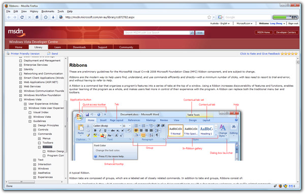
Microsoft’s official Windows User Experience Interaction Guidelines, or more affectionately known as the “UX Guide”, has had a recent October 10 makeover. Topics added in this update include “Ribbons“, touch computing, pen computing and printing.
Of most interest is the article dedicated to Ribbons, explaining to developers how to design a great Ribbon experience in their own application, but probably more importantly when to and when not to use a Ribbon. The Touch article also provides some insightful tips to developing a user-interface that is touch friendly.
Considering Windows “technically 6.1 but doesn’t sound cool enough” 7 just happens to make advances in both the Ribbon (with “Scenic”) and touch computing, definitely a recommend read for developers if you want to be a step ahead.
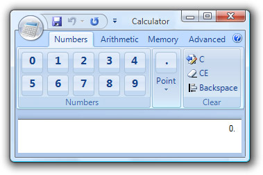
For example, here’s how not to make a calculator with Ribbon.

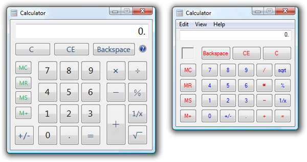
On the other hand, there’s an interesting screenshot of a “touch version” of Calculator. Personally compared to the version in Vista (right), even looks better.

I love that calculator app! Not really, but I do find it funny.
I like the color scheme of the touch calculator, even the large buttons
That ribbon calculator! haha! It has a save buton? What?
On the other hand the touch calculator looks friendly to the digits. 8^)
Chromifox theme user, I see.
The calculator is hilarious. It’s always nice when rather dry material like this gets a sense of humor.
What’s that green bar to the right of the search bar in the browser???
@Imran: That’s his internet usage meter. With all these posts, he’s clogging the tubes (and the bar) quickly.
What Firefox skin are you using in the screenshot of the MSDN page?
I’m not sure why you need to follow the ribbon model for every use of a similar interface. For instance, the calculator would be nice if instead of a menu, you switched between tabs labeled Standard, Scientific, Graphing, etc. These could even be at the bottom of the interface, to keep the same format, and the inside of the tab could look pretty similar to the current calculator interface. Don’t they want to get rid of the menubar in calculator? Why not adapt the ribbon tabs to function differently? Users wont be confused.
Too bad MS never follows its own design guidelines…
The calculator is a mess in most variants! Switch from “standard” to “scientific” views and you get a whole new set of functionality, not to mention a change in the way ‘order of operations’ are performed…
I think the most important part of touch is that the graphics are (mostly) vectorized or scalable in a major way to compensate for size of device and user (i.e. hands).
LOL at the Ribbon-ised calculator!! that’s hilarious
@Matt: I’m using Chromifox on Firefox 3. https://addons.mozilla.org/en-US/firefox/addon/8782
Lol I want to play with a Ribbon Calculator!
So I guess it’s not “Fluent” anymore? It’s funny how Windows Scenic breaks a lot of the guidelines in Windows Live Movie Maker (WLMM). If Scenic is really anything like it is in WLMM (though it’s a beta), then it’s going to be complete rubbish. I want the Application button back – not some ugly file menu icon.
I think they should have the calculator understand plain text equations that you type into the display box, the same way that search engines can answer plain text equations.
Finally! A Square root function in Standard mode!!!!!!!!!!!!!!!!!
Oops…it always had that. Sorry.