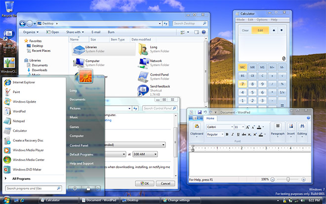
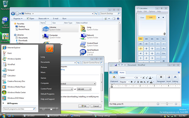
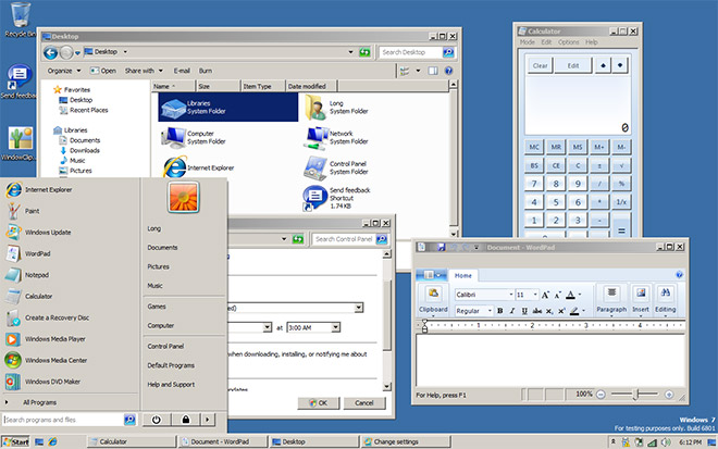
It’s ironic one of the first things people still ask when a new version of Windows is released is “how does Windows Classic look”. You know who you are, and I won’t ask why or try to convince you why you’d be better off with Aero in terms of performance, stability and productivity, but here’s how the different tiers of UI looks in Windows 7 M3 6801.
58 insightful thoughts
Comments are closed.


Wait on, what happened to the different task bar???
On a side note – they seriously need some audience mics in there keynote, it seems kinda sad that no one is clapping.
lol, I remember I asked it in the live blog. I was hoping that they had improved the basic and classic themes somehow, but alas, they still suck so far..
I really want “Build 6933.winmain.081020-1842″…not 6801..
And, something you could check Long:
Is there 2560×1600 res wallpapers in W7???
Not vital I know, but it’d be nice.
OOO!!! I just saw that Snap thingy!!! That’d be great for a high res monitor like mine when you want Word just to be on the left and whatever on the right.
@Nicko
As far as I’m aware, the new taskbar (as demo’d in the videos) is not present in the current released build. It will be available in later ones.
@Nicko: The M3 build given to PDC attendees doesn’t include the new taskbar.
Scenic (or whatever we’re calling the Windows 7 ribbon now) certainly has a long way to go – doesn’t look anywhere near as good as the final Office 2007 implementation. Which puzzles me – couldn’t they have simply used that code?
Also, lovin’ those thick borders in Classic.
Hi Long, could you check if Sidebar gadgets are DPI aware now? On Vista they don’t scale so on a massive screen they become tiny and useless.
long can you post the wallpapers that came with w7????
Off topic, but does anyone know what the transparent panel, to the right of the clock in the taskbar, does?
Given the desktop icon in the classic theme, I assume it may be some toggle to show the desktop (that “peak/glimpse” ability they talked about?).
@Garth: That’s the new location of Show Desktop.
really what about the new task bar , where is it ?it seems like vista no difference …
Never really warmed to the look of Aero (both glass and basic), and hate Windows Classic, so to see that they will be carrying on into 7 is somewhat disappointing. Obviously, it’s an improvement over the childlike big, bright and bold blue of XP, but then I’ve been using different themes since I first installed XP.
Plus, isn’t it possible that the themes have changed with the latest build on M3 that was shown off yesterday? Considering how much they changed the taskbar, I’m not sure how/if that would work in classic mode (unless classic mode simply “turned off” the new)
Classic looks horrible. I never thought it can get any worse than in Vista.
“You know who you are” – It’s not only personal preference, there is also a lot of hardware out there where Aero Glass doesn’t run at all or well on.
The Windows UI is a clusterfuck.
I dont get why they dont make classic run with the DWM engine in the background.
I am running a ubuntu skin on my Vista installation and it looks brilliant! Flat and plain colours to deter distractions (the systray notifications really pop out), yet taking advantage of shadows with the likes of GDI+ engine no where to be seen.
so much for customisation…
@Anthony: It is. I’m using classic and see dwm.exe in the background, except since Aero isn’t on. It’s just doing nothing.
Classic and Basic’s (title bar) look horrible. XP’s classic was the last best classic.
Classic looks atrocious. At least Basic has a calmer looking hue and tone.
long can you post the wallpapers that came with w7 of >>>??
The Aero Basic still has the minimize, maximize and close buttons placed differently from Aero Glass… I would prefer if the Aero Basic interface matched Aero Glass more closely (btw, I’m currently using Aero Glass, but shifting the Aero Basic buttons would be good for consistency’s sake).
Sadly (at least for me), Windows Classic theme looks horrible, like some deformed/mutant XP Classic theme… 🙁
Windows Classic looks kind of weird. Why can’t they just get rid of that look and feel?
Looking good (except classic). I want to install Windows 7 6801, but I only have files from an ISO image. Can anyone tell me how to burn these files over to a disk, and make that disk bootable? Plleeeaaassseee! (gives best bambi-eyes ever).
I just installed win7 7000. the classic theme looks good if you also disable the “themes” service
Gotta say I’m disappointed to hear there’s no 2000-style classic start menu. Maybe (please?) someone will make a true classic shell as a 3rd party replacement.
For me, the OS is just there to let me run my apps. Don’t try to be everything. Just give me my apps, in a consistent interface, and get the heck out of the way.
Classic view is so awesome!
Better productivity with the “glass” view? Hahahahahahahahha. No.
Windows CLASSIC or STANDARD folder view is best for productivity with
simple, alphabetical listings.
K.I.S.S_keep.your.work.simple.stupid and you may succeed and be happy.
Those I know who use the “O-wow” styles seem to be
bipolar, talking to their voices, excess female hormones,
with a more evolved false ego.
Guys thats windows vista. I would know, I’ve had both windows vista and the windows 7 beta. Thats not windows 7, the first look is vista aero, the second is vista basic, and the third is vista classic. I’ve been through all of those themes several times and I’m here to tell you it’s not W7. Plus W7 has no taskbar, instead, Microsoft has replaced it with somthing called the superbar. (Although in certain areas of the beta it still says taskbar.) Just thought I’d help some of you understand the difference. Hope I helped.
look basic so good
“Classic” start menu is full of sections.
Is it not possible to set it with programs in a simple hierarchy? That would be much easier.
“I won’t … try to convince you why you’d be better off with Aero in terms of performance, stability and productivity”
An Operating System is a toolbox. Who cares if it’s made of leather or blue-painted steel?
At all the “Wow, cool!”, all we do is open the same applications and do the same work.
I dont like the WIN bling-bling themes.
Why is it that MS think we just want to change into this funny looking platform.
Their Classic is nothing like classic, ist just a dull grey colorless version of WIN bling bling.
How come they dont make a theme for professionals, like WIN2K and XP classic.
I dont use officehours to fancy transparent menus, im spending time to calm down furious users screaming in anger. First IE7, then they normally installed Firefox classic. After that they had Office2007, that looks funny with XP classic. Peouple hate the default blurry font.
Now they are soon forced to run this bling bling teenage and newbee colourized platform from hell.
I dont blame them, they are at work – to get work done – not surfing around trying to find what they worked with the last 10-12 years.
A major setback for MS.
MS gave the teenagers their theme.
We want our PROclassic theme back.
@The fat man in taiwan
1-Actually, if you look at the right of the taskbar in every picture it has the show desktop button, which I use constantly if programs won’t(or can’t) minimize,2- and the REALLY easy to tell thing about it being Windows 7, is the watermark in the bottom right corner of the desktop(It says Windows 7- For test purposes only.Build 6801)(and NO it is NOT part of the background, because it always stays there), 3-and when you have autohide on and the taskbar shows as it does in the pictures it will cover the watermark, but it shows the taskbar and it isn’t covering the watermark(I only mentioned this to prove that I can tell those small, differences4-Although the picture could have been copied into paint and edited to have a fake watermark, and used as the background, what about the show desktop button?,Just thought I’d help YOU UNDERSTAND THE VERY SMALL DIFFERENCES.And the only way for that to be faked is if the taskbar isn’t really open, and it’s all part of the background, or just a very well put together picture. and if that’s so then it can’t be proven either way, it could even be windows 95 with a windows 7 screenshot as a background.Although in the beta it says taskbar I have heard of the superbar.
Oh cmon! Grow up! Classic looks very close to the same just with the new icons. NEWSFLASH!!! Classic was always grey and kinda boring (but snappier!). I use classic look, no desktop icons with a plain black desktop. I hope you can do the same in 7. I dont require bling, just wish MS would KISS windows more.
I like the OS from what I’ve seen in terms of functionality. But “CLASSIC” theme is a Big one for me. I hate the blobby look and feels and icons all over the place and the shimmering colors. The Aero glass altough attractive at first. is distracting in some ways.
…I’m so irritated with this whole “Blobby culture”. Some of us prefer the neat, straight cut look and feel. Well, I guess we are a fading minority since people are so GAGA about all this flashy shit….I’m not buying 7 till they fix Classic!
if none of the please you, try the windows xp theme somewhone made: http://www.askvg.com/download-windows-xp-luna-theme-for-windows-7/
I want you to put the “Classic Mode” back to Windows XP and Windows Vista capability. You screwed up when yo changed “Classic Mode” In your new operating system.
Lets face it, Vista was a repeat of the Windows 98 failure, Windows 7 is the abortion called Millennial Edition. It is Vista Repacked and forced down our throats. Like Tom Ridge found a new place to live, my computer!
I want the classic windows view, and all this child can tell me is how he loves Windows Seven and how wrong everyone else is.
I wish you college pukes would quit fixing things that aren’t broken.
Oh! Theres my email address, but, I cannot access it because, Windiows 7 didn’t include Outlook Express!
Cheap pricks!
I know this is a little out of date, but I’m trying to figure out why you would say that using Aero would mean the user would be better off with Aero in terms of performance, stability and productivity. The hardcore fact is that using Aero enables additional visual elements and settings, which use up more system resources.
I can combat your statement about stability by saying on my Dell D630 Windows 7 experiences problems with a triple screen setup with desktop composition enabled (Aero) turn it off (Basic) and the issues are gone. Using windows classic will always be a developers main choice since it means less resources for the visual elements of windows.
I personally like Aero and use it, but your statement was and is a little incorrect, using Aero by no means speeds up the system, does not improve stability, or improves productivity.
Please when writing an article from a tech aspect be accurate, say that Aero makes your experience more visually enjoyable, but nothing about it does what you say it will. Smart Window arrangement still works in Basic and Classic modes as it does with Aero. The only change in them is you lose the taskbar thumbnails when moving down from Aero.
I personally edit the registry to do away with that since it gets in my way, but that’s a personal preference.
The only thing I can offer is that the SuperBar should be spelt fubar! As is the rest of Win7.
Productivity is lost and huge relearning curve.
When will MS finally realise “if it ain’t broken don’t fix it!”. As for the Power Button and that
Ribbon menu! How long does it take to find anything now?
Hey. How can I get the classic Windows theme for Win7? I can’t find it and I really mis it. I had it Vista where it was on the computer, but at my new com I cant find it… Help me!
Every Windows interface looks plain childish, with XP as the king of silliness. How come Mac always seems to look cool while Windows looks like … Walmart?
Is it because they can’t find good designers or do they have no clue how to guide them?
RudolfB probably wonders why Windows dominates the workplace while the lead competing operating system feverishly invests in “looking cool.”
A very simple reason why people ask how to switch to Windows Classic, or how it looks … it takes a lot less processing power than Aero.
I honestly couldn’t care less what my operating system looks like – what I care about is that it eats the least possible amount of CPU and memory, and frees up computing power for actual applications.
Especially now that they stick Windows 7 on low performance machines like netbooks and nettops, there isn’t even the “upgrade to a newer machine” excuse – I (and probably other people) need every single possibility that can scrape even a little bit off the resource use of Win7.
Sorry, but I find the classic look easier and less distracting.
I like Aero, but the ONLY thing I don’t like about aero is the color shadows. Now on basic and classic you can’t choose border, start menu and taskbar colors like you can on aero.
This windows vista. No windows 7.
excelente