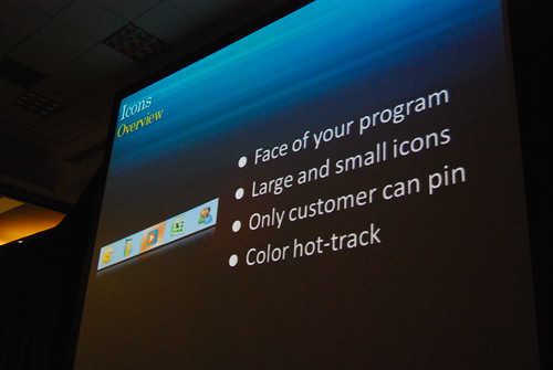
If you liked what you saw at the PDC08 Windows 7 keynote in terms of the user experience of Windows 7’s shell and taskbar, then get ready for more since what Sinofsky and Julie-Larson Green showed off is not all that’s on offer. Sitting in the session by Chaitanya Sareen titled “Welcome to the Windows 7 desktop“, a number of new features were shown off.
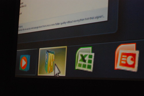
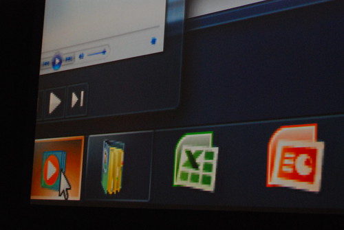
One of these new features is “color hot-track” for the Windows 7 superbar. Let me show you first before explaining what they are and why I think this is cool.
When hovering over the icons in the taskbar, the color highlight of the “glass” button is actually different from application to application. How it works is dynamically abstracting the color values of the application icon to find the most dominant RGB value. Besides the obvious eye-candy, this feature delivers some sentimental value by making it easy to identify applications by color.
This is exciting, not because of the feature, but because the fact that something like this is there. If something like has been thought of and implemented at this point in time, then imagine what’s coming in 12 months. As a sign of even greater attention to detail, the “highlight” glow even moves around with your cursor.
For a photo-slideshow of the entire presentation then you can find all the photos on my Flickr.
Update: Tom Warren from Neowin has a video recording of the feature live.


Personally, I think this is just a gimmick to reinforce user`s awareness of “what the hell is the name of the app showing this icon”. They took away the text description – you could orient yourself quickly with text in taskbar, now you HAVE to know what icon corresponds to what app, or you need to run them all over with mouse to see popup with text. I am pretty sure this won`t make it to final release.
But don`t get me wrong, I am happy MS finally pays attention to the details 🙂
@Jiri: I may have evidence to suggest “labels” will be available, off by default by can be turned on.
@Long: In that case, I`m all for the new taskbar! Thanks!
Any idea if they will post a video of this session for us to see?
@Jiri: I believe Mac OS X users get along without having the textual labels
Many of the UX innovations being shown with Windows 7 are super useful and look great. Microsoft is definitely on track to deliver a vastly improved user experience. I’m stoked!
@Robert: I am a Mac user, but I prefer taskbar to dock any day. Dock is the most controversial UI element in OSX. Guess why they opt for text all over the place in Windows 7? Because it makes orientation much quicker.
My experimentation with OS X was short lived, i didnt get on with it much, and i did hate the dock. The new task bar looks better to me, because the dock is more of an application launcher than an application management tool. There designed for use in different ways, i think text less application management works fine
I noticed this feature as well. I must say it’s the small things that make the difference. I do wonder though if there is anyway to watch these sessions online?
@Daniel: If i recall right, you can go to microsoftpdc.com and go to a session, there it’ll link to channel9.msdn.com where the video is supposed to get posted in a 24hour timeframe (when the session was) – maybe they’ll lag a bit with releasing them, but even last pdc all the sessions were available online (as video + synchronised transcript with slides… __if i recall right__ :p), so i expect that the offering on channel9 will be at least the same.
what i do hope they also post in the videos are the Q&A at the end of a session – cause usually those are even more interesting than the session itself.
also i hope someone will post a HD-ish version of the keynotes… 750K streaming on todays sceens looks really strange
Long (& rest of LiveBloggers), I have a request for you guys (I saw some of the things I emailed to E7 be addressed, so I was wondering others)::
–Could you dock the Taskbar to the top? Open the Start Menu; how is the orientation? I emailed Sinofsky about this weird Start Menu positioning issue since the 9x to Vista days –> It doesn’t open logically.
**Start Menu, if taskbar is at the side, should open to the side.
**If at top, it should open at the bottom with the orientation of icons reveresed (log off at bottom, etc.) –> Doesn’t seem right (nowadays), but it makes sense.
————
And that’s about it. (Asking since I had an idea of Start Menu –> hover Windows Explorer –> open separate Windows Explorer session to right, and able to drag/ drop for its own window. This is similar to Start Menu Jump List behavior.)
Oh, does someone have a netbook? PLEASE, test Win7 out on one and tell us how it is !! That will be very interesting.
they could have made it rounded squares…
The small things are what any good UX has to keep track of in order to separate from good to great.
Long, can you also post shots of Classic Theme on? It’ll satisfy man users’ fears with the new taskbar (I think).
@Tim James i agree at first the dock may seem really out of place for a long time windows user( i myself am one) but once you keep using it you start feel more comfortable with it.
btw i like the new taskbar 🙂
i really like the new taskbar and the ui changes but i think the new taskbar is very similar to the os x dock.
http://www.appleinsider.com/articles/08/10/28/microsofts_windows_7_to_bring_apple_tinged_design_changes.html
As most sites posting pictures must have the 160 GB portable drive in their clutches, I was just wondering how large is Windows 7 beta? I have to wait for the public beta and then download it.
3 GB?
Larger than Win Vista?
Smaller?
(That’s the compressed install …)
+1 classic theme shots. They put the option easily under the theme settings so lets see how pretty classic can get!
Love it, but Windows 7 Classic are to bloated.
You can watch the entire session here: http://channel9.msdn.com/pdc2008/PC24/
@Long, will the complete old-style taskbar be available just in case?
Accessibility wise, I wonder how/if this will affect color blind individuals. Could the color hot values be adjusted to compensate for the various types color blindness?
This is a terrible feature – I find the colours disorienting. Different colours should be reserved for specific purposes (i.e. highlit on active, flashing for attention, etc). If a feature has a potential to detract from usability at the very least – one would have thought – the option to switch it _off_ will also have been given :-\
Gosh!…wouldn’t it be mind-blowing to be a celebrity like that. So much skill and probably tons of cash, too!