Microsoft describes Windows 8 as “Windows re-imagined”. I would add to that, “with Metro”.
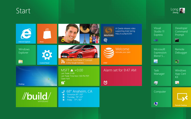
From the lock-screen to the boot-time recovery manager, the next version of Windows has embraced the Microsoft Metro design language to the core. It is undeniable the biggest design and user experience changes to Windows since Windows 95 but it’s also not without issues that concern me.
Even though anyone who’s seen or used Windows Phone 7 would attest Windows 8 is clearly inspired, it’s not just a scaled up version of the same thing. Although many of the standard controls share a similar styling, like the toggle switch, sliders and buttons, there’s some divergence.
For example, gradients thrive throughout Windows 8 when they’re discouraged on the phone. Of course this, among other differences, can be explained by different technical specifications and use-cases of PCs versus phones. Another example being the touch spots and trails left by any of the 10 independent touch points the OS supports simultaneously – one for every finger.

There is no doubt Metro makes Windows 8 beautiful to look at and use. From the moment you turn on a Windows 8 device, prominent numbers in Segoe UI v5.12 (Windows 7 has v5.00) gorgeously display the time alongside elegant white silhouette “status badges” that compose the personalized lock-screen.
Once inside, the Start screen transition as each individual tiles subtlety zoom in is just one of countless numbers of animations and transitions that helps make the OS feel responsive and “alive”. Although the tiles on Windows 8 do not flip like the phone, they do support animations which can surface an stream of rich information for the user to glance at.
On a reasonably sized screen (1440×900), the OS fits at least 12 tiles which accommodate a reasonable amount of favourite applications for the user to access and see without any scrolling. Obviously they can fit more with small tiles.

As far as touch-experience goes, the new shell and immersive applications are turning the tide for touch vs. mouse. Hotspots and trails provide nice subtle visual confirmation of your finger’s interaction with the screen and “touchability” is exponentially better than any previous touch offerings in Windows. Although there is parity for mouse users in terms of functionality, it’s clear now that Windows 8 is a touch-first experience, even in the traditional desktop.
Of course, the user experience in Windows 8 is not without issues. Whilst this is a developer preview and features could change, one of my biggest concerns among many is the behaviour of switching applications by swiping from the left edge has carried through since the earlier D9 demo.
In my own experience using it, the unpredictability of not knowing what application is in the back stage makes the multi-tasking experience feel like playing Blackjack. As ALT+TAB still exists for users with a keyboard, it’s a much more refined solution.
Since I’m not usually one for writing long articles, Metro on Windows 8 is an extremely visual and interactive experience which is why I would encourage everyone to try it for themselves. Even with a mouse and keyboard, you will agree that this truly is Windows re-imagined.
Here’s hoping that the Aero ui gets a visual refresh – perhaps as an optional visual style so my accent colour, and other options can be carried over from Immersive UI and Desktop UI.
I was thinking the same thing about the multi-tasking.
I wonder if final hardware for slates/tablets will require a Back button like WP has. Or maybe some kind of icon somewhere that can lead you to a Mango-like app switching screen.
It will have an icon and task manager just like windows 7.
“Although the tiles on Windows 8 do not flip like the phone”
I just saw them flipping on the livestream
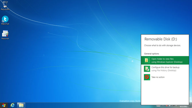
No doubt that the green boxes around the icons are simply placeholders and after the beta, they will have vanished, and so will the Windows 7 like look. 🙁 Though I understand Windows 8 is intended to be an entirely new experience, it is still nice to have a bit of that classic Windows 7 look here and there like Windows 7 did with still having a few Windows Vista elements here and there! 😛
There are some really nice concepts here. Let’s hope Windows 8 isn’t just another Windows Vista… aka a beta version of the real thing with the real thing being Windows 9.
I think they should allow users to kill the “old” windows desktop metaphor altogether. Or at least switch it off. Going back to that desktop mode while using it on a tablet seems counter productive.
My biggest concern using Windows 8 on a 3G enabled tablet would be malware. Yes, I can use a virus / malware program but the problem is that it’s the real “nasty” stuff usually stays undetected until it’s way too late.
I also wonder how they will address concerns of IT departments in the corporate space. Having recently worked with some corps on integrating iPads in to their ecosystem I think it will be an uphill battle for a true tablet in that space. iPads are easy in that respect, they have an easy deployment, zero malware / viruses, an easy kill switch, apps run within a sandbox and are fairly easy to trace. Yet, every single IT department had massive concerns about letting employees take an ultra portable device that easily connects back to the corporate network out and about.
It wasn’t that they couldn’t see the benefits it was more that they were concerned with the lax approach many employees have to security. They see it as their role (or at least their division director tells them) to protect people from their own stupidity.
Interesting. How about allowing Desktop Users to completely Kill off the Metro crap. If this goes into the release version of W8 without being Optional my next PC will be a Mac with me keeping my Older Windows 7 PC for gaming purposes only.
While just downloading the developer preview I am hoping their are offering a “Tablet style” installation. Know how much space get’s wasted by installing Windows 7 I am wondering how they will handle minimal installs for tablets. The last thing I would want it my minuscule 64 Gbyte of adam to be chewed up by pointless installs that I will never use.
The iPad iOS 5 beta version has a footprint of about 650 Mbyte. From the developer preview it looks like the install there has a footprint of nearly 8 times that. I know it’s pre-beta code but the size is still a concern on a tablet.
“In my own experience using it, the unpredictability of not knowing what application is in the back stage makes the multi-tasking experience feel like playing Blackjack.”
Not sure if this is an improvement for you or not, but if you hold your finger (or the mouse) down while dragging back and forth between the left side of the screen you can flip through the open applications. Basically, rather than dropping the app sliding in onto the screen, keep moving it off the screen then back on and it will pull the next app up. I don’t remember seeing this demo’d during the keynote, but I only managed to watch about 3/4 of it, so my bad if it was brought up already.
I really hope they change that green colour to something else… I was really sick of it by the time I had installed the developer preview.
After having spend a bit of time with this “Start” button goes to tiles panoscreen I must say this will be boom for shortcut launchers. I very quickly got tired of having to scroll through several pages every time I want to launch a new app.
forgot to add… the new start screen really just seems that… a different way of launching apps plus a view fullscreen only apps thrown into the mix.
Now… how do I prevent it from jumping into traditional windows all together?
I think Microsoft is basically lining up Windows 8 with its effort to build some infrastructure for Windows Phone.