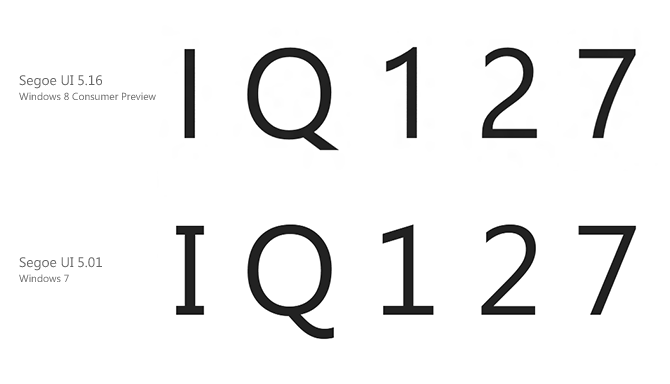
The hallmark Windows font, Segoe UI, has gone under the knife for its appearance in Windows 8 with a handful of changes and improvements. Some obvious – styling of particular characters of numbers, and others not so obvious – addition of OpenType stylistic sets, ligatures and international character sets.
Thanks for a heads up from David Warner, Microsoft has been slowly bumping up the version number of Segoe UI from 5.01 in Windows 7 to 5.12 in Windows 8’s Developer Preview and more recently 5.16 in the Consumer Preview.
The most obvious changes out of the box are in the characters “I, Q, 1, 2, 7” where the serifs in I and 1 are removed in favor of a more genuine san-serif look, the tip of the Q straightened but 2 and 7 more curved.
The new Segoe UI also adds support for OpenType stylistic sets and ligatures which increases variation across the standard character set. In fact, the old variations of the characters above are included in the alternative style set.
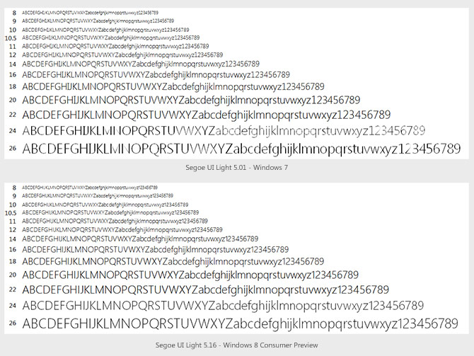
Microsoft’s fonts team has also worked on improving the hinting of Segoe UI, especially the Light variant which was never properly hinted. The new version has much more consistent hinting across the entire range of font sizes, especially at sizes 20pt, 24pt and 26pt. Just take a look at the “X” in the image below to see what I mean.
With over 2000 extra glyphs and 800 extra characters, the new versions of Segoe UI also broaden internationalization support with additional language character sets for Armenian, Hebrew, Georgian, Thai, Lisu and various Indian and African language.
For a side by side comparison between the two versions, take a look at the image below kindly provided by David Warner.

You are worrying us Long…HOW DID YOU EVEN..i’m not going to ask as it only encourages you..
Nice pickup though..bet win8 team are like “Oh he knows..DANG IT..”
Good to see you’re attacking the hard hitting Windows 8 Issues/News!!!! Subtle Font change – MEH!
Give the man a break! He’s a pixel hunter. 🙂
Wow, I guess you’d prefer a post of download links and boring setup tutorials.
It’s okay that they make changes, but I think it would be better if they named it different, like Segoe UI 8, because I prefer the old version. I don’t know if they’ve included the old glyphs als OpenType alternates.
Please note that also the 8 has been significantly changed. It’s like two O’s on top of each other instead of a turned infinity symbol.
Fortunately there’s still the regular Segoe. 🙂
++ Changing the design of the default glyph set = it’s a different typeface now. I guess they consider they “own” it and it’s only to be used as an in-Windows UI font. But it’s still wrong.
The new version looks better.
IQ 127.
So, can we call these “above average”? 🙂
Segoe UI is my favourite font when it comes to deciding which font to use for my Word documents and PowerPoint presentations! 😀
Wait… how do you tell I (capital i) and l (lowercase L) apart now?
The crossed I’s are something I appreciated. I admit the new one looks cleaner, but sometimes (especially as in serial numbers or random passwords, etc.) you really want differentiation between a capital I and a lowercase l. Segoe UI used to be a great choice because it was so much nicer and more elegant than Tahoma or Verdana.
It looks like Segoe WP
Good find Long…one thing to note is that the frameworks support the StylisticSet typography attribute so you can subtly tweak the font style if you want a specific look. Take a look at the XAML templates in VS11 for example and you’ll see that in StandardStyles.xaml we define Typography.StylisticSet20=true
Stylistic set #20 is the same as the default stylistic set in Segoe UI in Vista/7. Why change the default stylistic set only to use the older set in the standard XAML template?
@Quppa – the design is how the user experience team designed them to match the UI design guidelines
Changes like these should be classified as a different typeface. Capital I becomes difficult to distinguish from small l.
Making the “I” look just like the “l” is ridiculous. (That is upper case “i” and lower case “L” by the way.) Just when we had a font that could distinguish the two, they “improve” it. Grrrr.
–Ian (or is that Lan?)
I agree wholeheartedly with JL and Ian. Not being able to tell between “l” and “I” is one of the most idiotic examples of form over function, and yet another reason to avoid Windows 8 like the plague. The 1 is also now too similar to a 7 IMO.
I had a similar complaint about Google when changing the Android font from Droid Sans to Roboto. What is it with tech companies these days? Personally, I blame this obsession over Apple for popularising this dumbed-down form-over-function trend.
I don’t know about the changes in Segoe UI, but I’m loving Windows 8! In fact, I’m commenting from IE 10 in Windows 8 right now 😉
I actually enjoy notices of the subtle changes and issues in MSFT stuff. I just love it. Especially stuff concerning pixels and such.
It seems from the comments that there is some confusion about this.
The glyphs IQ1247?& etc. have not *changed* in Segoe UI in Windows 8.
What has happened is that there are alternative versions available which more closely match Segoe. To access these you specify stylistic set 20 which is what a number of the built-in applications specify as well as the default XAML templates.
If your apps don’t specify this you’ll get the same versions of these glyphs you always had. You can see this for yourself by typing them into notepad or removing the stylistic set 20 specifier from generic.xaml in your project.
[)amien
It is the opposite to what you’ve described in the consumer preview. Typing in Notepad you get the new set by default. The old styles have been moved into a stylistic set.
It’s a shame they’re not renaming it, or calling it Segoe UI 2 or Segoe UI Metro. Might lead to weird-looking documents if they give it the same name.
How does it compare to Zegoe UI? Don’t have the fonts at hand now, but it does look like Segoe 2 borrowed some changes.
What about Windows 8 Release Preview? Are you plan to test later?
Well, I found that the Segoe UI Italic goes to have subtle change as well to match from the other styles of Segoe UI.
IlIlIlllIIIlIllIIlIlI <—- Microsoft's incompetence by copying shitty Apple. Form and function in synergy with style and sense.
Hi Mr. Zheng, do you happen to know where these fonts are located on the system? Where do you find the version number?
How long does a zheng got to be, before it is classified as a long zheng?
Because in America, anything over six inches is considered a long thing.
Just ask any black guy he will tell you.lol