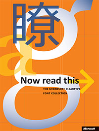
 Even though Windows Vista didn’t ship with a new “Add New Fonts” dialog that would have shaken the computing industry to its knees, it did however ship with some amazing new ClearType fonts. In 2004, Microsoft unveiled the “ClearType Font Collection” – a mix of serif and san-serif fonts to replace the aging set of Windows fonts that we’ve been stuck with for decades.
The collection included now-familiar names such as Constantia, Corbel, Calibri, Cambria, Candara, Consolas, Meiryo and Segoe. These are beautiful fonts that are rightful replacements for Arial, Times New Roman and the like who has served as the default fonts ever since Windows 3.1. But one other font has served a legacy a few years too long. It should have retired, it was announced to be retired, but it’s still kicking. Why?
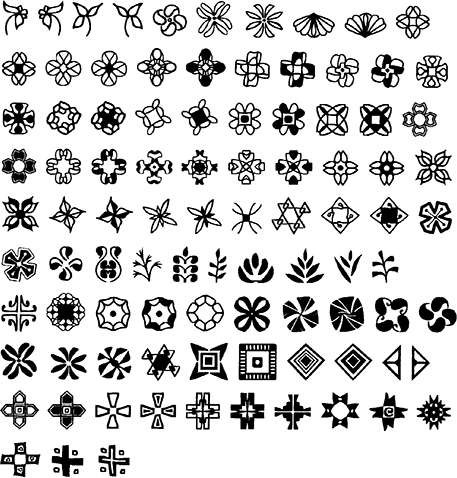
Of course I’m talking about Wingdings – our favorite dingbats font with a history of NYC controversy. It has been interpreted as anti-Semitic and then linked with the September 11 terrorist attacks. I think Microsoft felt a sigh of a relief when it announced the Vista-replacement for Windings, Cariadings. But Cariadings never came.
Microsoft Design describes Cariadings as,
a new decorative symbol font that will be included in Longhorn. “Cariadings” (Cariad means love or affection in Welsh) was designed by Microsoft’s own Geraldine Wade, one of the project leaders of the ClearType Font Collection.
The US Trademarks Office has approved Microsoft’s application for Cariadings ever since 2004. Even Microsoft’s own list of trademarks describes Cariadings as a font.
After doing some heavy earthmoving at the Patent Office (which is like right next door to the Trademarks Office), I uncovered Geraldine’s patent for the font type with a sample of what Cariadings looked like. Whilst I’m no Wingdings enthusiast, these are obviously more 21st-century-friendly.
So my question is, where the bloody hell is Cariadings? If anyone knows why it wasn’t included in Windows Vista, or even have a copy of it, please post it in the comments. 🙂
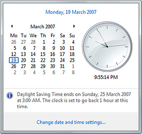 I think I found my Wow, however it’s not as grand as the space shuttle launch or the Berlin wall coming down. I was looking around to find out what was the deal with Daylight Savings Time, so I clicked on the clock and there it was, in plain English. And they didn’t even have to use the “lose/gain an hour sleep” analogy.


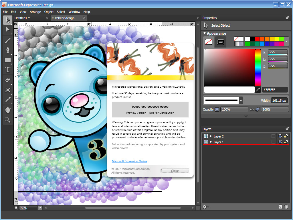
 Today, Microsoft shipped a
  Expression Design is a new endeavor for Microsoft who’s never produced a graphics-creation application by any standards in the past, that is if you don’t count Paint. One of the key features it offers is the hybrid availability of both vector and bitmap tools in the same workspace, whereas Photoshop and Illustrator complimented each other separately (although each contained a bit of the other). Whether that is of any significant use to designers is yet to be properly explored.