Review: Bellroy Note Sleeve “slim wallet”

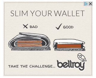
A little owl banner ad has been stalking me around the web challenging me to slim my wallet. Their ad targeting is incredible since my wallet is indeed uncomfortably bulgy so I was eager to find out exactly how much a difference just a wallet can make.

The people behind the ad is an Australian company called Bellroy. These guys pride themselves on creating slim wallets and even own slimyourwallet.com. The idea is simple, their wallet is specially designed to stack cards using less room than other wallets.

Bellroy doesn’t believe in the one-size-fits-all strategy. Their range of six wallets is split between folded bills and flat bills, combined with a range of card-fitting capacities.

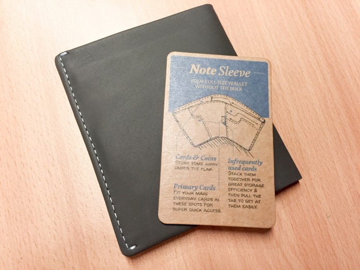
I opted for the Note Sleeve (above) which claims to fit flat bills, coins as well as 4-11+ cards.

IMG_0165

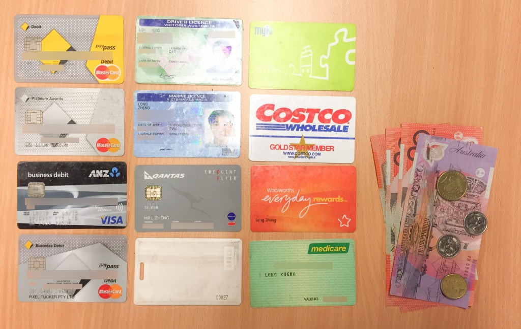
To start my experiment, this is what I carried when I made the switch. 12 cards. Cash and coins. (I must admit I carry more cards than I should. Bring on Apple Pay.)

IMG_0163

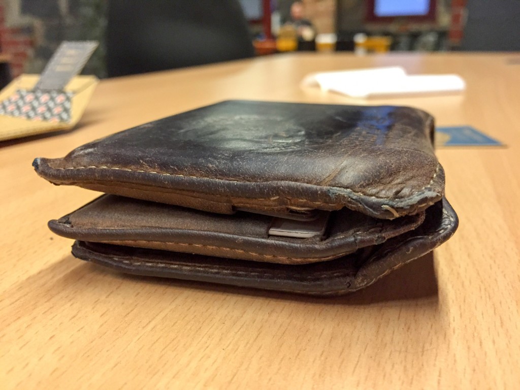
And this is how all those things fit in my previous standard leather wallet. Although the leather and stitches have lasted about 6 years, it was certainly bulgy and uncomfortable in tighter skinny jeans. Definitely function over form.

On to the Bellroy.

IMG_0149

IMG_0154

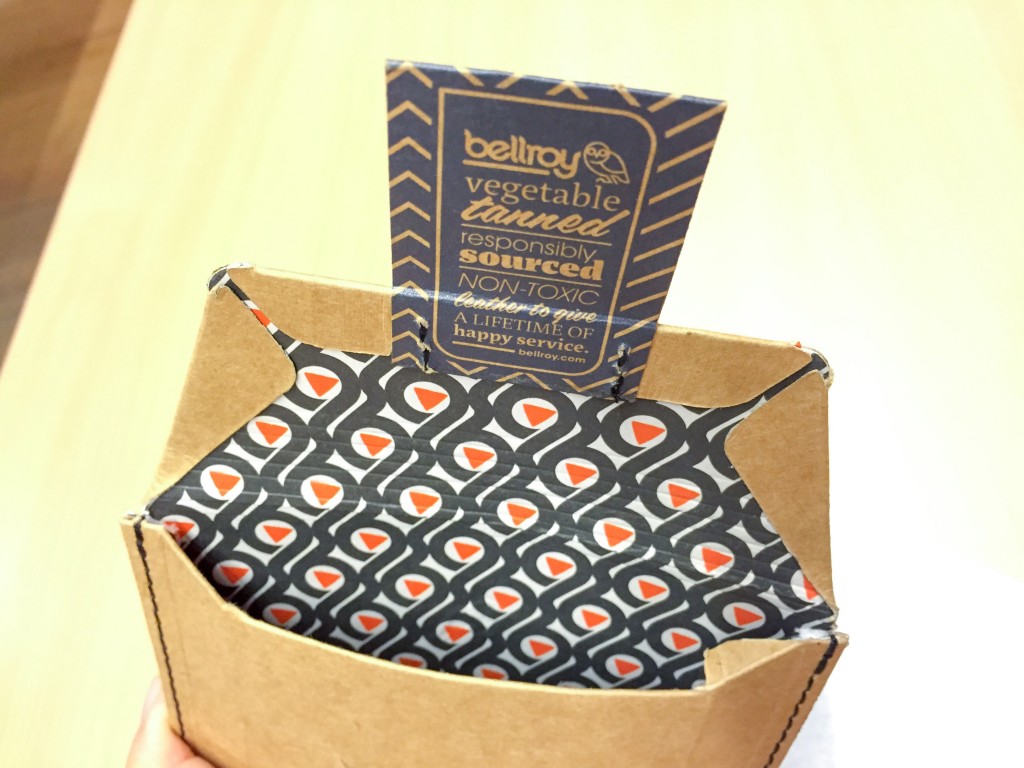
From the first impression of an embossed owl on the cardboard packaging, it’s clear this is a company that takes its materials and craftsmanship very seriously.

IMG_0156

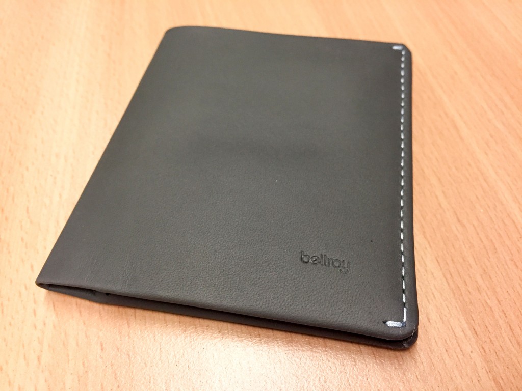
The wallet from the outside is modestly clean with only a small emboss of the logo. The silver stitching stands out quite well on this slate-colored leather. Oh and it also has that nice real leather smell.

IMG_0157

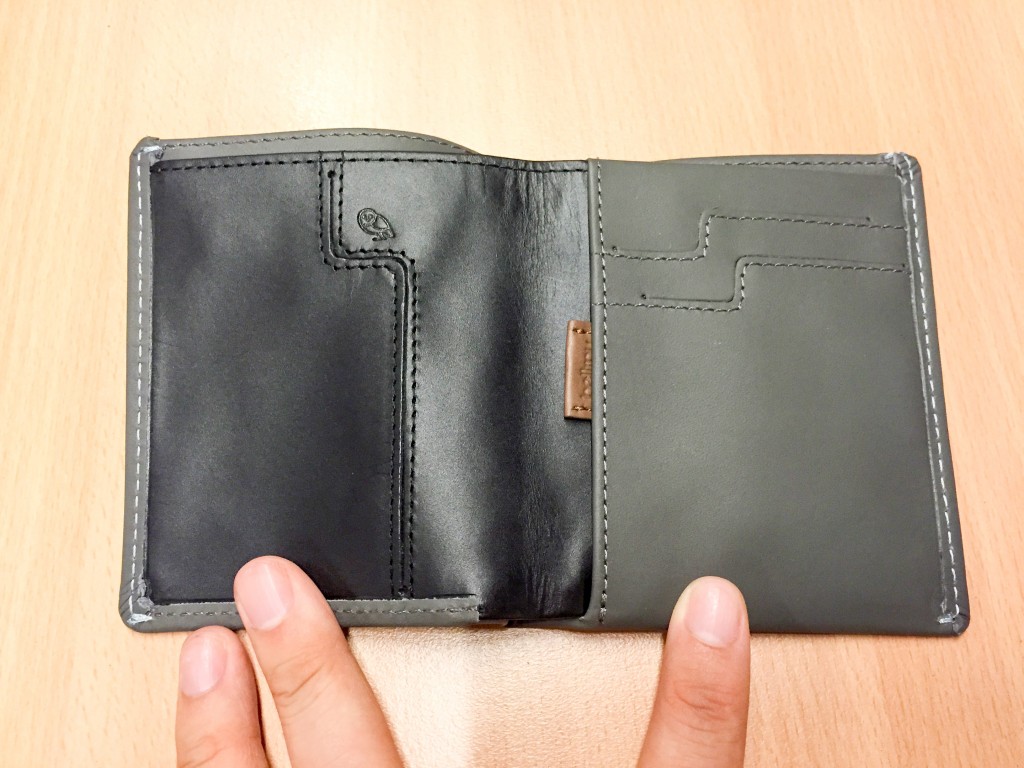
Splitting open the inside reveals a primary card slot on the left, two primary card slots on the right and the pouch for all infrequently used cards. (More on the little tab later)

IMG_0158

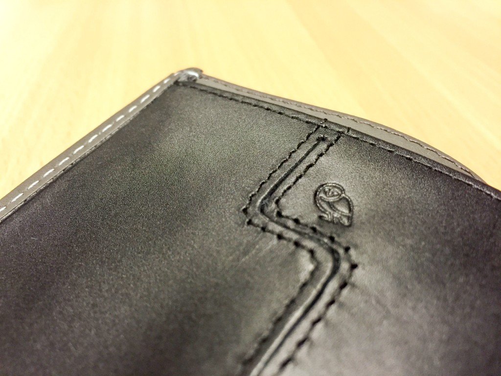
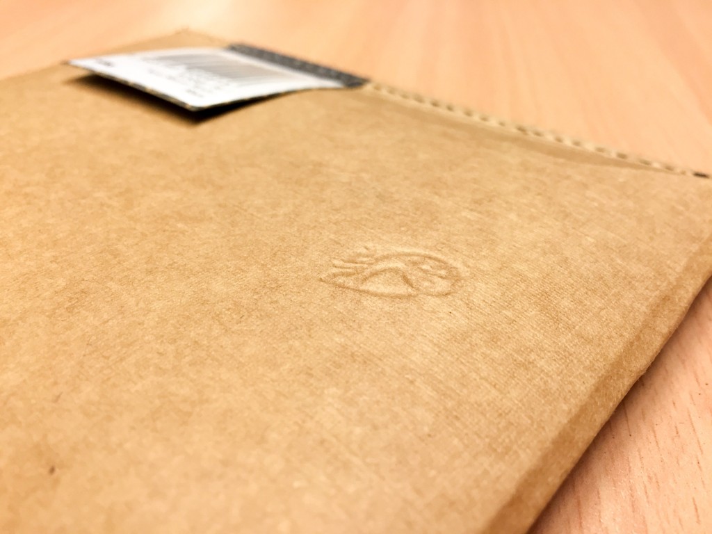
More fine stitching and a little owl.

IMG_0168

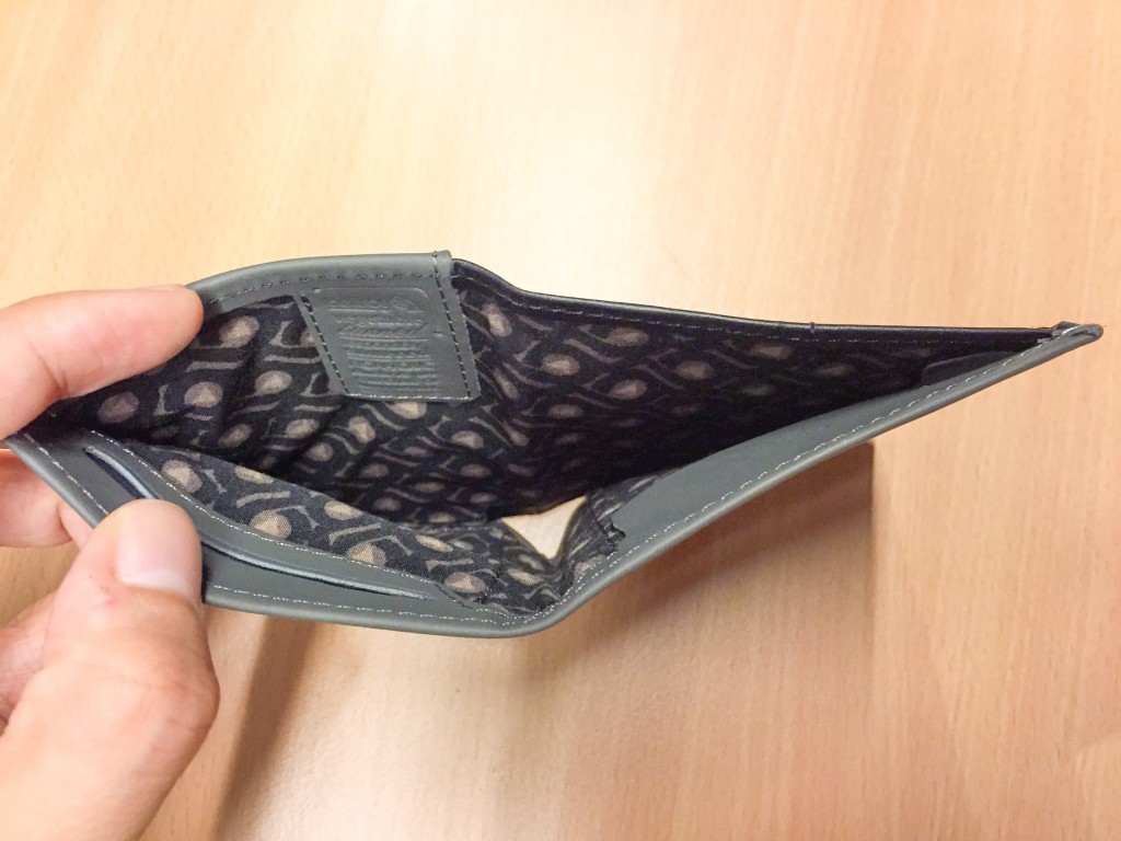
Since this wallet fits flat bills, there’s plenty of room for bills of most Western currencies. There’s two little pouches at the bottom, one with a flap (right) and one without. Both fit coins but I’ve found the one without the flap easier to access.

IMG_0161

IMG_0162

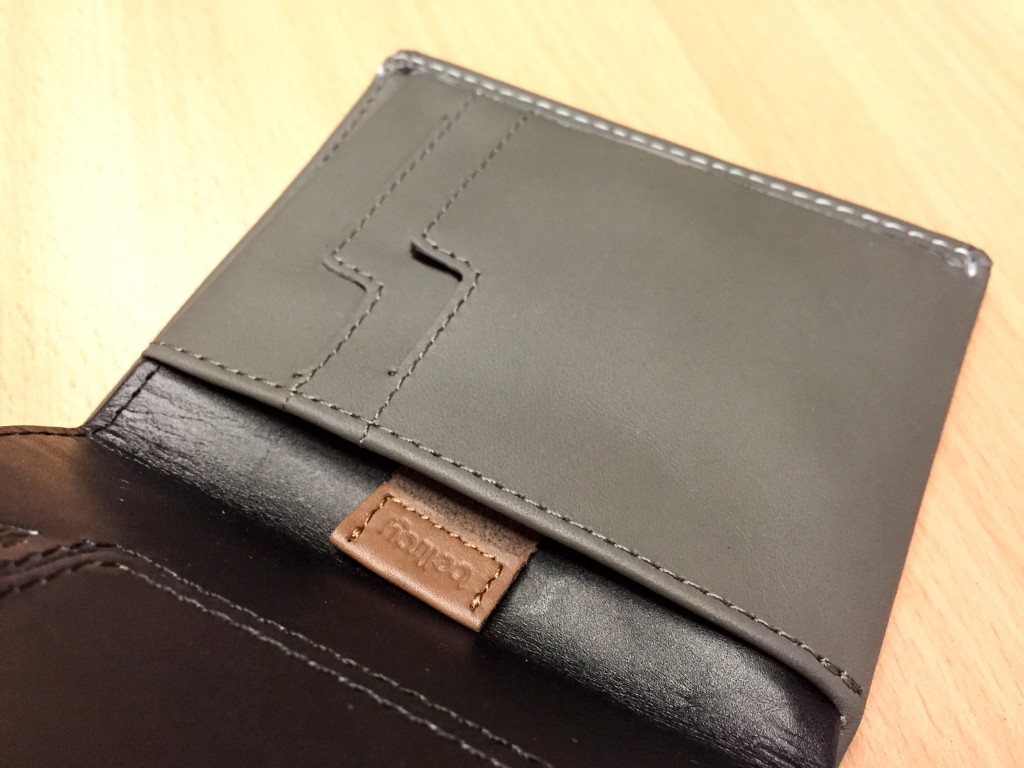
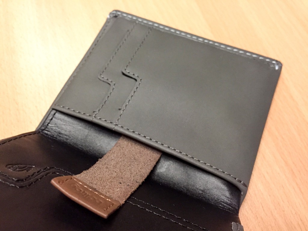
The little tab is Bellroy’s secret sauce for fitting lots of cards in a stack but making it still (relatively) easy to access. This means you can push in a stack of 6 cards deep into the pouch, and the tab allows you to easily slide out all of the cards for picking.

IMG_0169

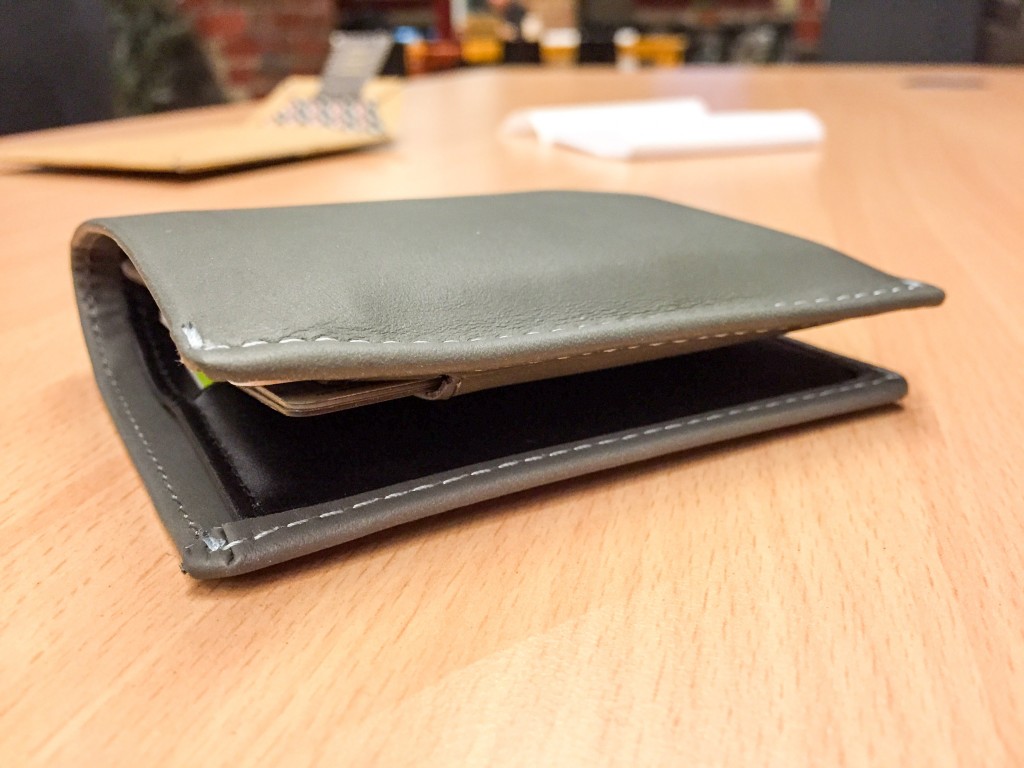
And this is what it looks like after I’ve put in all my cards.

IMG_0186

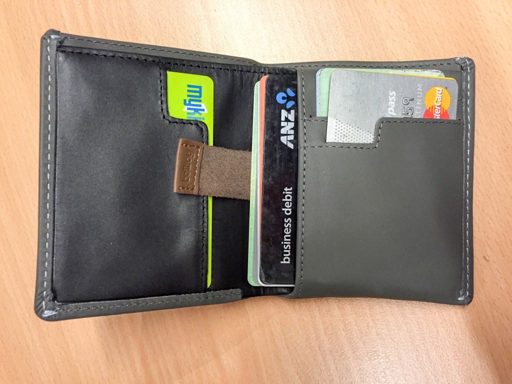
I put 2 cards in each of the three slots and 6 cards in the pouch. (Side note, I have different NFC cards in each side so I can scan my card by just opening it on one side. Of course it won’t work closed since multiple cards will interfere with each other.)

IMG_0177

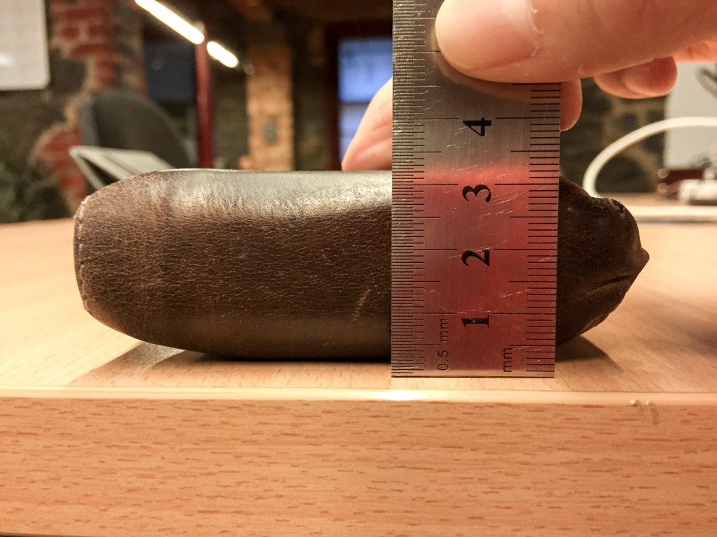
My old wallet measured around 3.2cm from the thickest side.

IMG_0181

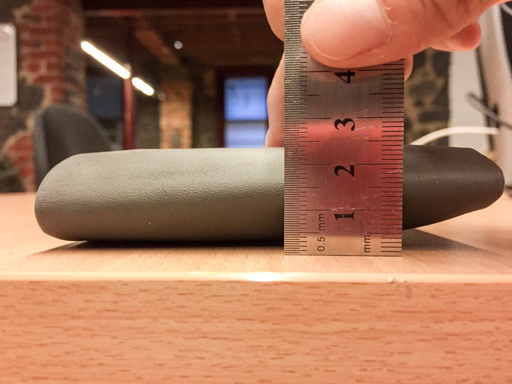
And the Bellroy measures 2.4cm from the thickest side. A saving of 0.8cm which equals to a 25% reduction over the original! Not bad for changing only just a wallet.

IMG_0189

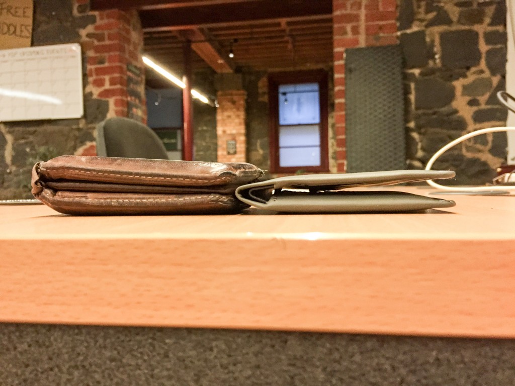
To get a better sense of where the savings come from, this picture of the two empty wallets side by side gives you a good idea just how thinly crafted the Bellroy Note Sleeve is.

What’s not picture is also how light it feels. Since there’s only minimal layers of leather, the wallet feels considerably lighter in the pocket as well.

I also found getting the wallet into my pockets was much easier. I believe this is because the edges are tightly threaded forming a thin hard flap which helps the wallet slide into pockets like a hot knife through butter.

In conclusion, I’m convinced Bellroy’s slim wallets work. And it’s not just me who’s convinced – when I asked people on Twitter for wallet recommendations, there was an overwhelming praise for Bellroy wallets that’s hard to dispute. At A$89.95, the Note Sleeve is a wallet worth investing in.

Disclosure: Bellroy provided the wallet at no cost for the purpose of this review.

Optimising for the 0.33%

I was browsing Apple’s new website today when something grabbed my attention. One of the screenshots on an iOS 8 page had an Australian address. “Oh that’s cute” I thought. As a designer, I understand the pain and effort localisation requires and I always appreciate the extra attention to detail, especially when it comes to localising bitmap images.

I quickly started to wonder just how much localisation does Apple actually do for the Australian website (which caters to just only 0.33% of the world’s total population). So I docked the AU and US sites side by side and started to browse.

I was pleasantly surprised.

If you ignore all the plain-text localisations, as you’ll see from the side-by-side examples below, I have never seen this depth of localisation for bitmap images before.

ios8

(Left: Australia, Right: US) Common in all of these screenshots, the time has lowercase periods and the date is in the D/M/Y format. More notably, the address is changed from “12921 Elm Road, Palm Springs, CA 94920” to “6/182 Acland Street, St Kilda, VIC 3183” (which is actually a real address in Melbourne). Many of the names below are also changed, although I have no evidence to suggest “Marissa”, “Jess” or “Claire” are more Australian.

ios82

(Top: Australia, Bottom: US) Australian slang shortens “university” as “uni”. We also use the “enrolment” spelling. The iPad in the background also mentions “Byron” instead of “Vegas”, in “km” instead of “miles”, and “petrol” instead of “gas”. The words “tanned” and “tan” are also changed.

ios83

(Left: Australia, Right: US) The location “Sydney” is used instead of “Santa Cruz”. “Favourites” instead of “favorite”.

ios84

(Left: Australia, Right: US) Subways aren’t that common in Australia so it is changed to “train”.

ios85

(Left: Australia, Right: US) “Mum” instead of “Mom”. Metric unit “metres” instead of “feet”.

ios86

(Top: Australia, Bottom: US) “Appointment” instead of “meeting”. “Cricket”, an Australian favourite instead of “baseball”. “Wentworth Park” is also a real Australian sporting complex instead of “SFDS”. Naturally the calendar has “Australian Holidays” instead of “US Holidays”.

ios87

(Left: Australia, Right: US) Even though the words are the same here, the number of app reviews and app price is appropriately adjusted for the Australian App Store.

ios88

(Top: Australia, Bottom: US) “Holiday” instead of “vacation”. “Glasses” instead of “frames”. We also don’t have number-based street names so “Roberts Street” instead of “21st Avenue”.

Surprisingly however, the United Kingdom Apple website which serves the second largest native-English market (0.88% of the world’s population) does not seems to get any special regionalisation treatment. For example no effort has been put to localise the Palm Springs address from the default US one. (Update 22 Sep: the UK website now seems to have received a localisation update as well).

Perhaps there’s some special connection Apple has with Australia which could explain why Apple launched iTunes Radio in Australia only second after the US.

Whoever did this at Apple, I tip my hat to you.

Update (11/4/15): A year later, the tradition lives on with the Apple Watch website.

watch

The user experience of blowing hot air

As someone who enjoys paying a lot of attention to detail and user experience, I’m always delighted by “they thought of that” moments when I come across it. This one took me 9 years to notice.

A couple of days ago I was in a 2005 BMW 3-series and I noticed something different about the climate system. It’s winter here in Australia so the temperature was set to the highest and the car was obviously warm, but there wasn’t any hot air blowing out of the face vents.

I was slightly puzzled, did a blower stop working? I toggled the face vent override button and it definitely blew hot air from the face vents, so I was slightly relieved it wasn’t broken, but turning off the button defaulting to automatic distribution definitely stops the air coming out of the face vents.

bmw28c

In this car, the air distribution can be independently fine-tuned to provide about 5-degrees of intensity for each of the windscreen, face and feet vents.

Looking at the air distribution configuration screen, it confirmed that the face vents were indeed off for some reason. At 28C (82.4F), some air went to the windscreen and most air went to the feet.

This was extremely odd because I was very confident the car used to blow air onto my face with the default setting.

bmw16c

After a bit of experimentation, I then noticed when I turned down the driver-side temperature, the air distribution changed along with the temperature. Huh?

At 16C (60.8F), most air went to the face and some went to the feet. This was what I had remembered to be normal.

bmw23c

Changing the temperature more confirmed this behavior.

But now I was curious, why does it do this? Unfortunately neither the BMW user manual or website made any references to this.

I then come across several anecdotal forum posts. According to those people, this is actually a subtle BMW safety feature to ensure hot air is not constantly blown on the driver’s face which might lead to driver fatigue and increases the likelihood of falling asleep at the wheel.

Although I’ve tried to get in touch with someone at BMW to confirm this, I’ve yet to hear anything back. (Note: If anyone knows someone at BMW, please pass this on.)

In the meantime, I’m inclined to believe this because I know just how much attention to detail BMW engineers put into their cars and this sounds like something they would have thought of.

The 12 step process to download Microsoft SQL Server Express 2014

The Microsoft SQL Server team has many goals. One of them is to create an industry-leading, high-performance, scalable and resilient database software. The other is to make said-software difficult to download.

In previous years, the team has employed the confusing file-name strategy. But this year, with SQL Server 2014, they have done their best work yet.

step-1

Step 1: I guess I want to “evaluate” SQL Server 2014 Express.

The hip developer guy not using his ergonomic Aeron chair instead opting for a standing desk certainly looks like he’s enjoying his SQL Server.

step-2

Step 2: Good to see there are now explanations for each of the download versions, but the “download” button turns out to be a con. Every single one of the five buttons all link to the same URL. (Hint: it’s not the actual download URL)

The two guys at the front of the office seems to be enjoying their Aeron chairs. They’re not having any of this standing desk business.

step-3

Step 3: This is definitely not the download page but there’s a green button so I must be on the right track. I get another chance to read about all the different versions of SQL Express in case I’ve changed my mind from a second ago.

step-4

Step 4: Wait, I have to log in to download this?

dr-evil-right

step-5

Step 5: Why am I filling out a form with my name and email address? No I don’t want any marketing emails from Microsoft or Microsoft’s partners. Of course this is fruitless because they’ll email anyway. “By Downloading SQL Server 2014 Express software, you may receive emails from Microsoft with SQL Server 2014 Express resources”.

And at the top of the page “if you do not want to submit your information, click Cancel” might sound like a good deal but you’ll just get sent back to the previous page without a download. It’s Microsoft’s way or the highway.

Oh and don’t forget which version of SQL Server Express you want to download. Of course there’s no description of what the versions contain on the page that actually matters.

step 6

Step 6: I want the 64-bit version. I have no idea what version “Other” might be and at this point I don’t care.

step 7

Step 7: For some reason this list selects the first item by default which happens to be “Chinese (Simplified)”. I had to double back to this page since I assumed English would be the default, like most people I would imagine. 我的中文不是很好。

step 8

Step 8: Yes! I’m done with the forms. Wait, where is my download? I need to download Akamai what? Why can’t you just serve the file over HTTP like a normal web server?

yes-wait-wtf

step 9

Step 9: The ultimate bait-and-switch. You thought you were downloading SQL Server, now you’re downloading Akamai NetSession. And “my_downloader_installer.exe” totally sounds like a virus.

step 10

Step 10: More button clicks.

step 11

Step 11: Of course this inconspicuous app wants outgoing firewall access. And I finally get to choose where to save “SQLEXPRWT_x64_ENU.exe”, using the legacy Windows save dialog without the handy sidebar.

step 12

Step 12:

1385753810661

Even after installing the almighty “downloader”, I have to track the progress of this download on a web page. What!?

really

Update 18/6: Microsoft’s Scott “Handyman” Hanselman has taken matters into his own hands and registered downloadsqlserverexpress.com which points to a simple page of the different versions and direct HTTP download links.

MSN Messenger and AIM instant messenger war: reverse engineering and sabotage

Found this amazing Microsoft story from Twitter told first-hand by David Auerbach, a former Microsoft developer in 1998 on the MSN Messenger Service team. It’s a sleuthing story of back-and-forth reverse engineering by Microsoft and sabotage by AOL, all for one simple feature – chatting with AOL Instant Messenger friends inside MSN Messenger.

It’s a bit long but a great weekend read.

After we finished the user part of the program, we had some down- time while waiting for the server team to finish the Hotmail integration. We fixed every bug we could find, and then I added another little feature just for fun. One of the problems Microsoft foresaw was getting new users to join Messenger when so many people already used the other chat programs. The trouble was that the programs, then as now, didn’t talk to one another; AOL didn’t talk to Yahoo, which didn’t talk to ICQ, and none of them, of course, would talk to Messenger. AOL had the largest user base, so we discussed the possibility of adding code to allow Messenger to log in to two servers simultaneously, Microsoft’s and AOL’s, so that you could see your Messenger and AIM buddies on a single list and talk to AIM buddies via Messenger. We called it “interop.”

Our client took the surrounding boilerplate and packaged up text messages in it, then sent it to the AOL servers. Did AOL notice that there were some odd messages heading their way from Redmond? Probably not. They had a hundred million users, and after all I was using their own protocol. I didn’t even send that many messages. My program manager and I thought this little stunt would be deemed too dubious by management and taken out of the product before it shipped. But management liked the feature. On July 22, 1999, Microsoft entered the chat markets with MSN Messenger Service. Our AOL “interop” was in it.

So I took the AIM client and checked for differences in what it was sending, then changed our client to mimic it once again. They’d switch it up again; they knew their client, and they knew what it was coded to do and what obscure messages it would respond to in what ways. Every day it’d be something new. At one point they threw in a new protocol wrinkle but cleverly excepted users logging on from Microsoft headquarters, so that while all other Messenger users were getting an error message, we were sitting at Microsoft and not getting it. After an hour or two of scratching our heads, we figured it out.

The messenger war was a rush. Coming in each morning to see whether the client still worked with AOL was thrilling. I’d look through reams of protocol messages to figure out what had changed, fix the client, and try to get an update out the same day. I felt that I was in an Olympic showdown with some unnamed developers over at AOL. I had no idea who my adversaries were, but I had been challenged and I wanted to win.

Image credit: Robert Ian Hawdon