I have absolutely nothing else to write about, so I’m going to post some pretty pictures of the individual application boxshots from the Office 2007 suite. Apparently they’ve been up for a few weeks, but I haven’t seen anyone mention them yet. I think they look great – simple, bright, stylish, unified yet unique with some amazing abstract images communicating the uses of each product.

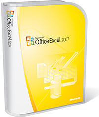
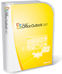
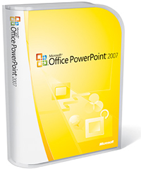
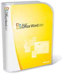

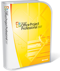
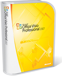
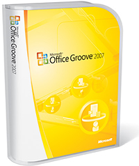
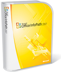
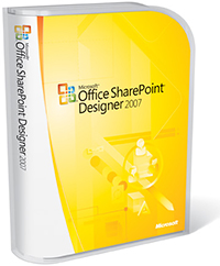

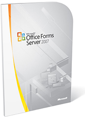
Interesting how the ‘pro’ applications have a darker swoosh gradient, and server applications have a (very) thin-footprint casing. Server administrators must have very little shelf-spacing these days.
Head over to the Microsoft PressPass Product Boxshots image gallery to see them in full 320dpi fidelity. (Click through the alphabets at the top)
You forgot Home & Student and Ultimate.
I wonder how long before Harvey Norman stocks Office Forms Server.
I like the new designs very much. Office is just a dream from a design perspective, where Vista is hell 😉
mmm…Yummy
Publisher is the forgotten child as an app.
i have to say, originally, i liked these, but then when i went to the store and saw them in person, i was utterly confused. they all looked the same, their should be some color difference between them with some graphic element, instead of the ghosted graphic element.