Last week, Microsoft has released another silent update to the official Windows Vista User Experience Guidelines on MSDN. The guide which serves as Microsoft’s equivalent to Apple’s Human Interface Guidelines, provides developers and designers with a set of basic principles and suggestions to make the user experience in Windows applications more consistent and user-friendly.
Only if every developer, or even if every Microsoft developer would read this, then the world would be a better place.
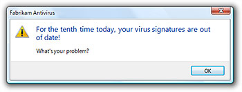 Microsoft has always published guidelines alongside Windows releases to ensure consistency across the continuously updated interface (ex. Windows 2000/98 and Windows XP), but the Vista guidelines are more accessible through the web and easier to understand with less technical-jargon and more human-speak.
The February update is the first update since the launch of Windows Vista from the last major update in December. This update adds an enormous amount of material to the guidelines and expands on topics that were either not covered or lightly covered before.
New content topics cover toolbars, warnings, confirmations, icons, sounds and software branding. The following is a highlight of what can be found in this update.
Icons guideline
![]()
“Three-dimensional objects are represented in perspective as solid objects seen from a low birds-eye view with two vanishing points.”
![]()
“Create concept sketches. Try out the concept in different sizes. Render in 3D if necessary. Test sizes on different background colors. Evaluate icons in-context of the real UI. Produce final .ico file or other graphic resource formats.”
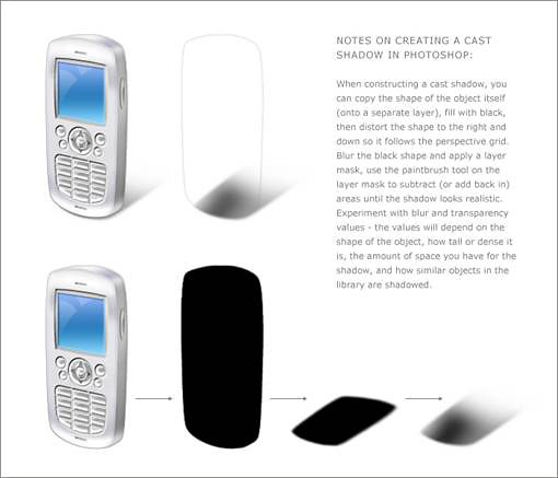
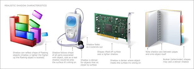
“Shadows for 3D icons are created on a case-by-case basis with an effort to fit within a range of cast distance and feathering to fully transparent. These examples help demonstrate variations that need to be created based on the shape and position of the object itself. The shadow sometimes needs to be feathered or shortened to keep it from being cropped by the icon box size.”
Warning messages guideline
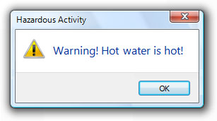
“Overwarning makes your program feel hazardous and look like it was designed by lawyers.”
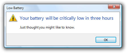
“In this case, it’s better just to warn the user in three hours.”
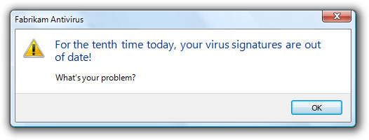
“Users are more likely to focus on getting rid of the warning than fixing the underlying problem.”
Confirmations guideline
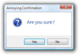
“The original annoying confirmation. This was a very bad start. If you want users to hate your program, just sprinkle confirmations like this throughout.”
Software branding guideline
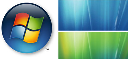
“Some primary branding elements from Windows Vista™. Primary branding elements tend to draw a lot of attention, so they should be used with restraint. Limit your use of primary branding elements to a few strategic experiences. Product-specific sounds aren’t recommended for most programs.”
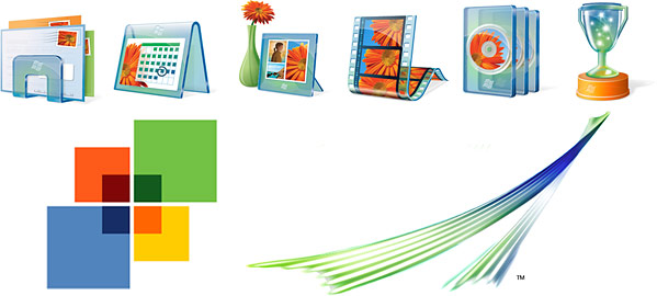
“Some secondary branding elements from Windows Vista. Secondary branding elements tend to be more subtle, and because of that, they can be used more often. While some of these secondary branding elements may not have much impact individually, when taken together they can give your product character and style. Transitions can have more impact than fixed graphics, which users learn to ignore over time. Prefer the secondary level of branding over the primary level.”

Now if only Microsoft could make them rules instead of guidelines.
Haha i like that low battery warning…
Microsoft should take a page from Mozilla’s book and allow the user to be able to check a box so that a certain dialogs doesn’t pop up again. This gives users more control than turning them ALL off or ALL on.
Dude your site is again messed up?
Notice how those app icons has a slightly lower bird eye view than Notepad, Computer, etc. Why does Micosoft breaking its own rules by using different perspective for Vista’s application icons (Calendar, Mail, Mplayer, DVD MAker)?
@ Herman Saksono
Agreed, why make guidlines that your own teams won’t follow. However, those icons do look pretty.
The different icon viewe elevations aren’t really that different. I don’t think it is noticable at all unless you actually look at both types of icons closely and even then I don’t think it matters. I have to say they did a great job with icons considering it’s so easy to know their context and meaning.
Microsoft has released their guidelines for development on Vista. The aim of this 763 page document is to ensure consistency……