Microsoft today updated two of its most popular resources, Microsoft Developer Network (MSDN) and TechNet with a fresh new look and new navigation capabilities. While changes are not groundbreaking by any aesthetics standards – the layout is nearly identical, however it does remove a share of the eye-sore across these extensive resources. But understandably there is just so much content and residue from updates stacked on updates, it will never be perfect.
There’s no denying the update brings a lot of Web 2.0 components to these sites, for example: auto-complete searches; tabs; drop-down navigation and a-hell-a-lot-of white space. But it’s not quite there. There’s no rounded corners, no extra-large input fields or even pastel colors. However, bonus brownie points for using Silverlight for the video-ticker on MSDN.
Just to put things into context, here’s a comparison between the old and the new. The “old” screenshot is not entirely accurate because it is from Archive.org, but it gives you a pretty good idea.
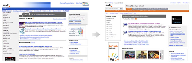
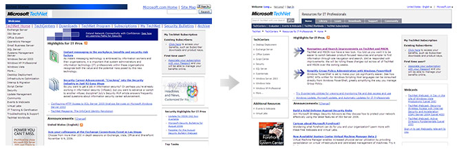
Update: Added 0.05 points for Silverlight implementation.
Those images dont work properly!
I just ran around in it, its nice to have the tabs at the top so you know where you are. With the old site you click a link and who knows how to get back to where you were later.
Now if only their forums could get a little love.
liveside.net is down. Out of disk space 🙂
Nice way to say “not enough to be 2.0”
I love your writing, sometimes 🙂
Yes, their newgroups suck the most and could do with some “renovation”.