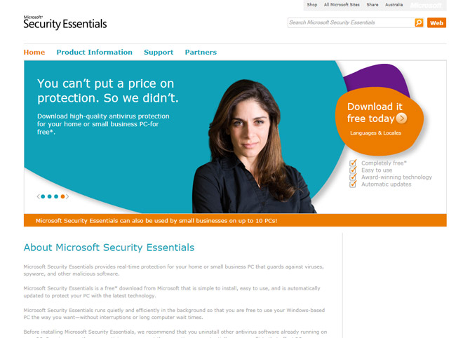
Moments ago, I tweeted that I noticed Microsoft’s Security Essentials website got a redesign and it reminded me of a corporate pharmaceutical website.
With the help of Wikipedia, I came across the website for Novartis, the world’s fifth pharmaceutical company by revenue. The similarities are uncanny. It turns out marketing drugs is not too different than anti-virus software.
Come to think of it, maybe they should give out pill-shaped USB drives loaded with the MSE installer. That would be kind of cool.
Update: This is a light-hearted post, not to be taken seriously.


Um — that’s a stretch, at best.
Umm… Sorry, but maybe it’s just me. I don’t see the similarity that you are talking about. Unless of course you consider all web pages with full width images similar to each other. 🙂
I’m not seeing it.
You might want to list the similarites. The bing search bar, ok. Nav up the top, large rotating splash image to get your attention, product details down below… white background… Looks like a standard professional design, Cisco follows the same principle. 🙂
What? Checks date again – nope, April 1st has really passed.
I think you’re really trying to push something that isn’t there…
Give me a break. Even without the disclaimer.
WOW take a chill pill everyone…Pun intended.
They are similar. In the sense that many thousands of corporate websites look similar.
I see it! Lady on the top banner looks like she might be suffering from constipation or bloating from PMS.
The resemblance to almost every other commercial website on the internet is also uncanny…
In other news Microsoft’s latest office building looks mysteriously like every other building around…
STRETCHING.
Some days it might be best to just not post, than to waste subscriber’s time on meaningless stuff like this.
The similarity is obvious: Both websites don’t show products but smiling models. It is one of the biggest mysteries of our time why Microsoft is afraid of showing real products.
It is strange that the website doesn’t look like the product or even like any other Microsoft website. Actually it doesn’t look like a software website at all. Oh and is this the Verdana font?! Really?
Seriously. What has changed inside Microsoft’s design departments? First the terrible new Microsoft.com home page and now this one…
Seriously, what’s with the lack of Metro in this design? 🙁 Likewise, the software needs updating to a Metro design, but I’m sure that’ll happen ready for Windows 8.
looks more like http://www.thebuzzinsurance.com.au at least the colours are the same, which is more than I can see between the 2 mentioned in the article
Don´t post under influence (drug).
As awesome as MSE is, sometimes i still miss OneCare. the 2.5 versions was awesome and 3.0 beta (that never got released) promised to take things even further. Such a shame.
On relation to this post. I like the new MSE site a lot. looks great and simple.