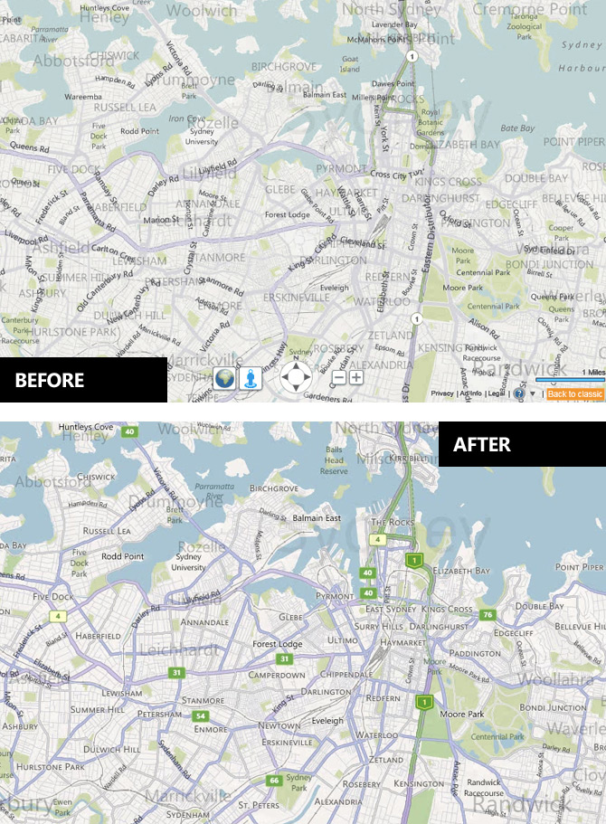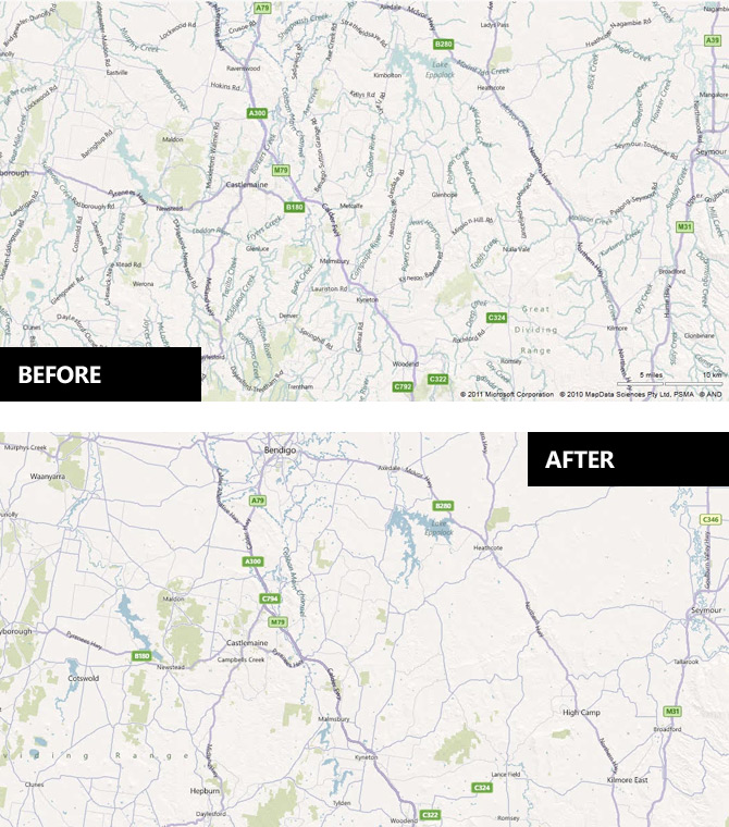
After I quite bluntly criticized the Bing Maps map style update of 2010, it’s only fair to give praise when changes for the better are made.
As LiveSide reports, Bing has begun rolling out the “July 2011 Maps Style Update” sporting more prominent borders and higher contrast colorset that addresses many of the issues I was concerned with. In addition, there’s also a much more conservative use of the transparent labels in favor of traditional solid labels to reduce clutter.
If you’re somewhat design curious, the PDF guide reveals many more subtle changes in greater depth which all adds up to a more refined look for Bing Maps.
Although the website has already been updated, it appears the mobile tileset for Windows Phone 7 has yet to be refreshed. Hopefully that will come sooner than later.
Update: The web of rivers are gone (for the better) too!

Well, I can’t share your positive view. While they have addressed the issues you mentioned they have created others.
As can be seen on page 3 of the linked PDF, the street names are less legible because of black text on top of dark street borders.
City labels are now rendered with a subtle white outline around black text which doesn’t work quite well, especially when zoomed out. Text isn’t on the pixel grid so it looks blurry. And those useful large city labels (when zoomed in) aren’t legible at all on cities with many roads, or can you see what city this is easily:
http://imageshack.us/f/820/bingjv.jpg/
Furthermore they haven’t changed the extreme ugly labels on satellite images (white and green clouds around text!). Finally, the controls could be much much better. I do miss the old option to zoom directly to a specific zoom level (for example City Level), and why the overlay control elements have to be in the same washed out colors is beyond me. They are violating their own (good) design rules. Where is that million dollar Bing blue?
The Bing team is hard at work, changes a lot of things but they don’t improve the experience that much, IMHO and sometimes they are going backward. The one single menu for view options is now gone and back is that hybrid of multiple buttons and drop-down menus — uhmp. And well, I don’t even talk about the content outside the U.S. …
The changes were great, IMO. So… why couldn’t they bring it to the UK? Why do we have to use the old map?
I think you’ll find that the changes HAVE been brought to the UK.
Progress. But I still think google did a better job on the colors and the labels.Here is a excellent post about this topic: http://herkulano.posterous.com/41latitude-google-maps-label-readability
IIRC, prior to this update, the Bing maps team was focused on making “more detail” easier to access for users, and I don’t remember if it was this blog or another blog that covered this aspect of the maps labels.
For example, the average person can find Cleveland, Ohio fairly easily. Finding the University Heights suburb of Cleveland, Ohio, though, requires a greater level of zoom in Google maps compared to Bing maps, making it harder to find for someone who doesn’t know the Cleveland area.
Looks like a minor tweaking to me. Not much improvement. I dont understand why they don’t roll out the colours that they use for the UK maps.
Man, bring back the rivers! Handy for those of us who actually want to see what’s about, not just roads.
Heck, include topo data as well!