In contrast to the ever-so-slight tweak of angle on the Microsoft logo late last year, Daniel C. Young, a graphics designer at the Art Center College of Design has imagined what a much more radical Microsoft rebranding could look like.
 Although the project appears to be entirely speculative. Unlike the recent HP rebranding exercise which was actually commissioned by HP but not executed upon, this is just Daniel playing with an idea, an interesting one at that – an logo and colors generated purely by algorithms.
Microsoft’s focus and leadership on natural user interfaces seems to be the main source of inspiration for his concept as he explain,
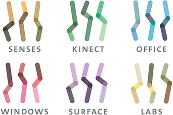
Generative logo and transmedia campaign for Microsoft Reimagined, a creative vision for Microsoft to lead innovation in natural user interface (NUI) computing through research and open collaboration with the art, science, and design communities. The identity system can generate infinite variations and unique color palettes for each of Microsoft’s product line.
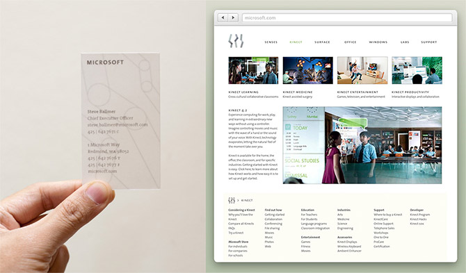
Daniel’s portfolio contains a range of mockups demonstrating the applications of the concept in both print and digital. There’s even a nice website mockup of a Kinect information page. For a design concept, this is quite comprehensive and quality work.
No doubts there are many practical issues with this idea, notably it’s generative nature leads to a very ambiguous logo without the wordmark, but it’s worth admiring the effort to think outside the box. Due to the tangible and intangible costs of rebranding for modern corporations, it’s unlikely Microsoft will ever change as radical as this which makes it more fun to dream.
Can’t express how much I hated this design
Those “joint” logos are not strong enough to be marketable, but for an internal cohesive identity, they seem a nice fit.
I do like the idea of a brand identity which is strong and iconic, but Microsoft do not sell themselves, instead they sell products.
The concept is nice, but I don’t see how it truly reflects Microsoft. What do the three strokes represent, how do they tie in with the logotype? Will the customer be able to instantly recognise and differentiate the branding for each of the product examples given like consumers already do with the existing logos?
I can’t help but feel the concept was developed first, then the re-branding an afterthought.
The six different marks together look good, but the logotype doesn’t work well, and I can’t say I like the business card or website mock-up at all. The logo really gets lost at this point.
Not bad for a concept, but I feel this logo in it’s current form could be slapped on to any company.
Its an identity waiting for a suitable owner…
I agree with Mick. It looks like a fine logo in general, but that’s just it. It’s too generic. It doesn’t have anything to do with Microsoft. And there are no applications of the logo on any current products, which would have helped to possibly tie it to the company. I also keep trying to see an “M” in the three strokes but am left feeling like they’re just three random lines.
And what annoyed me the most: If you’re going to show off an attempt to rebrand Microsoft, the very least you can do, if you’re not going to slap it on an existing product, is to develop it or show it on Windows rather than the very obvious OS X in the background of some of the shots of the video.
Personally, I’m a big fan of the Metro style that MS has been using to rebrand with.
I can’t tell them apart beside the colours does make sense.
Maybe it’s just my dirty mind, they all like doing each other in diff positions…
Interesting but reminds too much of ancient runes and is not as recognizable as the awesome generative new MIT Media Lab logo:
Prefer the MIT one to any of the MS ones. But it would be cool if he used colored tiles, which would have picked up on the Metro theming.
we… I guess if microsoft would do something like that they would be called up on just copying good ideas from other people yet again. MIT did this ages ago.
The logos look meaningless to me.
This is really annoying. This feels like an attempt to just slap an Apple look alike template. This doesn’t in any way feature any of the designs that MS is using on future products and holy smokes look at all that white space. MS has gone through alot of trouble to minimize it’s carbon footprint as a corporation and all that white space would just poop all over that.
Just dreadful.
I’m sorry but the sticks are awful. Looks like it’s been designed by a 5 year old. It says nothing at all.
I don’t agree that this is an attempt to make it Apple-like, if that were so it these would exhibit a more fined quality. Have to say I find these hard to distinguish apart from one another and quite lacking aesthetically. Doubt Microsoft would adopt them.
OMG, this concept is horrible!! the site mockup looks awful! the business card is the most generic one i’ve seen in year.
-graphics designer
These are all around terrible logos. Their only saving grace is that they were generated by an algorithm. Nothing wrong with thinking outside the box, though.
The logo is very sweet
I don’t think Microsoft would over consider using this because:
1) they are designed on a Mac and you know how everyone is: “Microsoft’s own logo was made on a MAC!!”
2) They are horrible
And reminds me very much of the Valve ‘Steam Powered’ logo…
Agree; It looks terrible. They don’t seem to represent anything Microsoft at all. What the heck is ‘Senses’ anyway?
Plus, the colors won’t make much a difference when printed in greyscale. It wouldn’t translate well if printed in black and white. Who’s going to remember specific bends when they’re trying to guess? It barely resembles an ‘M’ if that’s what the video was indicating. I like the HP rebrand design thingy, because even though the ‘h’ and ‘p’ aren’t exactly complete, they can be better inferred.
There needs to be a better rebrand and Microsoft logo.