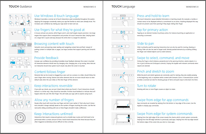
Since Metro-style applications for Windows 8 should all have a touch-first experience, Microsoft has recently released a brief but useful “Windows 8 Touch Guidance” documentation on how developers should think about touch in their applications.
The four-page PDF touches (pun) on some interesting touch characteristics of Windows 8 – including but not limited to drag-down/up for select/deselect, semantic zoom and panning and swipe from edge.
The document also establishes some useful guidelines on content and interactive element placements for different grip positions – landscape and portrait, and positions – one hand, two hand, rested on surface or on stand. Through user research, Microsoft has also found a 7x7mm touch target optimal for the average index finger width of 11mm.
If you’re designing or developing a Metro-style app for Windows 8, make sure to add this document to your required reading list.

Swiping down “Lets you **dock** or close apps”….? Hmmm….
Dock = snap application to the side for multitasking.
It took Android a very long time to realize that Press & Hold is a very poor paradigm for touch, and its not easily discoverable by non-technical users. I have a feeling in a couple years they will be releasing guidance to avoid this gesture, I honestly never use this in my apps. I am actually kind of shocked to even see it there as guidance, in fact they should be advising to use it cautiously or not at all much like Apple does, they do use rather confusing verbage saying it should not demonstrate any particular action and offer that it should used for information. I anticipate this to be severely overused as most Windows developers love their right click menus, and on touch thats a simple Press & Hold!
On the contrary, I think press & hold actually works quite well on Windows Phone. IMHO, it is almost expected from the application to have some sort of context menu when the screen element has the on-tap-“tilt” effect. Perhaps it isn’t easily discoverable, but works way better than any other context menu option (application bar or additional buttons). It also reduces screen clutter, which is always a good thing to have a “clean” look.
It’s quite clearly stated in the document (and in the various BUILD sessions) that timed interactions should be avoided and that press and hold, if absolutely necessary, should only be used to display tooltips and not prevent panning or moving.