Windows Vista system sounds

When Robert Fripp worked his magic on Windows Vista, everyone knew Vista is going to sound different and hopefully better. Now that Vista is literally peeking around the corner, not that it’s possible for a software to peek or even exist in the physical world, but if it were able to peek, what would it sound like? And how different would it sound to XP?

James Senior tried to help, but he was no avail. And that’s why I spent my entire evening (just kidding), half my evening coming up with this head-to-head comparison between Windows Vista’s system sounds and Windows XP’s. And only when you put them side-by-side, you can compare and judge which ones are better. You’ll hear sounds changed entirely, and even sounds barely changed at all. Although the sounds for speech recognition were not included since there were no comparisons in XP.

It is extremely interesting to note that all XP sounds were encoded at 352kbps, and Vista sounds encoded in 1411kbps. That’s 4 times the quality. And you’ll also notice the Vista sounds are all equalized at a lower volume than the XP counterparts, making them less annoying when you have your speakers turned up high. As well as, nearly every Vista sound is shorter than the XP version.

Have a listen for yourself.

[flv:vistasounds.flv 640 480]

I personally prefer the XP logon and logoff sounds.

Update: Microsoft’s Jim Allchin has more details about the Vista sounds (via Windows Now).
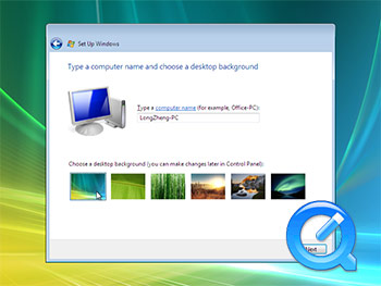
Windows Vista installation screencast

Has all the Release-To-Manufacturing news left you urging to install Windows Vista? Studies conducted by the Hanso Foundation show these kinds of urges are normal and you can do all sorts of things to satisfy these urges. But the best way, as recommended by Long Zheng; a mysterious but recognized professional, is to watch this screencast showing you exactly how Vista installs in under 3 minutes.

Note: This video has been edited for your enjoyment (if that is in any way possible). This does not accurately reflect Vista’s installation time. If you think otherwise, please seek immediate medical attention.

Windows Vista installation screencast
Click image to view video (H.264, 2:53min)

View the alternative Soapbox Flash version if you don’t mind blurriness.

Where’s Mr. Inconsistency

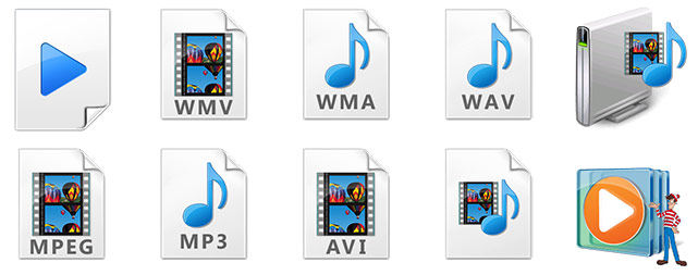
Windows Media Player in Vista inconsistency

Blue, blue, blue, blue, blue, blue, blue, blue, blue, orange! This has me stumped. Also note the upside down page.

If they changed all of the icons, great. If they changed none of the icons, great. But don’t just change one icon.

Update: I must admit they’re all great icons. They’re extremely detailed and are great to look at in their full resolution. But I just can’t draw the connection between a predominantly blue application (default WMP skin is colored blue) with a predominantly orange icon. Obviously the WMP icon has to change since its a Windows branded application, but maybe the file-type icons needs a hue adjustment to match the new cyan?

Microsoft releases barely visible logos

Update: Microsoft has now updated the Windows Vista logo to a higher resolution. But screws up the Office 2007 logos.

Microsoft is following in Paul Thurrott‘s footsteps of quality preservation, and has released some new logos to their image gallery, showcasing the adverse effects of image compression even better than YouTube videos taken with a camera phone.

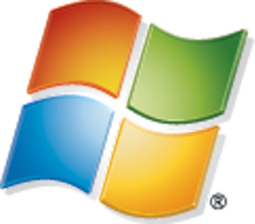
Microsoft logo low quality

It’s even hard to tell if this logo is registered or not. What’s that blurry spot in the bottom right corner? This comes from a portion of the “Windows Horizontal” 320DPI TIF logo at 100% without scaling. The 72DPI JPG doesn’t even load.The 72DPI version has been uploaded, but are tiny. And Microsoft expects publishers to use this in print? I think someone just took the 72DPI version and scaled it up with Paint.

But for the sake of not being sued, Microsoft, Windows and the (barely visible) Windows logo are either registered trademarks or trademarks of Microsoft Corporation in the United States and/or other countries.

Update: Upon further investigation, all the post-XP era logos have the same low quality 320DPI version. Only the XP logos are crystal clear in 320DPI.

Why tablet PCs rock for presentations

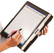
Man holding Tablet PCI’ve had my tablet PC for over half a year now, and apart from the few things you can do with it; like drawing little stick figure men on top of your lecture notes, I’ve found it comes in pretty handy when you have to do an oral presentation.

In the past, oral presentations has always included a deck of cue cards and sometimes large pieces of A4 paper that you would juggle in your hands and sometimes ‘accidentally’ drop all over the floor so you can buy more time, hoping the recess bell could come at least 30 minutes earlier. But with a tablet PC, you can doodle your problems away. Of course, having a $3000 machine also means you’ll want to hold onto it firmly, but if you do happen to drop it, I can promise you it’ll buy you lots of time and grief.

Here are some of the reasons for using a tablet when giving a presentation:

  • Unlimited pages – Don’t be limited by the amount of forests you have in your country. You can give a 5 minute presentation, or a 50 minute presentation. No matter how much material you have, you’ll be sure you can fit it all in the palm of your hands, elbow and arm.
  • Easy to navigate – All tablets have ‘tablet buttons’ on the side of display panels, so you can easily scroll up and down pages without touching the keyboard or mousepad.
  • Easy to view – Whether you like your fonts big, colored red or white on black, you can customize your notes to whatever you’re comfortable with.
  • Lit screen – Ever presented in a hall as well lit as the bottom of your bed? In fact. You can even turn off the room’s lighting entirely, so your Powerpoint can look great on the projector. Whether you like it bright or dim, you have control over the brightness of your screen.
  • Better than text – Put in videos, diagrams, artwork to help you remember and regurgitate information. You can even play a YouTube video beside your notes if you want. And even better, turn the screen around so everyone can see.
  • Portable – On the moon, which weighs more, a tablet PC or a piece of paper? Well if you’re on the moon, I don’t think you’d care. But on Earth, you can hold a tablet in one arm with ease. Just remember to detach any accessories like additional battery packs to save weight, and your arm.
  • Cool factor – It looks cool. And you’ll probably score a few extra marks.
  • Network projector – Using Windows VIsta, you can control a projector wirelessly giving you greater control of presentation. You’ll never have to look behind to see if you’re on the right slide or not, and even annotate your slides as you progress. Why? Because you can.

Of course, the only thing stopping students from accessing such a great learning device is the $1000 ‘tablet markup’. Maybe someday tablet PC manufacturers will stop being greedy and recognize they can increase profit by selling more units. There’s a thought.

Here’s a few tips for those who wants to present with a tablet PC:

  • Turn off screen savers – You wouldn’t want your screen blacking out during a presentation. Remember to disable screensavers and monitor energy saving features before you present.
  • Use the Reading tool in Microsoft Office Word – Not so handy on the desktop, but great for presentations. You can format your entire document with larger font sizes using a few clicks. And it will scroll entire pages so you won’t get lost with where the typing cursor is.