Dude, where’s my Aero Diamond?

Aero
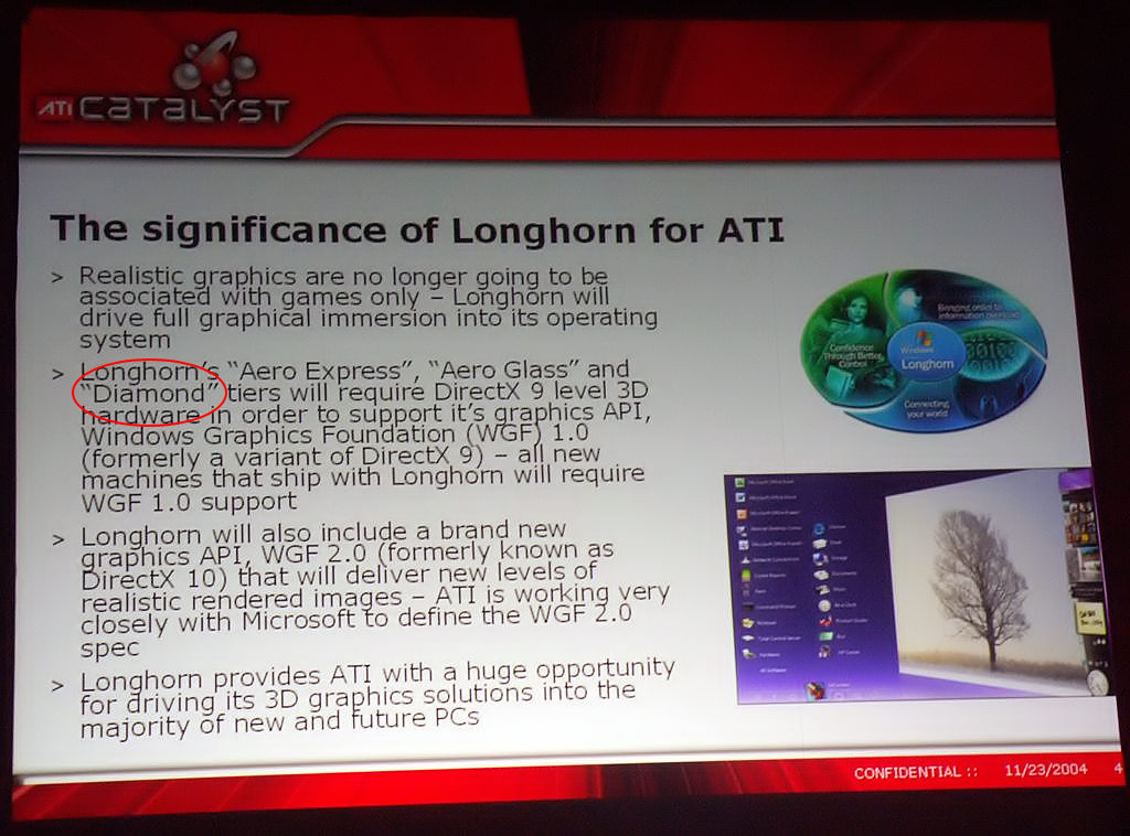
Ever since its first public appearance in an ATI presentation slide back in 2004, Aero Diamond has been the gossip of many Vista communities. It has led to many rumors surrounding its existence; some believe it has been canceled, some believe it is a secret Vista theme in development, some believe it is a vector version of Aero Glass and some believe it is just the codename for the Media Center UI. With Vista launching right around the corner, what is rap on this mysterious UX (user experience) project?

What is it?

At first, Aero Diamond was believed to be the codename for the visual style theme for Windows Vista Media Center Edition. However since both Media Centre and Tablet PC were later integrated into Windows Vista as extensions (as opposed to versions), it would be inconsistent for Microsoft to create an individual theme for Media Center alone.

Later, another speculation arose from several Microsoft published documents detailing the different tiers of the Aero experience, one of which was labeled “Aero Diamond”. Aero Diamond was suppose to offer a better user experience compared the now prominent Aero Glass experience, although since no visual imagery of it has been ever released, no one knows what it aimed to achieve or may have looked like.

XP and Luna

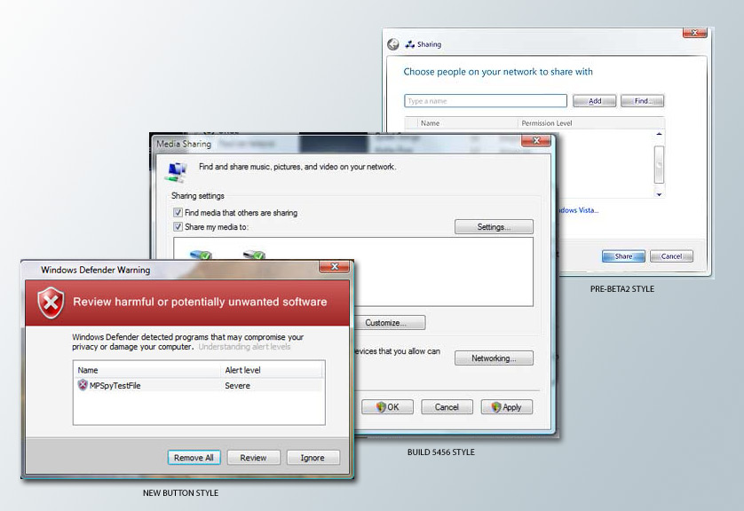
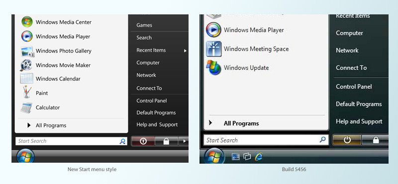
There has been a lot of comparisons made between Aero Diamond and Luna as evidence to suggest it is possible for Microsoft to be secretly developing a theme for Vista. During the development of Windows XP, a ‘cover-up’ theme (we now know as Watercolor) was used in the beta testing phase. This theme was believed by many to be the final XP theme. And only in the last few public betas did Microsoft reveal the Luna theme to the public.

The ‘Luna story’ is significant because it shows Microsoft’s ability and tactics to secretively develop an alternative visual style without public awareness, changing user experience or delaying development schedules. Many argue this tactic can be also applied to Aero Diamond, as a theme currently in development and secrecy limited to only the few people designing it.

Whilst it is easy to apply the Luna story to Aero Diamond, there is one significant factor that it does not take into consideration. During the development XP, the public was unaware of any other themes in development and thus did not speculate or question Microsoft on the matter. However this time around, the public is aware and questions Microsoft about it, and time after time, official Microsoft sources has confirmed Aero Diamond has been vaporised. Whether or not these official sources are telling the truth or trying to redirect attention remains another question.

The Vista UX

The future of Aero Diamond looks bleak. It will be highly unlikely for Aero Diamond to make an appearance in Windows Vista. With so much effort being put into Aero Glass, even if Aero Diamond was being worked on, the development schedule will not accommodate for the public testing of Aero Diamond if Vista is still slated for release in January 2007. Having said that, there is still hope. The initiative to create a ‘better’ user experience in the first place will continue even if the visual style has been abolished. And since we’re still in the beta phase, Aero Glass can still change. With already some of those changes taking place, Aero Glass itself can transform into an extremely polished and usable visual style.

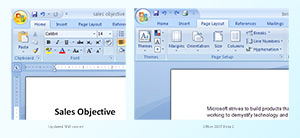
I have no doubts that Microsoft is ‘design-capable’. Microsoft Design proves it. This team of talented designers has created some very appealing user experiences such as those found in Office 2007, Windows Live, XBOX 360 and even Microsoft Hardwares. With all the constraints and technical limitations placed around them, I am confident that Aero Glass and the whole Windows Vista user experience will match or even supersede today’s UX standards.

Ready, set, boost.

This post has been modified heavily due to an error in the research of bandwidth speeds.

If there’s one performance feature of Windows Vista that is actually tangible to the end-user, it’s ReadyBoost. ReadyBoost allows users to increase their system memory without the need to add conventional RAM sticks, instead, users can use removable USB flash drives to act as a temporary (or permanent) memory source.

Currently, system memory is divided into two sources. One source resides is the physical memory (RAM sticks), and the other is the pagefile. Of course the more physical memory you had the better, it can greatly improve performance and reduce effects of ‘disk thrashing’. ‘Disk thrashing’ is the result of physical memory, forcing Windows to store temporary data on the hard drive. The hard drive has no where near the speed of RAM, but offers much more storage capacity at a cheaper cost.

ReadyBoost tackles the memory problem by offering a balanced solution between speed and price. Users can plug in cheap and readily available USB flash drives externally to quickly expand their system memory capacity. Any data stored on the device is also encrypted, offering security on the data stored if the device happens to be forcibly removed. ReadyBoost devices can also be ‘hot unplugged’, removed without prior system notification. It is smart enough not to store any system critical data that might cause unexpected system failures if removed.

Conceptually, ReadyBoost is not only limited to USB flash drives. Brandon LeBlanc reports Jim Allchin had a concept of using the ReadyBoost technology across the network, allowing computers to utilize memory from other (presumably idle) computers on the same network. This demonstrates the capability and potential for ReadyBoost.

But the big question is, how much of a performance difference can it make?

SATA150 currently offers a maximum bandwidth capacity of 1.5Gb/s, and SATA’s second revision SATAII offers a capacity of 3.0Gb/s. When compared to the USB2’s maximum bandwidth of 480Mb/s, SATAII has a clear advantage. If you compare actual write speeds as well, you would find USB flash drives would also lose out to SATAII-based hard drives. So how could ReadyBoost possibly provide any performance boosts? Well there’s one important difference between hard drives and USB flash memory when it comes to sequential access. Whilst hard drives may be great for reading and writing gigabyte-sized files, once you start randomly seeking smaller pieces of non-sequential data across the entire platter, the seek time can greatly influence the read performance. Therefore, if you place a smaller cache on a more responsive device like USB flash memory, and use that cache optimally, there would be a small performance gain.

Not only is ReadyBoost is going to be a great opportunity for consumers, but also hardware manufacturers. With already flash memory at record-low prices thanks to Apple’s iPod-nano, expect even cheaper and faster memory devices in the near future with manufacturers aiming to tap into this unexploited market of expandable external memory.

Now’s the time to buy an SUV

Well you’d think marketers would have problems selling the most fuel-consuming passenger vehicles in the world when oil prices has almost doubled in a year, but apparently, they’ve got it all figured out.

My friend Tom spotted this banner on MSN, but it isn’t displayed today. However being hosted on the MSN servers proves it is legitimate.

MSN SUV ad

Remember, the bigger the car, the bigger the savings! I personally wouldn’t worry about the price of running these beasts, I mean think about it, these are once in a lifetime opportunities. You’d be stupid to miss out.

Firefox with new Vista Basic theme

Ever wanted to see what the Windows Vista Basic theme would look like on a third party (non-Vista) application, like Firefox? Well I’ve got a screenshot!

Firefox on Vista Basic

Surprisingly, Firefox looks pretty cool on the Vista Basic theme. The light glossy light blue toolbars fits in well with the blue border that is predominant in this theme. Also because of the icons are in PNG format, they adapt to the new color scheme extremely well.

Found it on Ahish Shetty‘s blog. What is probably more interesting is that he posted this screenshot on June 24th. And only around July 5th, did Brandon LeBlanc find proof of this new Vista theme.

Updated Office 2007 ‘NW corner’ UI

Updated Office 'NW corner'
Images: (Left: Microsoft Design) (Right: Office UI Blog)

Jensen Harris, part of the Office UI team, has been talking about updating the ‘north-west corner’ of the Office 2007 design to better suit the glass frame in Vista.

This screenshot shows the potential changes they’ve made to the ‘NW corner’. The circle has been made smaller, includes the slightly updated Office logo, as well as by default on hover, shines with a golden background. The “Quick Access Toolbar” also sports a new border. Also subtly, in full screen mode the application no longer has a rounded off corner on the top-left.

Update 1:

Jensen Harris tells me the screenshot is from an interim build, and not all of the changes has been implemented. Also, the golden orb color is not the default state, but however the hover state.

Update 2:

Office themes
Szajd also pointed out that there was a popup image of the three updated Office colour themes that I’ve missed. Thanks for catching those Szajd!

The new silver theme looks awesome. I personally found the black theme to be too dark for personal likings, so the silver would fit in nicely. Also, the default state of the new Office orb is depicted.

New Vista UI updates & Office icons

New taskbar style

New Vista taskbar style
Image: (Top: Winsupersite) (Bottom: Microsoft Design)

The new taskbar is a thinner and has a far more transparent background. The application buttons are thinner and wider, with a faint white border. The ‘hover’ state sports a trendy blue gradient button that reminds me of the new Vista Media Center style, also the Live Preview no longer reports the name of the application on top. Overall, a subtle change over the current design, but makes the taskbar more aesthetically pleasing and cleaner. Also on a side note, there are two new icons on in the Quick Launch bar, Show Desktop (left) and Flip 3D (right).

New button styles

New Vista button styles
Image: (Left: Microsoft Vista) (Middle: Winsupersite)

It has a softer border with some outer shadows, as well as a lighter gradient on the back. The default select state has a cool blue inner glow. It is another subtle change, but makes the buttons far more attractive than before.

Updated start menu style

New Start menu style
Image: (Left: Microsoft Design) (Right: Winsupersite)

The differences here is pretty big. The text is a lot smaller, thus allowing them to fit more into less space, as seen on the right. Also the search bar is thinner with a dropdown-enabled search icon. The power icon has been changed, and background changed to red. Also, various application’s icons has been updated.

New Office 2007 icons

New Office 2007 icons
Image: (Microsoft Design)

Color-coded glossy icons with a curved edge on the top left, featuring fairly recognizable icons for each of the products. A nice move away from the big square we have today.

If this is a sign of whats to come in Vista RC1, then I’m extremely enthusiastic about how polished it may be!

Updated Office 'NW corner'
Also check out: Updated Office ‘north-west’ corner UI.