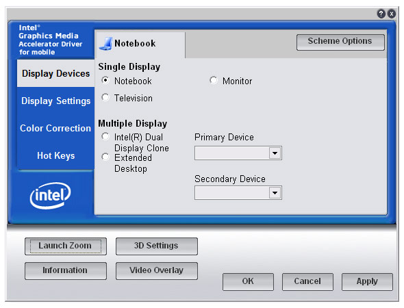
For at least the last 3 years, Intel has kept the same old ugly control panel interface for its integrated graphics card drivers. Being an OEM, naturally the software interface does not utilize the operating system’s UI controls, instead replaced by a branded interface that looks extremely repulsive to use. Open suggestion to Intel, if you’re going to skin an application, at least do it right.
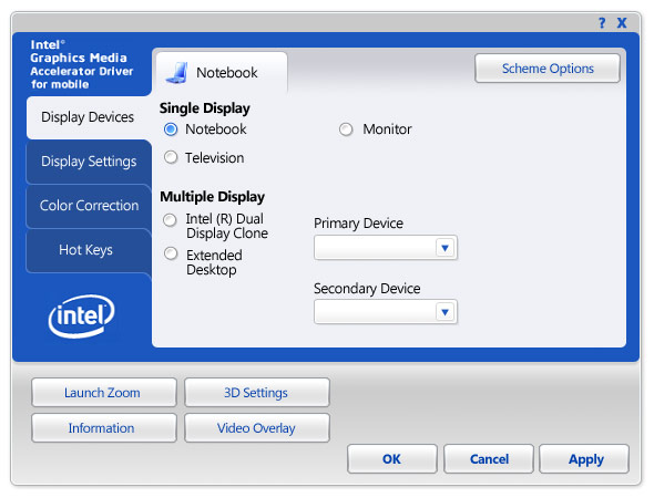
I mean it took me just a little over an hour of effort to transform your repulsive interface into something I find a little more pleasing without touching any of your branding elements. I’m sure you paid someone a good deal amount of money to do it. Money well wasted.

Original Intel graphics control panel UI

Conceptual Intel graphics control panel UI
What do you guys think?
Awsome 🙂 Although the JPEG compression is a bit high…
This is what happens when they let developers handle the GUI as well.
No offense, but I find hardly any difference. Sure, the shading is different in yours, but everything is exactly in the same place, and IMHO it’s not an improvement, it’s only different.
I would have lined up the three option buttons for the Single Display into a single column, so they are closely spaced. No need to drag the mouse three inches to change from one to the other. I would have used list boxes instead of dropdowns for the primary and secondary device selectors under Multiple Display. I probably would do something different with the four stray buttons above and to the left of the OK button.
I agree the GUI en-masse could go for an overhaul, but for ‘Vista-ing’ it up, you did an excellent job.
This thing is so ugly it’s just embarrassing at big conferences, where I’ve seen presenters fuddle with it.
I think that’s amazing! Your4 fonts are so smoothes, and soft. And I love the little buttons beside notebook, etc, etc. I hate how they had the blue part bevelled (barf) you fixed that right up. And you round the edges.. i need your skills.
@Jon Peltier: I didn’t want to change the layout because that would be an unfair comparison between mine and Intel’s. I just want to show what a few button styles and colours could improve the look and feel of an application.
Long Zheng:
Fair enough. To me your version doesn’t look any more functional (which it isn’t), but maybe it looks more modern, less 90’s.
And I admit I have been known to fix up userforms in projects I’ve taken over from someone else, though usually I do more to the layout than the styling.
@Jon: Yeah. This was a “prettying up” exercise. Usability is a another question. 😛
I don’t like reinvention of the GUI a hundered times.
To have a consistent interface developers of such big companies should have to use “original” Windows GUI-Elements. It just don’t make sense to skin every app like it was Winamp & Co.
oh yee!:) send this to intel:)
Just removing the big puffy blue bevels makes a big difference.
Did you edit this with only graphic tools? No programming?
I am just beginning with Visual Basic .NET (for school), and was wondering how you could ‘skin’ the toolboxes and controls….
If you could post a snippit of code showing how to skin a textbox, for example, I would **greatly** appreciate it!!
You know, if the books I am using for the class, M$ says that programs *should* look as ugly as Intel’s…
Are the guidelines for Vista *that* different?
@Benjamin: It was a Photoshop edit. No code editing or ‘skinning’.