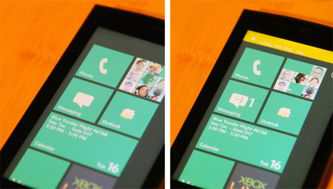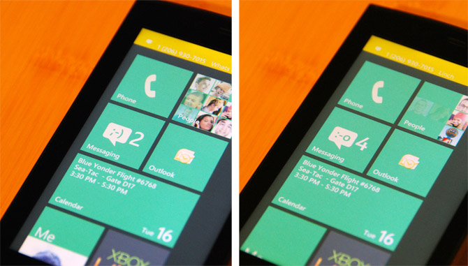
As a great example Microsoft is still tweaking and crafting the Windows Phone 7 Series experience, a couple of new subtle yet “delightful” UI features was actually added to the build of the OS they’re showing off this week at the MIX10 conference.
The first of which in case some people are not very good at “spot the difference” and haven’t noticed what you’re suppose to be looking at is the new “Messaging” tile which has an emoticon that appears when you receive a new message. If that wasn’t delightful enough, it also changes as you receive more text messages – from a smile to a wink to a gasp.

Of course this demo build changes the emoticon with quite a small margin and this will be padded out in the final release, although I’m sure heavy SMS users will trigger all of the emoticons without a sweat.

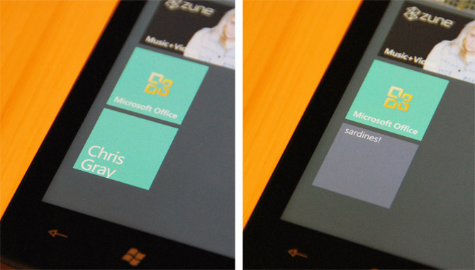
The other change that has been implemented is “tile flipping”. Best illustrated with an example, tiles like a contact pinned to the Start screen will at times flip on its back like a card to reveal messages which in this demo is a Facebook status update.
I think this is a great idea to bring even more “life” into the already “live tiles” that exposes highly contextual information from services like a social network without any input or effort from the user. Delightful indeed.
It seems they are putting a lot of work into it, and although it looks great, I just can’t agree with the copy/paste, multitask, lock-in path they took.
It would make me look too much of a hypocrite if I went out and got a Windows Mobile 7 phone 😉
The mail icon has been replaced by the outlook icon which dosen’t look as great
That’s not even the new (2010) icon, where as the office icon is.
I’m guessing its just a placeholder
I know right!
I mentioned that on another website. It looks so out of place. They better change it back to the original white envelope they showed earlier…
I agree, they should at least create a new set of MS Office Icons that look like the symbols in Windows Mobile 7, meaning, only using white color like the phone icon or the original mail icon.
So that includes redesigning the out-out-place-looking Microsoft Office icon in the 5th and 6th screenshot.
it doesnt look even close to being an office logo
@thenonhacker: MS redoing the Office 2010 icons which they’ve already shown for awhile? Yeah, right. Very unlikely. Unlike Windows Phone 7 Series, Office has been a pretty powerful brand for quite a long time, and sadly, I doubt they’ll change their icons just to resemble and stay consistent with the Metro UI.
Also, many people usually identify Office programs by their colorful distinguishable icons on the desktop.
At best, I think they should just replace it back with the old white envelope, rename the whole thing ‘Mail’ and just let it direct the user to the Outlook app.
it is so out of place. That would make me not buy the phone…
@Quikboy: I have another idea. Notice that XBox Live is not using the accent color (green) as its background. Instead, it uses a dark gray background. MS Office Icons, and other colorful icons, should make use of dark gray backgrounds!
What’s the yellow bar at the top? I don’t remember seeing it before on the Start screen.
looks like a notification.
The flipping idea seems to be lifted from OS X’s flippable dashboard widgets.
Which is a idea lifted from… paper 2.0 😉
Really? I thought flipping idea originally came from the Playing Cards Matching Game in Super Mario Bros. 3?
New “disappointment” is WP7S won’t support cut and paste at least for now. Gosh they’re trying their best to copy iPhone.
They are copying the iPhone at least for now.
They still use a different font on the Start screen! Take a look at the number “2” or the text inside the calendar tile. That’s not Segoe or Zegoe. Is it the default font from Silverlight? Maybe. Well, for me it is a bit disappointing that they didn’t even use the right font on the shown builts while the whole UI is heavily based on the beautiful Segoe font family.
I also don’t like the grey background of the Start screen. It looks like the display would have terrible contrasts. Hopefully they will add a nice gradient to the background like in the Zune software. Could be even helpful to show where you are in the list of tiles: at the top or bottom.
Missing animations for pressed tiles, unreadable yellow notifications, yellow Office icon on yellow tiles? Well… still a lot to do. 🙂
Loooks Coool.! – Any idea..If Microsoft is gonna make the Windows Mobile 7 (Developer Phone) available online to shop for app developers? – Pretty much similar to that of Google Dev phone!
Cheers’
Vijay
Interesting: They developed a completely new font family for the phone OS called “Segoe WP”
http://yfrog.com/02segoewpj
Can you please upload the font somewhere? I would be really grateful. Thanks!
The font is part of the developer tools from Microsoft. You can get them from here for free:
http://developer.windowsphone.com/windows-phone-7-series/
… now, before you get any ideas, the A Team is watching.
I love my HD7 Phone, my only concern is that I can’t send the videos I record. It uploads to my Zune account, but never gives me an option to download so I can send in an email. Nor can you send it in a mms text from the phone, I think with all the tech out into this phone that should’ve been a given. Any ideas on how I can fix this problem????