As anyone who uses an ultra-portable laptop would know, reading ultra-minimalistic weblogs with 9px-sized fonts on a high-resolution 1400×1050 display panel spanning an entire 12″ is like an everyday blessing for eye-care companies. Now’s a good time to invest in the laser eye surgery business.
Whilst desktop monitors has always maintained the adequately readable 96 DPI standard with LCD displays, pixel-density on laptops has reached as high as 144 DPI, and that means smaller interfaces and fonts. But who doesn’t want more pixels? The more pixels, the clearer the image.
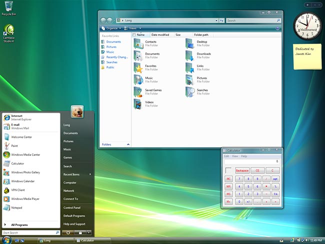
 Windows Vista aims to reduce the negative effects of high-DPI displays by introducing an updated DPI-scaling engine for the desktop compositor. This allows icons, interfaces and text to be scaled bigger to compensate for the extra pixels. In theory, everything should look just as crisp and detailed compared to the default 96 DPI. But in practice, due to lack of vectorized interface elements and icons, it’s not perfect. So exactly how good does it look? I’ve put together this comparison to show you exactly that.
Hover over the links to change the image.
Please note: the images may take short while to appear due to the high quality and large file sizes.
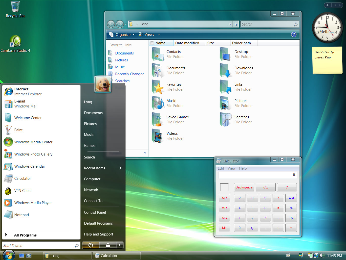
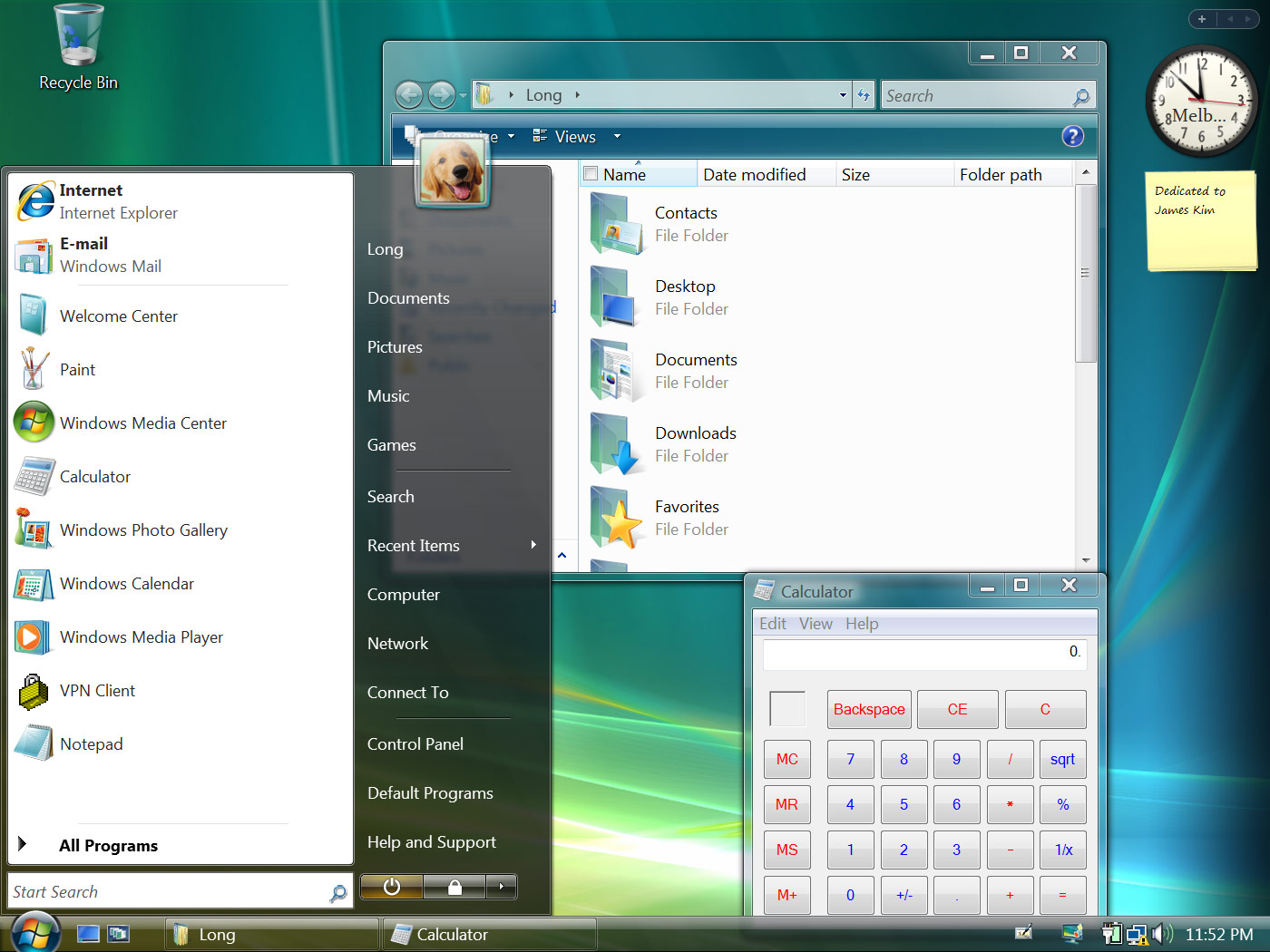
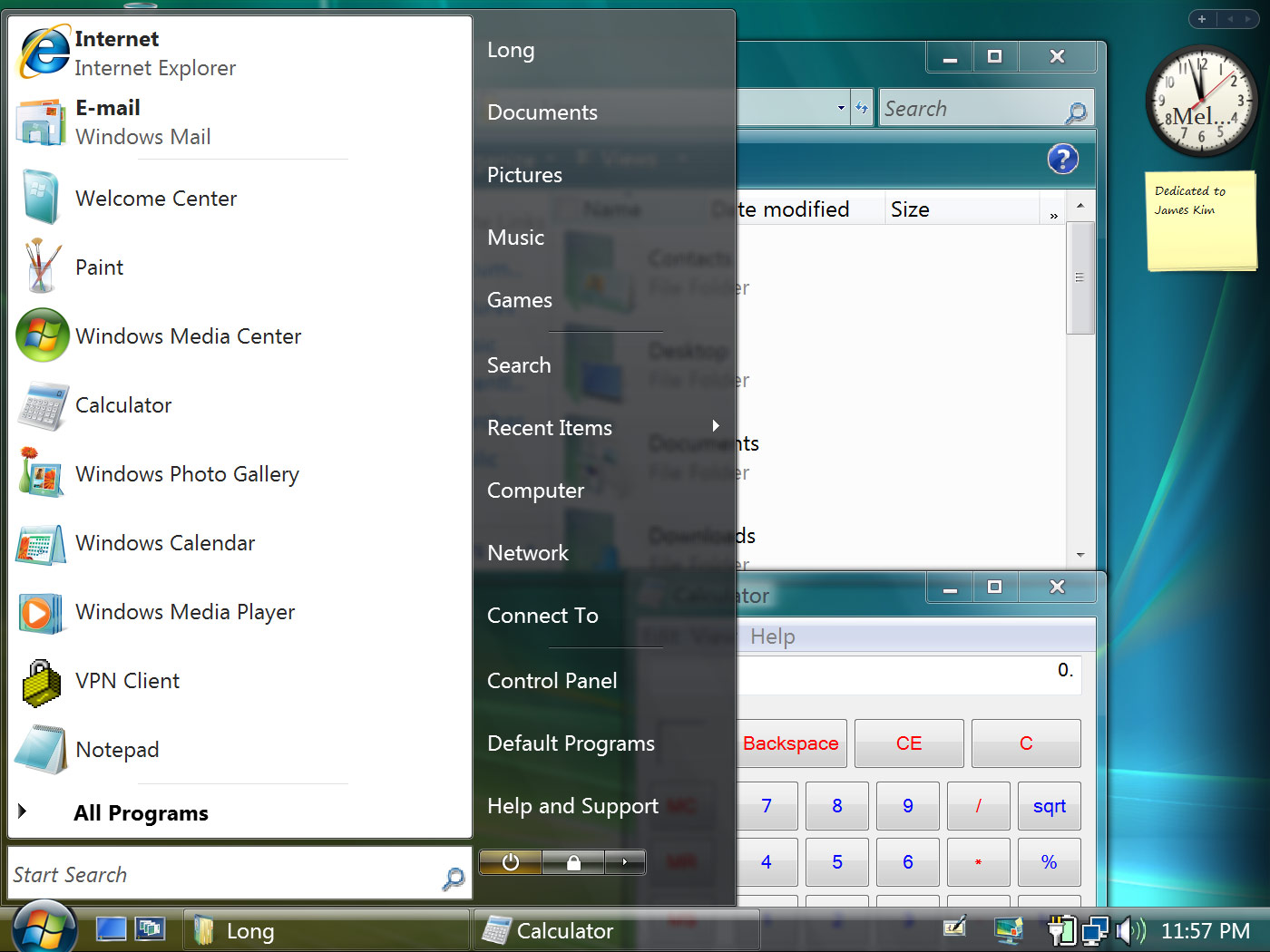
96 DPI (Default) | 120 DPI (125%) | 144 DPI (150%) | 192 DPI (200%)
As you can see, the interface scales quite nicely all the way up to 144DPI. Everything is still reasonably crisp and usable. But when you get to 192DPI, things become awkward. For example, the search icon in Windows Explorer is definitely out-of-place, and the power control buttons in the Start menu is way out of proportion. Also to note, sadly Sidebar gadgets do not scale at all.
But it doesn’t stop here.

 Are you rich? Do you have a company with too much liquid finances? Do you find it hard to sleep at night because you sleep on pools of money? Then you need the Long Zheng 4000!
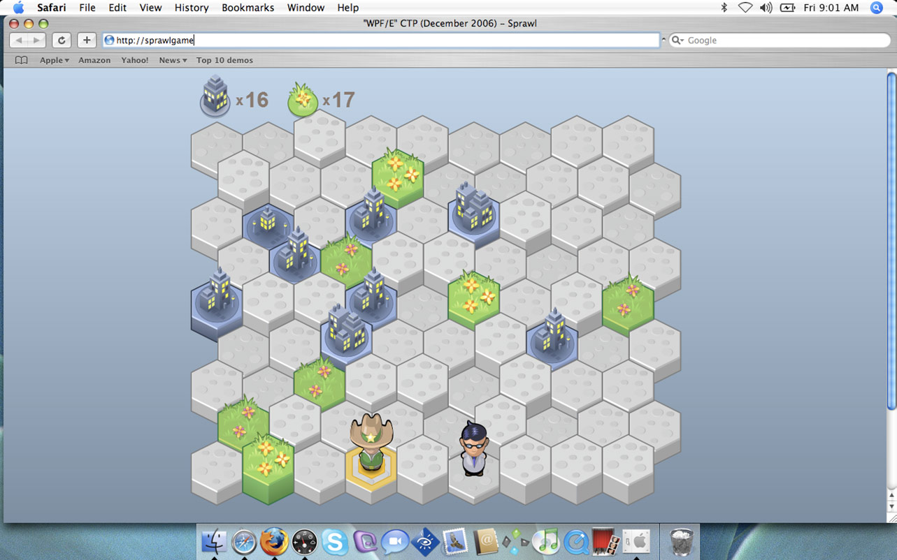
 “WPF/E” will also support Windows Media Audio and Video streaming for cross-platform distribution. Finally, Mac users will be able to view the previously proprietary WMV9 formatted content in OS X one way or another. The included