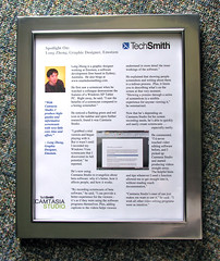
I don’t get a lot of frames sent to me, so this was something special. Thanks to Betsy Weber and Carla Wardin from the TechSmith Corporation! It’s nice to see something sent from the US delivered faster than something sent from a city away.
Got mice? Get the Official Windows Vista Mousemats!
 If you have mice in your home, both the electronic one and the real one, then you need mousemats! Just like door mats, a mousemat is a representation of who you are.
The Official Windows Vista Mousemat is a true work of art. Crafted from the cheapest materials in the mysterious factories of South Eastern China, these mousemats are produced day and night from the right combinations of tears, sweat and depression. The mousemat captures the full glory of the Windows Vista orb, from the strange looking flag symbol to the revolutionary glossy highlights, the visuals are nothing short of true aggressive branding.
With the help of the helpful James Senior, I am able to bring this exquisite piece of true craftsmanship to you for the price of free! There are 20 fine mousemats to give away, so your chances of winning are better than the George W. Bush getting re-elected. Own a part of software development history. Capture the moments when your favorite Longhorn features got cut. Never again will an operating system be so unique in its development cycle.
Back to the mousemats. It’s round, blue and has a big Vista orb on it. You’ll love it. Compliments well with a Mighty Mouse.
Enter the giveaway to win 1 of 20 Official Windows Vista Mousemats!
Competition closes Wednesday 4th of October, 2006.
This is a random prize-draw, the quality of your one-word response will not be judged.
Windows Vista: The “choose your own adventure” UI
Some of you may, and some of you may not, (so that’s everybody) know Windows Vista has 4 tiers of user interface experience, from the best to worst: Aero Glass, Vista Standard, Vista Basic and Windows Classic. So why so many? Who knows, graphics designers unemployment at an all time low in Redmond? But regardless of whether you like it or not, these are the choices that will be shipping with Vista so let’s understand it while we can.
I have taken the liberty (because no one else is as bored as I am) of taking 28 screenshots to compare the 4 different interfaces. These were taken on the same applications and layouts to give you a feel of the exact changes it makes to an user experience. The default screenshot is always the Aero Glass interface, and hover over the buttons to reveal the selected interface. Click the button to reveal a full-screen version of the screenshot.
Please note: the images may take short while to appear due to the high quality and large file sizes.

All 756 icons in Office 2007
Thanks to a neat trick posted by Jensen Harris and Savraj Dhanjal, I was easily able to create this panorama of 756 new toolbar icons in Office 2007 Beta 2 Technical Refresh.
When you can witness the sheer scale of such design projects like redefining each icon in the Office system and even the monolithic Windows operating system, you can come to understand better why Microsoft just can’t make guarantees about each icon being updated to the new style. But on a brighter note, good job to the Office team. They’ve done extremely well in terms of UI consistency in the primary applications: Word, Excel and Powerpoint.
The Zune Box
Today is Zune day. The blogosphere has gone crazy with Zune news. But I’m not going to discuss why social networking sucks, or how DRM will destroy the very foundations of human existence, or debate whether or not a gadget can be brown. I’m going to focus on the packaging, not because everything else has been blogged to death, but because this has huge implications for Microsoft.


First thoughts. It’s brown. It’s square. And it’s simple. Second thoughts, what the hell is that thing at the bottom? Third thoughts, what is this? Granted Microsoft learned from their mistakes, but I think this is not going to work. Of course I have no idea what is displayed on the other 4 sides of the product box I cannot see, but if this is the same way the product will be displayed in retail stores, then it has serious problems.
For someone who doesn’t know what the “Zune” is, and I could safely assume that is a large percent of the population, this product box means nothing to them. It has a brand that is unrecognizable and doesn’t even indicate the slightest association with a portable media device. For a technology enthusiast, this might look cool since its ultra-modern and clean, but to someone who might be scared of turning their computer on, this box has no significance or influence to make them pick up the box and have a look around the other side, assuming there is anything on the other side.
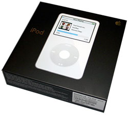
The iPod solves this problem by having an image of the device on the front face of the product box. For even someone who might have never heard of the iPod, this box will not only tell them what an iPod is (a portable media device), but show them what the product looks like. So if someone either knows the iPod name or what it looks like, then they’ll instantly recognize this box. The Zune misses this opportunity by assuming consumers already know what they’re looking for, and that is, a brown box with the Zune logo on it. And that’s a pretty bold assumption.
The only way this will work is if Microsoft delivers an advertising campaign that embeds not only the “Zune”, but the brown box into the minds of every electronic consumer in the world. And that’s probably what they’ll do. I look forward to the FY07 expense report (inside joke). How much will Microsoft pay to get the Zune off the ground?
Coming Zune: any 2nd now
Zune, 2nd. Get it? No? Oh well, worth a shot. Ridiculously funny joke aside, Sean Alexander spotted the second commercial spot for the Microsoft Zune placed on the Zune announcement site. Here is the video for your convenience.
This obviously represents something. The small bird was sharing content with the big bird wirelessly, and in this case, a flaming stream of fire. Next, the bird receiving the content catches on fire, and starts rocking out pretty hard. Charcoal chicken anyone? The bird burns at about 200 degrees, loses a layer of skin revealing new feathers. Now both birds catches fire and continues to rock. Then the Zune burns up too.
The moral of the story? I do hope Sony doesn’t make the batteries for the Zune, cause that would be ironic.
