I haven’t had so much fun and muscle-aches reviewing anything before.
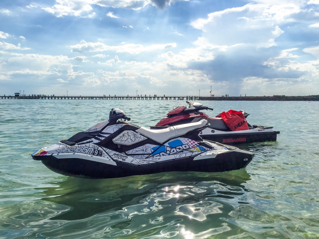
I don’t normally review jetskis but I couldn’t pass on the opportunity to check out the Sea-Doo Spark, a new affordable entry-level jetski half the price of most personal watercrafts on the market. Don’t let the size and price fool you though, it’s as much adrenaline rushing fun as the big brother, if not a little bit more.
I’ve actually owned a Sea-Doo GTX 215 jetski for about 2 years. The Spark caught my attention because you could buy two for price of a bigger one, and jetskis are always more fun to drive than ride.
Compared to a typical Sea-Doo jetski, the Spark is around 25% smaller and 50% lighter. This is made possible by a new composite polypropylene and fibreglass “Polytec” material. It’s so strong and durable the entire frame and hull is just two moulded pieces held together by a set of bolts, similar to the unibody concept for laptops.
Powering the Spark is a new fuel efficient engine available in 60 and 90 horsepower variants (I tested the 90hp model). Even though this is only half the horsepower of traditional jetski engines, the incredible power to weight ratio means you actually get better acceleration than bigger brothers. It’s like a Tesla of the sea.
What it gains in acceleration it loses slightly in top speed. I peaked at about 80km/h (50mph) whereas the bigger ones can do 100km/h (65mph). Of course unless you’re racing jetskis, your arms and legs will fatigue out much sooner than the jetski.
The engine is also more economical, using less unleaded petrol than the bigger models going the same distance. It takes about $40 to fill up a full tank and I only used half a tank for roughly 3 hours of riding.
Unfortunately something’s going to give with compact size and comfort isn’t a strong point of the Spark. Whereas you’ll find wide cushioned seats on larger jetskis and even active suspension to soften out the bumps, the slimmer and firmer seat on the Spark makes rough waves and landing those high jumps a lot tougher on the bottom. That is if going slower isn’t your thing.
The Spark also comes in 2-seat and 3-seat models that vary slightly in length (I tested the 3-seat). Even though you could fit 2 full-size adults on the 3-seater, it’s not the most comfortable ride for the passenger at speed. The Spark is most fun with just one.
Sea-Doo has also made available the latest jetski technologies in the Spark: fly-by-wire throttle control, GPS speedo, closed loop cooling. The most important of which is Sea-Doo’s intelligent brake and reverse (iBR).
By a simple squeeze of the brake lever on the left handlebar, you can come to a dead stop from top speed in about 2 seconds. What’s a safety feature is also quite fun – the G-force from 80km/h to 0 on water makes a bit of a splash. The same function also allows you to reverse making it as easy to maneuver as a tiny car, super convenient for docking at the boat ramp.
Speaking of maneuverability, the Spark’s agility is hard to beat. Using the Sports throttle mode, you can make turns so sharp and accelerate so quickly that you can quite easily throw yourself off if you’re not gripping firmly. And in the event you do fall off, the Spark clip-on key will detach and automatically turn the engine off.
Simply put, riding a jetski is some of the most exhilarating fun I’ve ever had. With the Sea-Doo Spark, it’s now more affordable than ever to own one. Starting at a base price of AUD$7,850 going up to about AUD$10,000 if you add the higher-performance engine and brake system (a must in my opinion), it’s a great little toy for any revheads on water and now more affordable than ever.
A lot of water was splashed in the making of this review.
Microsoft .NET has been making quite a bit of headway in the developer community recently with both the open source efforts and the upcoming ASP.NET 5 modern web framework. With so much attention on making .NET a “hip” platform (and hopefully breaking into the startup ecosystem), I would like to draw attention to a very frustrating problem that I hope the .NET team can address, .NET produces pretty poor quality JPEGs.
Now if this were some obscure .NET function that hardly anyone uses I wouldn’t care as much, but JPEGs are an integral part of most desktop, mobile softwares and web services today. Granted PNGs and SVGs have become common for UI graphics, but JPEG is still the leading compressed image format used in uploaded avatars and photos (I look forward to the day WebP and BGP is the norm).
I like paying attention to detail, so it horrifies me just how much detail is lost through the Microsoft .NET JPEG encoder. There’s no better way to explain this than to show examples.
I first ran into this problem a few months ago when I was working with images in a podcast RSS feed. I was simply grabbing an online image, resizing it and then saving a JPEG file for local caching. A simple image optimization workflow that almost every modern app will do.
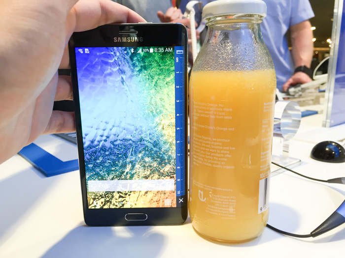
This was the image I was working with. (PNG lossless, 147KB)
And this is what happens after I save it as a JPEG in .NET. (JPEG 100% quality, 70.2KB)
To the untrained eye, they might look not too different, but I invite you to look closer especially around the letters. Here’s the two side by side zoomed in.
Now I know what you’re thinking. Surely that’s just JPEG compression right? Well Photoshop’s JPEG encoder handles it fine. (JPEG 100% quality, 83.7KB)
The thing about JPEG encoding is that it is all proprietary. You can encode JPEG many different ways and it will produce different files or varying fidelity and compression size. Yes they all have a “quality” parameter, but the same “quality” across two apps won’t produce the same result. (In my own testing, the Adobe Photoshop JPEG encoder seems to be the state-of-the-art.)
To cut a long story short, my workaround was to save the file as a PNG (which .NET is quite capable of) and then use the ImageMagick Windows command-line executable to convert it to a JPEG file. The result is worth the hassle. (JPEG 90%, 38.5KB).
Here’s the before and after comparison between .NET’s JPEG and ImageMagick’s JPEG with a 55% size saving (38.5KB vs. 70.2KB). I don’t think I need to tell you which one is which.
My advice to any .NET developer is to avoid the built-in JPEG encoder – the quality is worse and the file size is larger than what it should be. Combined with the fact that almost all .NET best practices and image processing libraries (including the cool imageresizing.net) relies on the .NET JPEG encoder, I imagine this to be a pretty widespread issue.
Perhaps with a bit of encouragement the Microsoft .NET team can fix this for .NET 2015 (it is not fixed in .NET Framework 4.6 Preview). Won’t somebody please think of the pixels?
Escape room games seems to be popping up everywhere around the world. In Melbourne alone there are at least half a dozen companies now offering one or more puzzle rooms. Some appear to be horror themed while most take the premise of a detective story.
When you think about it, escape rooms are kind of weird. You voluntarily pay money to go inside an enclosed space with the sole purpose of trying to come back out. Having said that, for the same reason why “escape the room” computer games are entertaining, it’s the process of some 60 minute of puzzle solving that’s actually very rewarding.
A group of friends and I attempted “Abduction in the Graveyard”, one of the three puzzles available. We were provided a brief backstory together with character names and roles based on the world of Sherlock Holmes.
It’s a lie as good as Santa Claus – all pretty much useless but all in good fun.
Before going in, sixty minutes in a single room didn’t sound challenging enough, but when the LED clock high in the ceiling starts ticking down, there’s actually real pressure in the group to save the fictional girl from the kidnapper who threatens her life. Admittedly in this particular story there’s no real reason to “escape”, we’re just very financially-attached detectives.
Puzzles led to clues, clues led to more puzzles. This process repeats over and over, becoming more elaborate and integrating more game mechanics that you pick up over time. (Just like the difficulty progression of a computer adventure game).
The puzzles and props included but is not limited to physical, auditory, visual, mathematical, and it would be criminal not to have a UV puzzles. If only the kidnappers actually invested their money instead of buying elaborate combination locks, maybe they wouldn’t need to abduct people for ransom.
While we conquered many challenges in a reasonable time, a small handful actually challenged the group’s collective problem solving. In two occasions, a well-timed hint from the intercom with the game master (spectating through CCTV cameras) was necessary to steer us in the right direction. In the end, our group’s first ever attempt took 63 minutes, a tad slower than average.
I must admit there were real moments of frustration but also real moments of accomplishment with your friends. The price is admission is a bit higher than your typical casual entertainment, say the price of a movie ticket, but it was a much more memorable experience.
I can’t wait to get locked in another room.
Disclosure: The game my friends and I participated in was provided for free by Escape Hunt Melbourne.
I haven’t been so excited about watches since the last time I wore a watch about 15 years ago was when all the cool kids in school had one. Since then I have found it hard to justify a small obstruction on my wrist for the value of reading time at a moment’s notice or the materialistic symbol of fashion and prestige.
That is until I could read my email and Twitter messages on my arm.
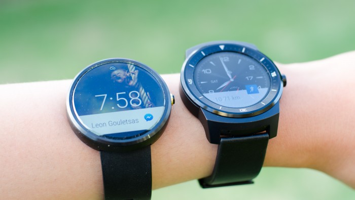
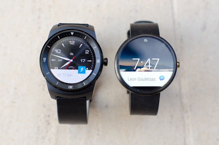
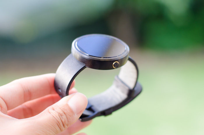
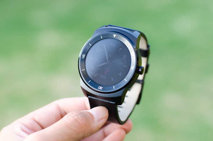
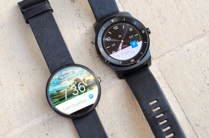
I was finally able to get my hands on two highly anticipated round Android Wear smartwatches last week, the Motorola Moto 360 and the LG G Watch R. I put down my iPhone and dived head first into the world of Android & Android Wear for a full week to see if technology can convince me to strap on a watch again in 2015.
Display
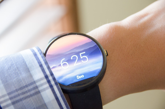
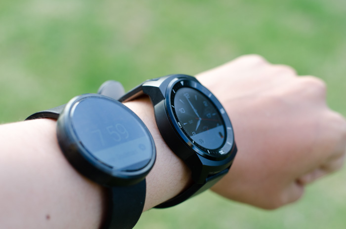
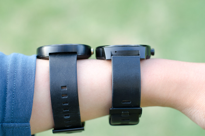
The Moto 360 was infamously the first round smartwatch on the market and it still is the most elegant Android Wear watches available today. The large 1.56″ inch glass display enclosed in a thin stainless steel case looks stunning both screen on and off. Since wearing it I’ve received nothing but compliments on just how beautiful it looks.
The tiny bezel comes at a cost of a thin slice of the display at the bottom is cut off (nicknamed the “flat tyre”) which I didn’t actually find as big of an issue. When the screen is off, you can’t see it at all, and when the screen is on you’re too busy paying attention to the gorgeous display to care.
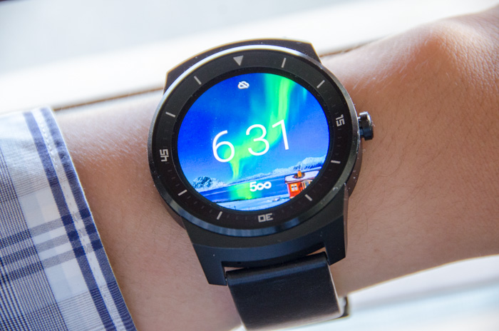
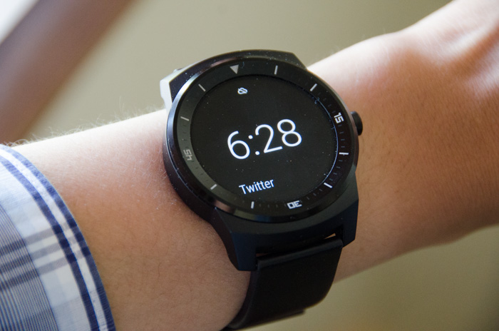
The LG G Watch R is the only other round Android Wear smartwatch, but makes a different tradeoff. It sacrifices a thicker bezel decorated by non-rotatable time markers for a perfectly round display. The screen is also marginally smaller at 1.3″ achieving a slightly higher pixel density which results in slightly crispier text and icons if you pay enough attention.
Both watches have vibrant colors and very wide viewing angles, but what sets the LG apart is the POLED (plastic organic light emitting display which has an “always-on” mode that changes the watch face display to a simplified black-and-white version when the watch is inactive. The benefit of this mode is that notification text still appears.
Comfort
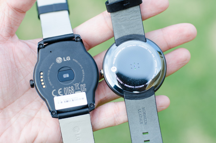
On the wrist, the Moto 360 is lighter (49 grams) and more comfortable to wear. The underside is covered by smooth circular plastic shell which sits firm against the skin.
The LG G Watch R is heavier (63 grams) and extends the size of the backplate far beyond the size of the front bezel and uses a slightly coarse and hard plastic material which presses firmly against the skin.
Thickness wise, both watches are about the same height. Both watches also ship with standard leather straps which do a good job of keeping the watch tight around the wrist, even my twig-like arms. Motorola does offer optional stainless steel bands and LG owners have successfully switched out custom bands as well.
Both watches are also waterproof which is handy if you’re taking a swim. (But capacitive touch will not work if there’s water on the display.)
Android Wear 5.0
Already in it’s second major update, Android Wear 5.0 is a very simple and pretty effective wearable operating system with a few rough edges and a little bit crashy – on rare occasions opening settings or apps require two or more tries.
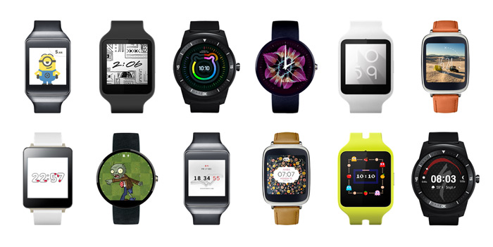
The watchface home screen is now officially customizable with third-party apps, which sits alongside the dozen or so OEM provided watchfaces. There’s a good mix of elegant, practical, fancy, nostalgic and funny watchfaces available now that should suit most tastes. Some (not all) contain complications which can be configured to display things like calendar, different timezones, steps and weather. (My favourite is the 500px watch face which shows a new photo every time it wakes)
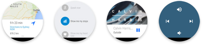
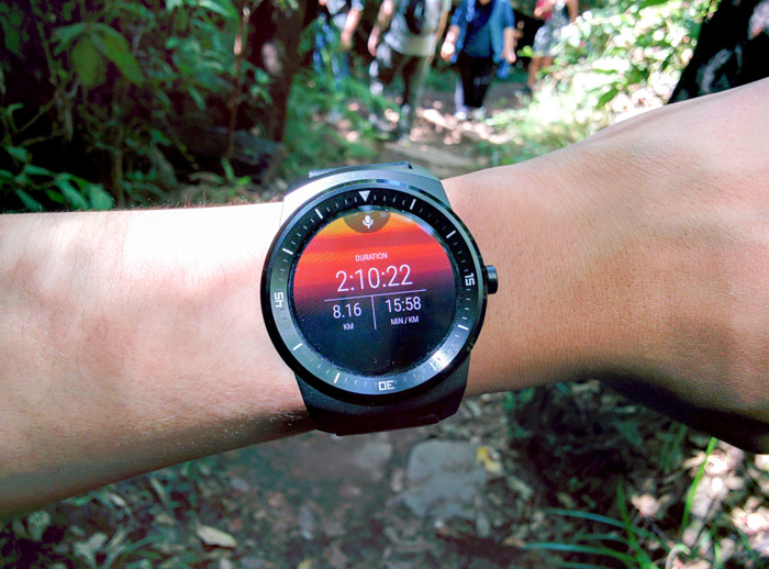
Out of the box there’s a good mix of practical functionality including notifications (more below), caller ID, music player controls, Google Now, steps and heart rate tracking via Google Fit, alarm, calendar and stopwatch. Of course this can be extended with third party Wear-specific apps or Android apps that includes Wear extensions.
It all comes together with swipe gestures, up and down to scroll through notifications in time descending order, right to see more details and actions, left to dismiss and close. I did occasionally confuse my gestures in the minimalistic UI, but fortunately the platform is quite forgiving. For example if you accidentally dismissed a notification you didn’t mean to, you can undo within a few seconds.
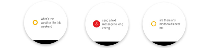
The de-facto “Ok Google” voice commands which can do Google searches, send text messages and start apps work surprisingly well in crowded and loud areas. Having said that besides demoing the watch to others, in practice I’ve never actually used voice commands in public.
Performance on the Moto 360 is noticibly worse compared to the LG G Watch R. The transition from screens aren’t nearly as smooth (especially side to side). The tilt to wake gesture is also a little bit slower to respond on the Moto 360 which makes me wonder if the OMAP processor is slightly underpowered.
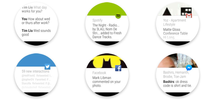
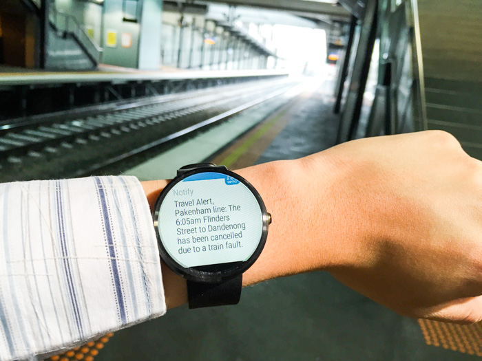
Android Wear notifications
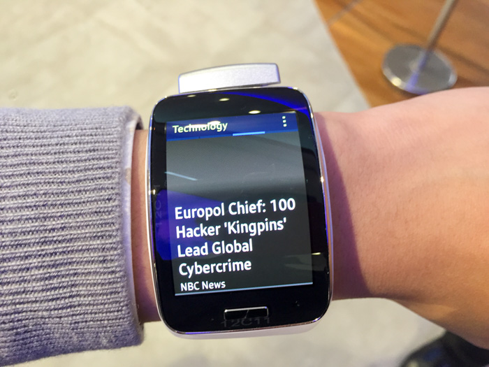
The killer feature of Android Wear is notifications. Natively it displays all Android notifications from any application. Messages, emails, updates and events can all appear as notifications on the watch. (You can also block specific apps from appearing on the watch.)
Apps which have been optimized for Android Wear notifications including but not limited to Facebook Messenger, WhatsApp and RunKeeper enables more detailed views, custom actions and also spoken text replies. Apps like the camera also extend special functionality like a remote shutter trigger, convenient for selfie-takers.
Since no Android Wear watches have a speaker, a subtle vibration (light enough not to be heard but strong enough to feel) alerts you of new notifications. Intuitively, a setting on the Android Wear companion app will allow you to automatically mute notifications on the phone if the watch is connected, preventing duplicate notifications.
As someone who has a love and hate relationship with notifications, I have found it invaluable to quickly peek at which app the notification is from and the first single line of text. This allows me to identify the “I must respond”, “that’s good to know” and “I don’t care” notifications so I spend less time distracted in conversations and on the go.
And in the cases I actually do want to act or respond, a quick swipe to “archive” email and the “open on phone” button wastes no time getting you to the relevant app and message on the phone.
In fact this was one of the killer features of Google Glass, but now it’s available in a much more discreet and socially acceptable form factor.
Battery life
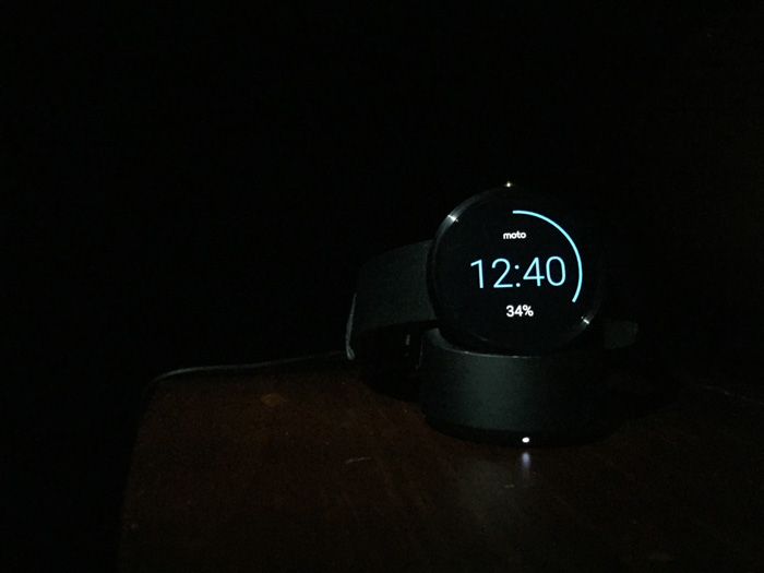
Battery life on the Moto 360 and LG G Watch R have both been impressive, lasting a full day with some juice to spare with a constant stream of notifications and a high brightness setting.
Of course this still means you definitely have to charge the watch every night, but it’s rather quick painless, especially in the case of the Moto 360 whereby the wireless charger also doubles as an elegant nightstand clock.
Conclusion
If you already use an Android phone, Android Wear watches are definitely ready for prime-time. If you have any interest in a wearables for either fitness tracking or notifications, then Android Wear is one of the most capable multi-function wearable platforms out there today.
If you prefer form over function, the Motorola 360 is a amazing piece of crafted technology that looks amazing and works well. On the other hand if you slightly favor function over form, the LG Watch R is probably one of the best functional Android Wear watches on the market today that still looks good on any wrist.
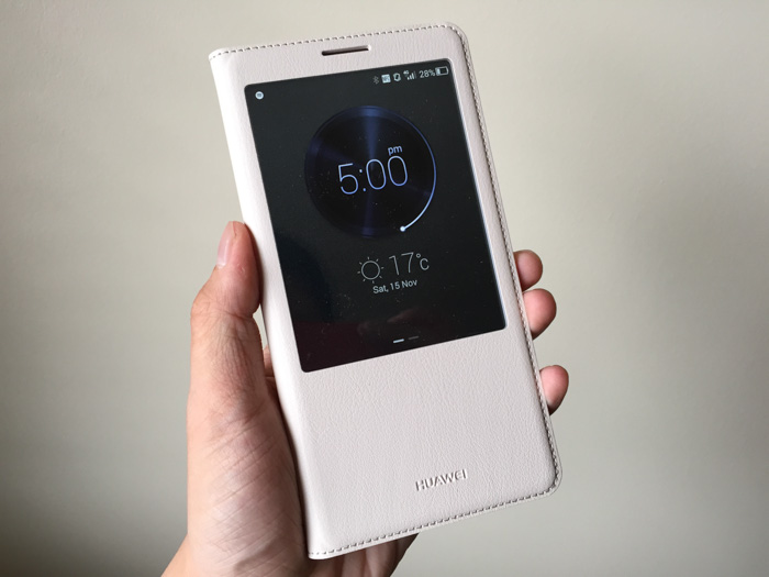
Did you know Huawei ranks third-place in global smartphone shipments this year? I didn’t. The company has been expanding its presence in the consumer smartphone market for a few years now and it looks like the bet is beginning to pay off.
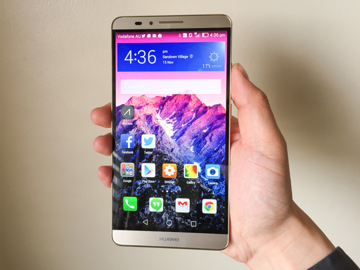
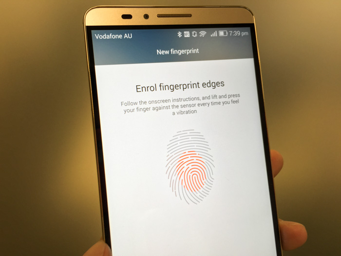
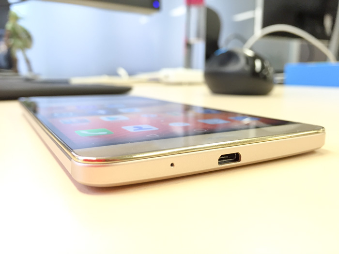
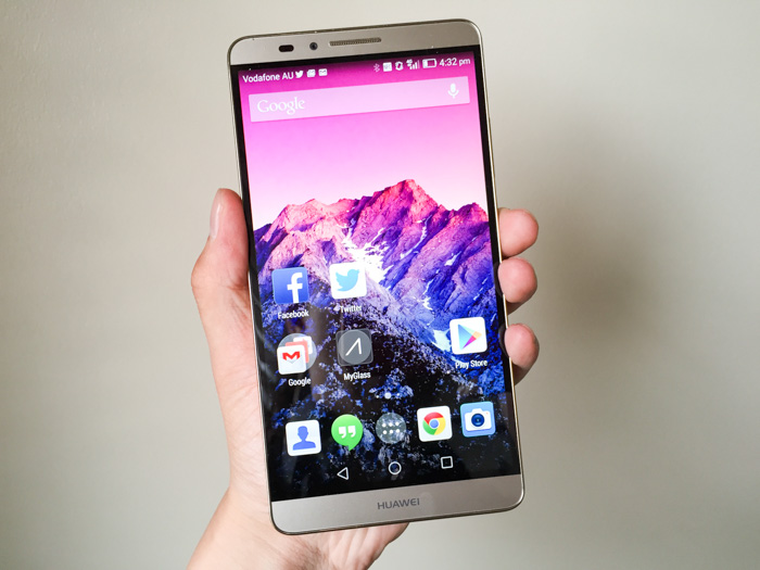
The company’s latest flagship is the Huawei Ascend Mate7. Don’t let the name fool you, it’s neither made-for-Australia or seven-inches big. What it is, is a massive 6″ Android phone with massive specs to match. Octo-core processor, 3GB RAM, 32GB onboard storage, fingerprint sensor, Category 6 LTE, IPS-NEO display, 13MP camera, dual-SIM support and of course, it’s gold.
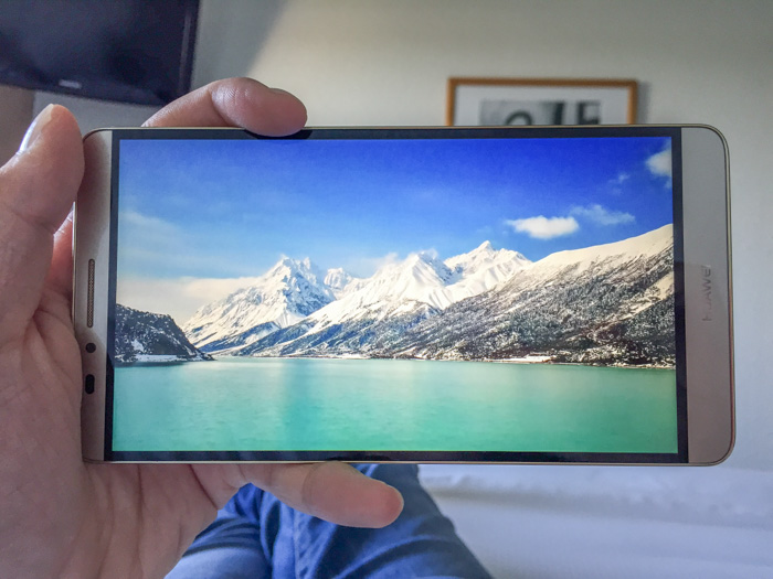
Although I’m somewhat biased against phablets with my small hands, I must admit this 1080p screen is absolutely gorgeous for videos and browsing. It features a relatively new display panel technology called IPS-NEO which improves upon IPS with darker blacks, especially when viewed at an angle.
Impressively, the 6-inch display – half an inch bigger than the iPhone 6 Plus – sits in a phone almost the same size as the iPhone 6 Plus thanks to ultra-thin bezels around all sides of the screen.
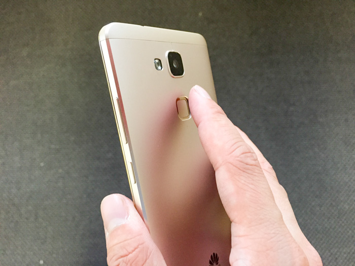
One of the reasons the bezel can be made so thin is because the fingerprint sensor is placed on the backside of the phone, which sounds odd at first but actually works pretty well.
The index finger sits comfortably over the sensor when gripping the phone in either hand, and a simple tap will power-on and unlock the phone in one go (unlike iPhone’s Touch ID which requires a press and scan from standby). The recognition speed is near instant and accuracy is reasonable (I got a few recognition fails).
Similar to the iPhone, it allows 5 different fingers to be registered. Going above the iPhone, it also allows using different fingerprints to access (or prevent access) to different storage files and apps. Although this feature could be useful for a shared tablet, this is a bit of a gimmick for a phone.
An undeniable advantage of big phones is big battery life and the Mate7 sets the bar extremely high with its 4100mAh battery (compared to Galaxy Note 4’s 3220mAh and iPhone 6 Plus’s 2915mAh). You know it’s big because even charging it takes a notably long time.
Huawei boasts it provides two days of regular usage on a single charge, utilizing additional smart power saving features such as using only 4 low-power CPU cores for running less intensive applications. However since I always charge my phone at night, I’m only able to confirm it completed a whole day on 4G-only still with juice left.
The 13MP camera produces respectable photos in most situations. The shutter is extremely responsive, even boasting a quick-snap feature to take a photo as quickly as under a second from standby by tapping twice on the fingerprint sensor. The camera software also features a Lytro-like refocus feature allowing you to edit the focus point after the shot, a bit of a fun gimmick.
In the past I’ve had a few hit and misses with the firmware on older Huawei phones, but thankfully there’s no issues with the performance and responsiveness of Android Kitkat 4.4.2 on this phone.
The latest version of Huawei’s custom Android skin, EMUI 3.0, is one of the more lighter OEM customizations and has some elements of Google Material Design even without Lollipop (e.g. soft keys).
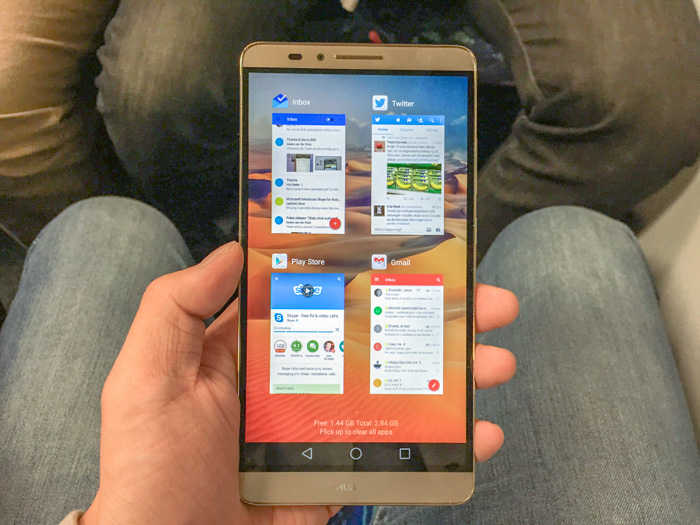
The built-in stock apps, app switcher, notifications center are all quite elegant and functional. If I were to pick just one issue with the customisation, it would be the dynamically generated home-screen app icon backgrounds which persists even if you switch to a different home launcher app (such as Google’s).
Available now in Australia for $699, the Huawei Ascend Mate7 seems to be a great value-alternative to other premium phablets with a gorgeous screen, state-of-the-art specs, elegant design and unintrusive OEM software. Although I can’t see myself using a phone of this size day-to-day, it demonstrates at least Huawei’s got the design and technical know-how to put up a good fight with the giants of Samsung and Apple.
Disclosure: Huawei provided the phone and travel to the launch event at no cost.
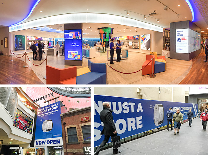
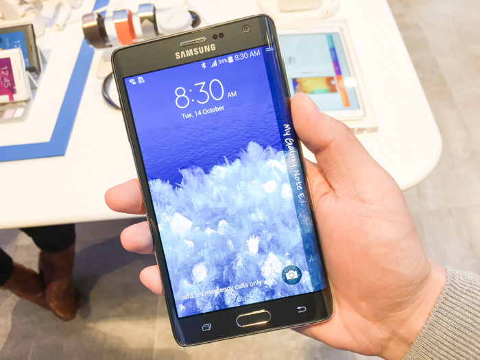
Samsung Australia is officially opening a new “Experience” store in the heart of Melbourne tomorrow. This morning it gave media the chance to try out some new unreleased products including the Gear S, Galaxy Note Edge, Note 4 and Gear VR which the public will also be able to preview at the store.
The company’s obsession with curved screens this upcoming product cycle has intrigued me from a usability point of view to say the least. After spending a few minutes with them I admit there’s no doubts there’s some part technical “look what we can do” gimmick, but having said that you can’t completely rule out some practical benefits too.
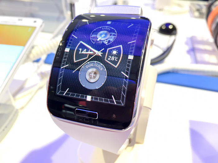
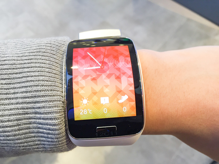
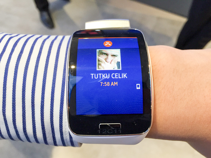
Gear S
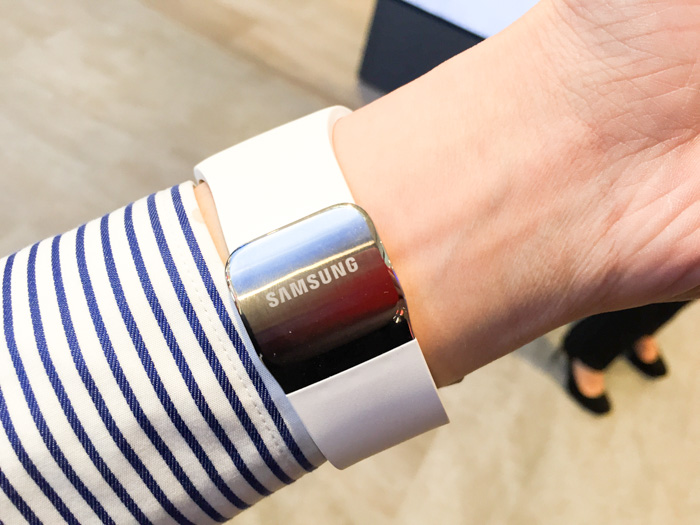
I’ve been following the wearable smartwatch category pretty closely and Samsung is a notable player with three generations of watches already under its belt. Undeniably the Gear S stands out from the competition with its curved screen but also for running the Tizen OS, not Android Wear.
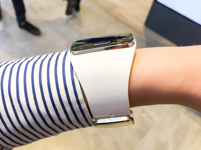
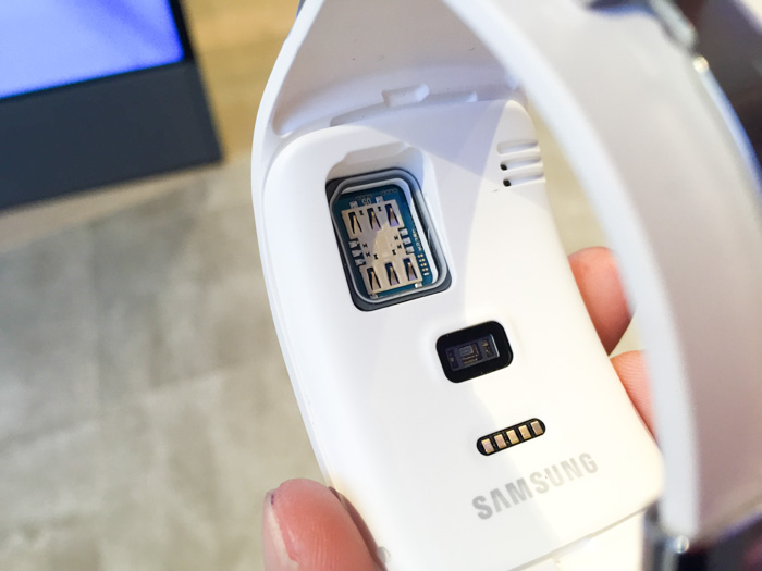
(Ignore the bulging silver block at the top in all my photos. This is part of the obnoxious but necessary anti-theft security since the watch is removable from the strap.)
Putting the Gear S on the wrist makes a very compelling argument for the curved screen. No doubt the screen is big looking at it front-on (and I have tiny arms), but the fact that the screen is curved actually minimises its profile from the side. To put it another way, if the screen this size was not curved than it would have been an unwieldy bulge on my arms.
The curvature was also not an issue when it comes to swiping gestures (which you do a lot of) or visibility. The AMOLED screen had excellent brightness and viewing angles that negated any effects of glare of distortion caused by light bouncing from more angles on the curved glass.
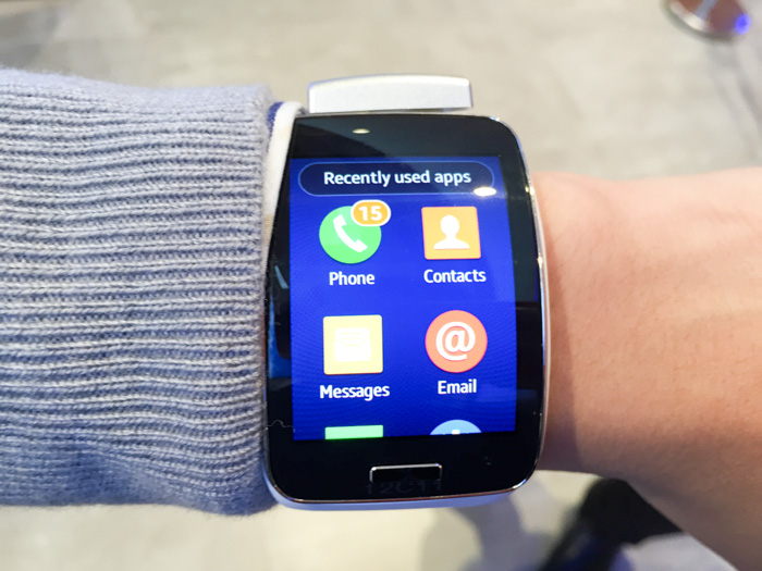
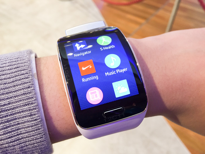
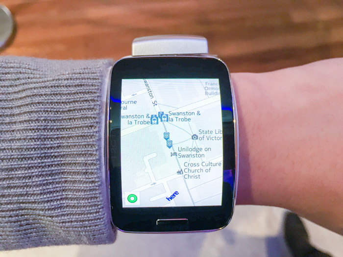
The Tizen OS and third-party apps are surprisingly responsive. Even pinch to zoom in the Nokia HERE Maps app worked without lag or jitter. I do worry about the wearable apps ecosystem outside of Android Wear but we can only wait and see how developers handle cross-platform wearable apps.
The Gear S is also one of the first smartwatches with both onboard GPS and cellular (Micro SIM), making it possible to use without tethering to or carrying a phone (otherwise it still supports WiFi and Bluetooth). This enables the ability to get directions, track runs/heartbeats and share the result directly, but it’s yet to be seen if this is practical with the already limited battery life of smartwatches.
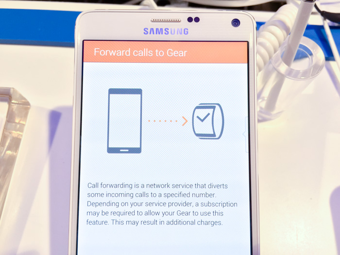
Furthermore, because the Gear S has an independent cellular connection, the companion Android manager app can also be set up to forward all calls from the phone to the watch.
In summary, I’m quite excited for the Gear S. Although I think it would have been a much more compelling device running Android Wear, its feature-rich hardware and screen in particular is actually a remarkable piece of engineering and design.
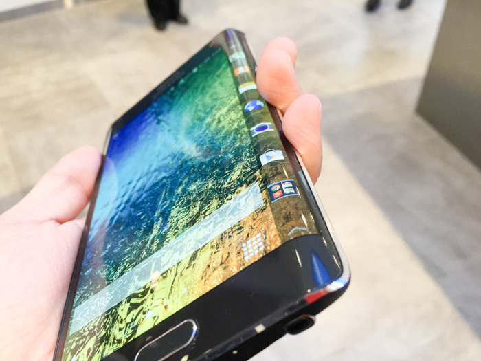
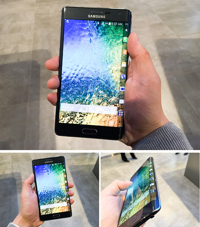
Galaxy Note Edge
A lot of people including myself was and maybe still are skeptical of the edge. The truth is even the Samsung staff think it’s “edgy” – they admit this isn’t going to be for everyone if most people.
Putting the Edge in the palm for the first time is certainly a different feeling to every other phone. It’s actually not the curve that’s the issue but the sharp right angle it makes at the edge which is a little bit awkward (especially for a right-handed user) but not overwhelmingly bothersome after getting some used to.
Using the edge is fairly straight forward. By default on the homescreen you have access to a dock of application icons that can be used to launch apps. You can also swipe left and right to other customisable widget/notification-style panels like news, sports, weather and Twitter. Swipe from bottom gives you quick access to a ruler, stopwatch, timer, flashlight and microphone.
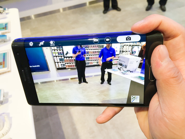
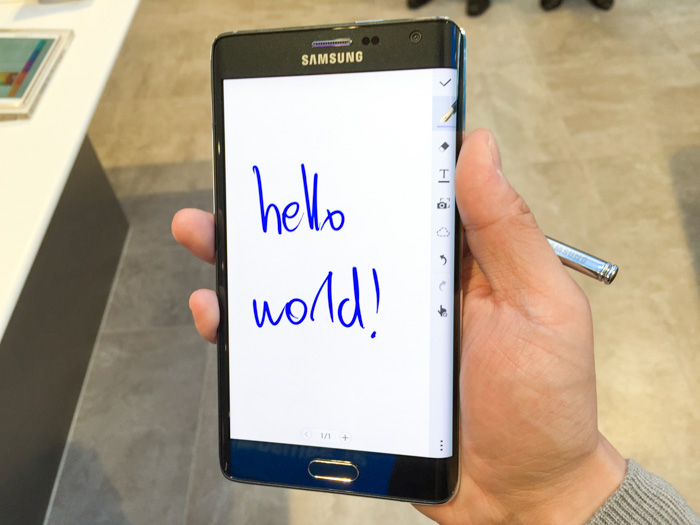
Two of the apps demoed utilising the Galaxy Note Edge SDK were the camera and note-taking app. Both of these apps take on the approach of shifting UI buttons to the edge, leaving the main display an unspoiled canvas which any minimalist would appreciate.
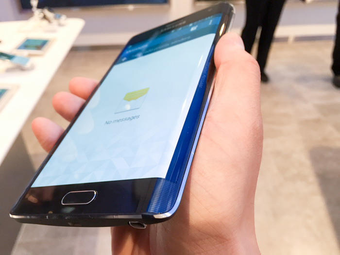
For apps that do not have any support, the screen automatically shows a black strip with subtle faint text which can be personalised. You can still swipe to access the panels as you can on the homescreen. As a very minor nitpick, you’ll notice that such apps actually extend a little bit into the curve instead of being fully contained on the flat surface.
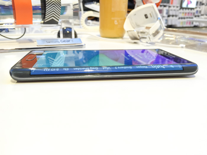
Disappointingly the panel does not rotate when the phone is lying flat on a table, which makes it difficult to read from the right side. I was secretly hoping it would transform into a stock-ticker for unread notifications.
In conclusion, I think the edge concept and implementation is certainly interesting but I’m skeptical of widespread third-party support since even Samsung’s own app support is quite sparse. If nothing else, it’s a really cool ruler.
Long Zheng
User experience entrepreneur
Melbourne, Australia
I'm a person and stuff. Mostly person, sometimes stuff. Proud introvert.
I make/made stuff people love to use: MyPal: unofficial Melbourne myki mobile app, Omny Studio: enterprise podcast hosting, PTVGlass: Melbourne bus, tram & train timetable on Google Glass, Map2Glass: type and send addresses to Google Glass, SoundGecko: text-to-speech web reader, ChevronWP7: Windows Phone community unlocking, MetroTwit: Twitter app for Windows, Speedo Plus: Windows Phone GPS app, Bing Image Archive: browse daily backgrounds and Windows UI Taskforce: crowdsourced bug tracker.


