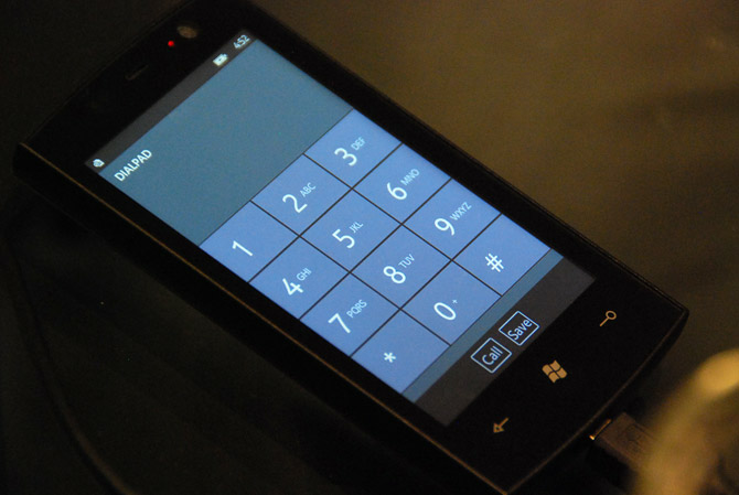
The first layer of wrapping on the giftbox that is the Windows Phone 7 Series development platform is being teared down today as Charlie Kindel on the Windows Phone team revealed some ever-slight details on what developers might be able to do on WP7S and how.
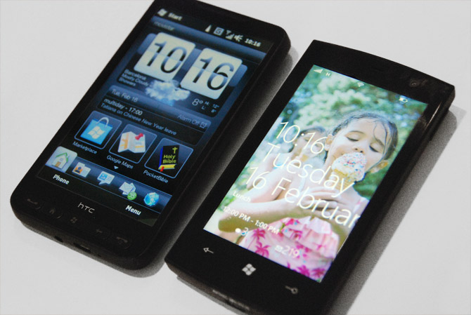
One detail that caught my eye was a picture attached in the blog post that at quick glance might pass as a general comparison of all the current-generation smartphones with WP7S, but on closer inspection, it’s not the WP7S we’ve come to know and love since Mobile World Congress.
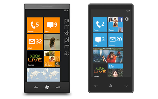
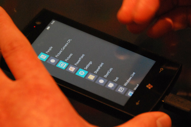
As both images are presumably mockups, the right one resembling the build shown at MWC, I can assume the left one comes from an earlier concept. The striking difference between the two is the way the “start menu” is conveyed. The build at MWC had an arrow in the top right corner which when clicked on revealed a long list of applications that were installed on the device.
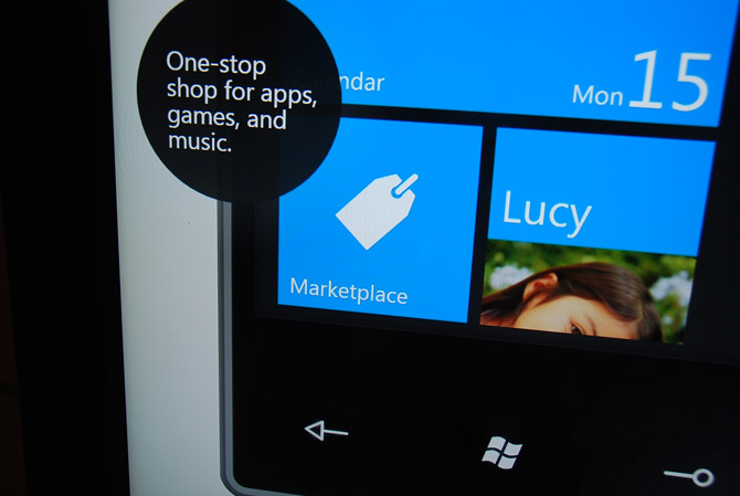
In the alternative concept however the menu is “peeking” in from the right hand side which one can assume opens by swiping to the left. The way applications are grouped are also different, as the top five items are the hubs “people, music+video, xbox, photos, marketplace” leaving “apps” in a class of its own.
Personally I actually prefer how the menu peeks in the start screen – it’s much more consistent with the teasing that occurs in the rest of the UI. Which is the “real” start screen, guess it’s one more thing we’ll have to find out at MIX.
Update: Charlie Kindel implies the screenshot is an older mockup.
 Instead of waiting for OEMs to pick up the ball, Rafael and I are offering an alternative.