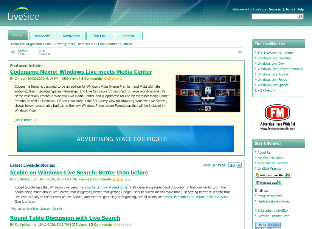
Most of the time, I prefer style over substance. In today’s Web 2.0 world, rounded corners and subtle gradients keeps me pretty happy. But some of the worst players of Web 2.0 standards or any design standards for that matter are from Microsoft enthusiast communities. Some of the sites I hate to love include: ActiveWin, AeroXP, Bink, JCXP, LiveSide and Neowin. Your mileage may vary.
But it’s not all wrinkles and HTML 4.0 out there, there’s some great looking sites out there including MSTechToday, Windows-Now, Windows Connected, Shell:revealed and honorable mention to On10.
Whilst it is still true, content should come before design, but once you have content, why not top off some great content with a great design that’s easy to read and use? Most of the time, these sites have some really in-depth content, but because they don’t pay enough attention to formatting and styling, it’s hard to read and I end up giving up reading it all together.
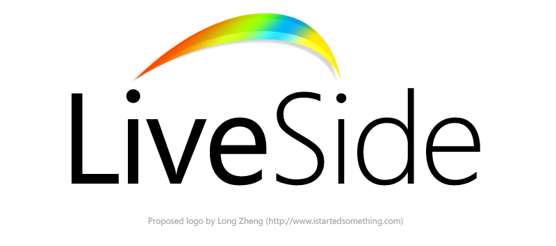
And to demonstrate, I have taken a few hours away from my group assignment time to work on this mockup for LiveSide. If I fail, you’ll know why. And hopefully some will enjoy it even.
I’m happy to give away the logo and website design to LiveSide for free, if they want it. Only because I think they do publish some really good insider news and provide great insight into the Windows Live venture.
What does everyone else think?
Added: honorable mention to On10.


