Microsoft describes Windows 8 as “Windows re-imagined”. I would add to that, “with Metro”.
From the lock-screen to the boot-time recovery manager, the next version of Windows has embraced the Microsoft Metro design language to the core. It is undeniable the biggest design and user experience changes to Windows since Windows 95 but it’s also not without issues that concern me.
Even though anyone who’s seen or used Windows Phone 7 would attest Windows 8 is clearly inspired, it’s not just a scaled up version of the same thing. Although many of the standard controls share a similar styling, like the toggle switch, sliders and buttons, there’s some divergence.
For example, gradients thrive throughout Windows 8 when they’re discouraged on the phone. Of course this, among other differences, can be explained by different technical specifications and use-cases of PCs versus phones. Another example being the touch spots and trails left by any of the 10 independent touch points the OS supports simultaneously – one for every finger.
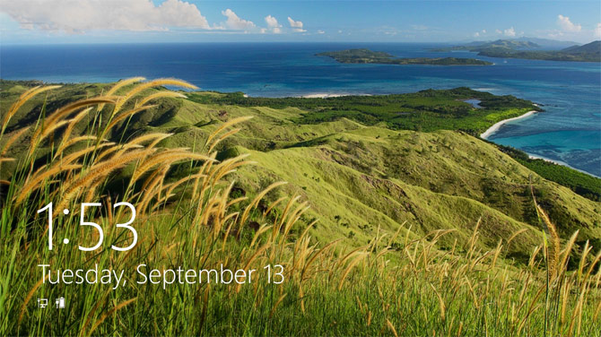
There is no doubt Metro makes Windows 8 beautiful to look at and use. From the moment you turn on a Windows 8 device, prominent numbers in Segoe UI v5.12 (Windows 7 has v5.00) gorgeously display the time alongside elegant white silhouette “status badges” that compose the personalized lock-screen.
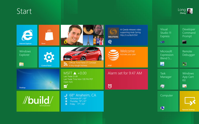
Once inside, the Start screen transition as each individual tiles subtlety zoom in is just one of countless numbers of animations and transitions that helps make the OS feel responsive and “alive”. Although the tiles on Windows 8 do not flip like the phone, they do support animations which can surface an stream of rich information for the user to glance at.
On a reasonably sized screen (1440×900), the OS fits at least 12 tiles which accommodate a reasonable amount of favourite applications for the user to access and see without any scrolling. Obviously they can fit more with small tiles.
As far as touch-experience goes, the new shell and immersive applications are turning the tide for touch vs. mouse. Hotspots and trails provide nice subtle visual confirmation of your finger’s interaction with the screen and “touchability” is exponentially better than any previous touch offerings in Windows. Although there is parity for mouse users in terms of functionality, it’s clear now that Windows 8 is a touch-first experience, even in the traditional desktop.
Of course, the user experience in Windows 8 is not without issues. Whilst this is a developer preview and features could change, one of my biggest concerns among many is the behaviour of switching applications by swiping from the left edge has carried through since the earlier D9 demo.
In my own experience using it, the unpredictability of not knowing what application is in the back stage makes the multi-tasking experience feel like playing Blackjack. As ALT+TAB still exists for users with a keyboard, it’s a much more refined solution.
Since I’m not usually one for writing long articles, Metro on Windows 8 is an extremely visual and interactive experience which is why I would encourage everyone to try it for themselves. Even with a mouse and keyboard, you will agree that this truly is Windows re-imagined.