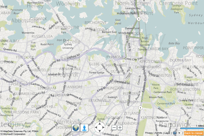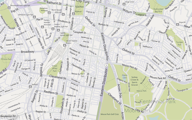
I’ve never been a fan of the Bing Maps/Virtual Earth color scheme so when I read reports today that it had been updated, I was hopeful Microsoft might have injected some vibrancy and fine detail into their otherwise dull and indistinct maps. That was before I realized Microsoft wanted to make their maps look worse.
I know what you’re thinking, “that’s an outrageous accusation”. Maybe, but I can’t think of any other reason why Microsoft actually removed the white glow on the labels from the previous version of Bing Maps that was there to provide contrast between the text and the background. That is if the semi-transparent text wasn’t distracting enough.
Furthermore, I’m also quite confident a (road) map is suppose to highlight the features of the road network so viewers can make judgements on how to get from point A to point B safely and efficiently.
With the lack of color separation between freeways, highways, roads and streets, identifying routes become quite difficult when all the roads are light shades of pastel purple, barely visible above on the trademark dull gray background.
Although I don’t claim to be an expert cartographer, I can appreciate a well-designed map when I see one. This is an eyesore.
Update: Added an alternate screenshot with a different zoom level on a different part of Sydney.


