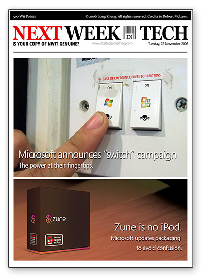
Credits to Robert McLaws for inspiration.
Windows to boot
Millions of computers starts each day with an image to remind users of which operating system they’re using. Here’s a look back at 22 years worth of the most agonizing waits in history.
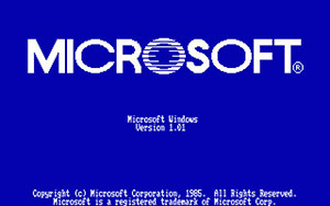 Windows 1.01: Since the blue-screen-of-death has yet to be |
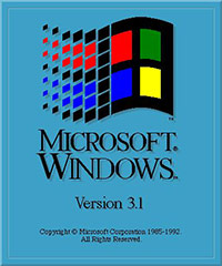 Windows 3.1: The first and last vertical bootscreen. The designer must have just found the color palette, bevel and drop shadow commands in Photoshop. Credits: PCForum.hu |
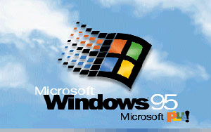 Windows 95: Clouds and infinite-scroll animation introduced. Copyright missing-in-action. Credits: WinSuperSite |
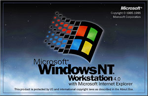 Windows NT 4.0: Dark and scary. Borders make a return. First bootscreen to feature the Microsoft logo. Credits: Dabestsite |
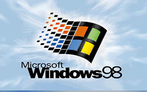 Windows 98: Better looking clouds for a better operating system. Copyright still missing-in-action. Credits: Windows Nation |
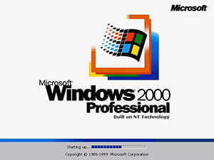 Windows 2000: Clouds removed. Copyright return. SKUs introduced. Barely-accurate progress bar invented. Credits: The Best Website Ever |
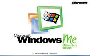 Windows ME: Just as colorful as the operating system experience. Progress bar abolished. Credits: Windows Nation |
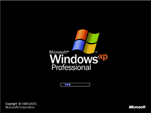 Windows XP: First white-on-black bootscreen. SKU branding (re)introduced, infinite-scroll color varied by SKU. Credits: The Elder Geek |
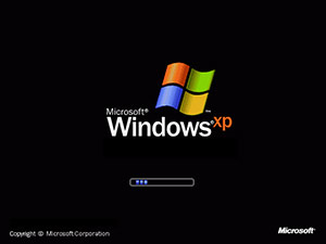 Windows XP SP2: All operating systems are created equal – Microsoft no longer discriminates SKUs. Copyright years removed. Credits: Win History |
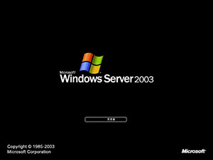 Windows Server 2003: No points for knowing where this was inspired was. Credits: Toasty Technology |
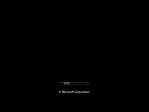
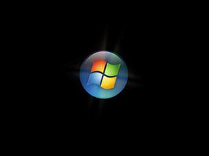
Windows Vista just has to be different. The first thing you’ll notice is there are two bootscreens, separating the low-level code and branding experience. The first bootscreen is an ultra-minimalistic scrolling animation featuring thin green lines which is only accompanied by a short copyright text. The second bootscreen features a full-resolution 32-bit animated glowing Windows pearl, synchronized together with the official startup sound. Credits: Ed Bott
It’s interesting to see how progressively smaller the Microsoft text gets.
Clearification #3 – Back to ‘not much sense’

Forget what I said last time, Clearification has returned to the state of ‘not making much sense’. Today, the third episode in the six episodes series with Demetri Martin was released, titled “Electric Brain”. The story revolves around a scientific experiment with a brain-analyzing device. Check it out for yourself.
It’s a little bit funny. Not much storyline. Weird, to say the least. A few guest appearances of Windows Vista showcasing Office 2007, Flip 3D, Windows Media Player and Internet Explorer.
 In other news, the official website for The Institute for Advanced Personhood has also opened. Feels a little bit like Lost’s alternative reality game, the Hanso Foundation.
There’s a lot of history behind the institute, it’s staff and its beliefs. There’s also a nice little mini-game that explores your psychological traits. According to the test, I’m “one of a kind”.
Microsoft shows off Vista like its 2005
On the official Windows Vista website, there has been an awfully large collection of pre-Beta 2 dated screenshots illustrating poorly, the final look and feel of Windows Vista. Looking through the features page, it feels like I’m warping in-and-out of time. Nearly every page offers a taste of Vista in a different era, far-fetched from a gallery of consistent user interfaces.
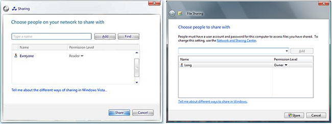
Just to show I’m not kidding around, this particular screenshot for Sharing pre-dates even Longhorn Beta 1, from July 2005. On the left, the screenshot on the website shows the old back button, cyan titles and ‘jellybean’ buttons. It looks pretty horrible. On the right, is the final interface for the same feature.
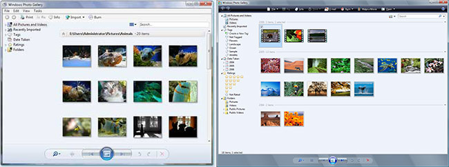
Another example is on the Windows Photo Gallery page. This screenshot was even taken at a time where menu toolbars were still turned on by default. The main toolbar is still largely unorganized and lacks the black gradient. Control buttons at the bottom were still looking a little clunky and the Aero Glass border is yet to infiltrate that area. Windows Photo Gallery today is far more polished in comparison.
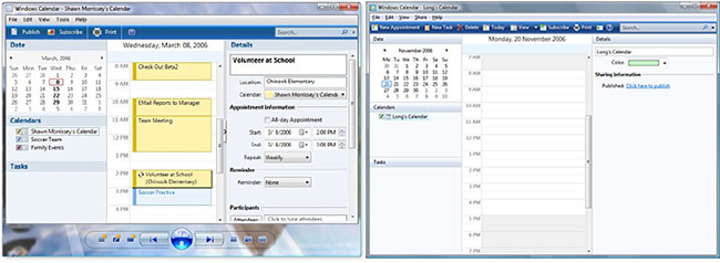
What a mess Windows Calendar was. Thank god the bottom control buttons were completely scrapped. Surprisingly, the menu toolbar made it through.
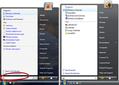
Although not all of the older screenshots are worse. For example, in User Experience, I very much prefer the older Start menu. Besides the purple text in search results, two minor differences include the boldness of username, as well as a darker user picture ‘holder’. The bold username served a very useful purpose for separating the actual user from their folders.
I could go on with more examples, but I’ll leave it at that. This problem is barely limited to only the Vista website. All over Microsoft.com, and even in the all-too-important Vista Virtual Pressroom, there are more than handfuls of outdated and quite frankly, ugly screenshots of an otherwise aesthetically pleasing user interface.
During the course of development, Vista’s UI changed (too) many times and even more Microsoft.com websites fail to keep up. But now with Vista well beyond its production cycle, Microsoft should start focusing on updating these screenshots to send a refreshed and consistent message about the new user experience.
Perhaps a new Vista website is being developed for the business and/or consumer launch? Possibly rolling out at the same time as the new Microsoft.com website? I sure hope so, the current one’s becoming quite dated.
Win 1 of 3 Windows Vista Caps & Decals
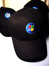 Desperate times calls for desperate measures. When no one else would supply freebies to give away, I sought to the help of two great Aussie Microsofties (Deeps De Silva and Bernard Oh) for some highly-undervalued Windows Vista merchandise.
There are three caps with a Vista orb logo on the forehead. Hand wash only, one size fits all, 100% cotton, made in China. The decal is a Vista orb sticker that you can basically stick on to any surface except water. I’ve heard Apple decal stickers work magic, and work even on water, but that’s what you get with the premium you pay. Nothing particularly fancy, but might satisfy the die-hard Vista fans.
Each winner will receive a cap, a decal, mailing bag, sticky tape and an assortment of postage stamps.
Enter to win 1 of 3 Windows Vista Caps & Decals
Giveaway closes Friday 24th of November, 2006. Winners chosen randomly.
Maybe if we cause enough chaos, we can talk about world peace
Common sense just seems to escape some people. Protesters at the G20 Summit in Melbourne loses it.
From The Age article,
Mr Rae, said he was trying to push a barrier forward toward the lines of police blocking Collins Street, when one officer lent over the barricade and hit him on the head with his baton. “He took a full swing at me as hard as he could… I wasn’t expecting it. The cops seemed to be pretty aggressive from the start. I wasn’t really doing much, just pushing the barricades which was pretty harmless I thought,” he said.
Just pushing some barricades, smashing some cars. Usual stuff. Harmless.
One of the protesters described the police action as “provocative”.
And, a riot isn’t?