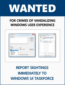
I really opened Pandora’s Box last Saturday when I asked the community what Windows user interface quirks they’d like to see fixed or improved in the next version of Windows.
The way I originally imagined it was to go through each of the suggestions by hand and add them to my post along with a pretty screenshot. Needless to say, I got tired about 20 entries in and couldn’t imagine doing 140 more. I had to come up with something more manageable.
With PHP in one hand, MySQL in another and some duct tape in my mouth, I’ve put together a voting-centric community feedback portal over at www.istartedsomething.com/taskforce.
It’s not done yet, but it’s at a stage where it’s complete enough for use and I can add functionality (hopefully) without destroying the database. One key functionality missing for now is the ability to edit the entries you’ve submitted, so keep that in mind and double check everything.
I’d like to ask everyone who’s submitted an entry in the blog post resubmit their own entry using their own account so credit is given where credit is deserved. You are free to use the screenshots I’ve already published.
I have an exam in the coming days so I want everyone to start playing with it now and when I get back I should have a nice stack of bugs to iron out. Have fun.
You can stop refreshing the page now. If you’ve been holding your breath for the last couple of hours in anticipation for the drawing of this website’s “31 Days of the Dragon” giveaway, seek medical attention immediately. The rest of you read on.
When I set out to design my contest, I opted for something easy and straightforward because we’re all a little lazy. With over three-thousand and seven hundred (3700) entries, I think I can safely say now it was easy enough.
At the same time I also designed the contest in mind of all the Windows Vista user out there who really wasn’t getting enough lovin’, so I’m also proud to say a thousand and eight hundred eighty-four (1,884) of you – just over half of the entries – took advantage of the bonus offer by turning on the Customer Experience Improvement Program in Vista. Hopefully you’ve kept it on.
Before I announce the winner I also want to mention users who have attempted to abuse the system like the one guy who registered using 6 different AOL emails are automatically disqualified. For your information, AOL emails in sequential numbers stand out.
Without a further ado, the winner is Andrew Stockdale (@gmail.com). For your information, I don’t think this is the same Andrew as the leader singer of Wolfmother. If under the rare circumstance it is, I will redraw.
If you didn’t win, you don’t have to resort to violence. There are still a handful of opportunities to win left on some other sites who’s still accepting entires. Good luck.
Most of us who use Windows Vista have probably come across a couple of user-interface quirks during our times – some of which irritate you more than others, some are more obvious than others. With the development of Windows 7 speeding full-steam ahead, I thought this might be an opportunity as good as ever to make these problems known to Microsoft and hopefully get them all resolved.
Instead of going at it alone, I thought this is the perfect opportunity to harness the wisdom of the crowd. Therefore I’m asking you to submit any UI quirks you know of in Vista and I’ll help compile a list of them together, including but not limited to legacy icons, legacy styles and malformed layouts. Include with it a brief description of the problem (and possible alternative if appropriate).
I can’t promise you that all bugs will be fixed but I will push them to someone at Microsoft who has been said to “get things done”. Without a further ado, I’ll kick it off with a couple of examples.
There appears to be a lot going on behind-the-scenes for Windows 7 than meets the eye. Effective next week, June 1 2008, original equipment manufacturers who wish to get their new PCs certified by the Windows Logo Program for the “Certified for Windows Vista” label will have to get their hands dirty with Windows 7 when it’s available.
Customers have a need to ensure compatibility with the new releases of the OS and that hardware (systems and devices) are fully functional after an upgrade. This will enable Microsoft and partners to evaluate the results and correct issues in the new OS and the associated hardware as part of the release plan.
Beginning with the release of the first beta of the next operating system, all Windows Vista client and Windows Server 2008 submissions must include a complete CPK with test logs for the new beta OS. The test logs generated from the beta OS are not required to pass. Issues with hardware, system BIOS or drivers must be investigated and resolved by partners prior to the launch of the logo program for the new OS.
The tests should be run after performing an upgrade from Windows Vista or Windows Server 2008 to the beta OS. Testing on the new beta OS must be done with drivers that are intended to install on the beta OS.
Design and Implementation Notes
Beginning with the first beta of Windows 7 all Windows Vista submissions must include a complete CPK with test logs from Windows 7. The test logs generated are not required to pass.
Now for those who haven’t seen such poorly formatted tables before, I’ll just explain briefly what it’s trying to imply. This policy requires computers of all classification (desktop, mobile) for all purposes (consumer & business) and running all SKUs of Windows Vista (Home Basic, Home Premium) to comply with its “future requirements” when the Windows 7 beta is released. To comply, such OEMs much upgrade from Windows Vista to Windows 7 and export a set of automatically generated driver test logs to submit with their application, regardless of whether they pass or not.
Whilst I don’t think the first beta of Windows 7 will come out on June 1, it’s a Sunday anyway, but this does mean throughout the Windows 7 beta testing process Microsoft will have a very thorough understand of what works and doesn’t work with Windows 7, probably far more than they did with Windows Vista. The end result should be much better degree of drivers compatibility by release.
Some of you with a sharp eye might have noticed something very interesting on-screen during the Windows 7 multi-touch demonstration at the D6 conference yesterday. If you did, you might be curious to understand what you saw. If you didn’t, read on anyway. Update: The new taskbar is superficially called the “Superbar”.
The picture above comes from the video feed of Julie Larson Green‘s (Vice President of Windows Experience Program Management) demo of the multi-touch picture browser demo app. The quality is a little rough, but you can easily notice a few things that are different.
The first being the taskbar is higher than usual, but not as big as double-height. If I were to guess, I’d say its somewhere around 1.75x-high. In the left corner, the Windows orb remains wedged “on top” of the taskbar – sticking its head out a little – instead of in the center like it is today in Vista.
The taskbar also appears ‘divided’ into sections by variations in the color (dark, gray, lighter) to indicate the different areas. Speaking of which, if you look at the far right corner, you’d notice that the tray (icons & clock) is not touching the edge of the screen, and there’s a small lighter gap. I have no explanation for this, but is well worth keeping an eye on.
A double-height taskbar in Windows Vista
Keeping the focus on the right, the tray is also different. The icons sit in the middle of the taskbar, instead of wrapping in two-lines like it does today, whilst the date now wraps on two lines instead of three. This clearly indicates this taskbar cannot accommodate three lines of text.
Most obviously the quick launch icons are now larger in size, but the icon besides it is not a quick launch icon instead an application. I’ve been told this particular Windows 7 build has rendering issues which is why there’s no label or text next to the icon, but there should have been. At the same time, the icon also should have been a smaller version of the “Live Preview” thumbnails you see when you hover over applications in the taskbar today. That would have been pretty sweet. Apparently that feature has been canned .
Now you would probably be wondering why I just spent so much effort writing about a taskbar, and the answer is because this is what Windows 7 is about. They’re going to take existing interface elements like the taskbar and give them a new coat of paint with some sparkles. Different enough so you notice them, like Walt Mossberg did.
During the demonstration (5:25) Walt asks “I can’t help noticing that the taskbar doesn’t look like the taskbar?” Julie responds with, “It’s something we’re working on Windows 7 and I’m not suppose to talk about it now today.” Shutdown.
In the midst of all the hype around Windows 7 news and affairs, CrunchGear and TechCrunch shows us how gullible some bloggers (and readers) have become. I would like to direct your attention to exhibit number one.
CrunchGear with the offending imagery, claiming without a sigh of doubt these are real screenshots of Windows 7. Their followup update somehow insists a Microsoft employee has told them these are “older version of the concept renderings”, how deep down the rabbit-hole are they going? Note: I’ve reshifted some of the images around to be clearer.
TechCrunch gives them their “seal of approval”. At the time of writing, now 925,000 RSS subscribers have been told these are “real”.
And another. In fact, all of the images are third-party mockups except the “version screen” which is not very interesting to begin with. For an article claiming to have “a ton of … screen shots of the current build of Windows 7” this is pretty ridiculous.
I don’t have much to say except if you’re reading a site with advertising, the writers are usually funded by advertising revenue. Thus, it is always in the best interest of most paid-per-impression writers to publish articles which gets them eye-balls, ad impressions, and thus income. Some writers hold a higher level of integrity than others. Without excluding myself from this rule, take everything you see here and everywhere else with a pinch of salt and pepper.
Speaking of myself, I wonder what I wrote last Saturday. Oh wait, I know.
Long Zheng
User experience entrepreneur
Melbourne, Australia
I'm a person and stuff. Mostly person, sometimes stuff. Proud introvert.
I make/made stuff people love to use: MyPal: unofficial Melbourne myki mobile app, Omny Studio: enterprise podcast hosting, PTVGlass: Melbourne bus, tram & train timetable on Google Glass, Map2Glass: type and send addresses to Google Glass, SoundGecko: text-to-speech web reader, ChevronWP7: Windows Phone community unlocking, MetroTwit: Twitter app for Windows, Speedo Plus: Windows Phone GPS app, Bing Image Archive: browse daily backgrounds and Windows UI Taskforce: crowdsourced bug tracker.
 I really opened Pandora’s Box last Saturday when I asked the community what Windows user interface quirks they’d like to see fixed or improved in the next version of Windows.
 You can stop refreshing the page now. If you’ve been holding your breath for the last couple of hours in anticipation for the drawing of


