PowerPoint Prototyping Toolkit (release 0.2)

PowerPoint Prototyping Toolkit

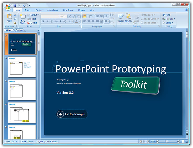
After hearing about the impact and success it had in Microsoft, I couldn’t wait to get my hands on prototyping in PowerPoint 2007. Amongst a few things Manuel Clement suggested a few weeks ago in his presentation about “wireframe prototyping with Office PowerPoint 2007”, was to create a toolkit of commonly used GUI components to copy and paste when designing the prototype screens. That’s what I set out to build.

PowerPoint Prototyping Toolkit sample
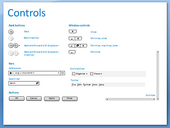
My vision for a toolkit is to contain a set of all the possible and feasible GUI components you could otherwise use in designing a real Windows application or browser application. For example, it should include buttons, drop-down lists, window frames, toolbars, dialog boxes and address bars. Of course there are probably as many of those as there are stars, so I’ll just have to focus on the most commonly used ones.

I imagine I’m not the only one excited by prototyping in PowerPoint, so others might need to build similar toolkits as well, then why not make it publically available? I’m glad you asked.

Downloads

After a few hours of work, it’s currently very limited and only supports a handful of the control I require to show off my short demo, but I hope it gives you a taste of what I intend to do with the idea. Press F5 (start slide show) to see the demo in action.

I’d love to hear everyone’s feedback on what is there currently, what can be improved, what can be added (or removed). I’m also considering making this an “open” project so everyone can contribute to essentially a toolkit library. If you think this is a waste of time, please tell me that too.

Update (18/10/07): Changes in revision 0.2

  • Added start bar and start menu components
  • Added additional example screen with opened file
  • Added basic form field controls (radio buttons, checkbox)

Microsoft Design prototyping with PowerPoint

PowerPoint prototyping
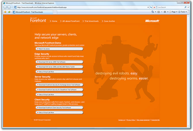
What does Windows, Windows Live, Internet Explorer, Home Server and Expression Blend all have in common? Believe it or not, PowerPoint played a role in the design process. The productivity application where you and I might just make slideshows is also becoming a popular prototyping tool inside Microsoft.

At the “Expression around the clock” event in Seoul, Manuel Clement gave a talk about wireframe prototyping with Office PowerPoint 2007. Manuel is a lead of XDR (Experience, Design & Research) at Microsoft Design – the group responsible for design of Windows (7) and Windows Live. Simply put, XDR is taking over where MSX, the former Windows design team, left off. Thus, you bet I’ll be watching them very closely.

Prototyping is the process in user experience design where you want to build a quick mockup of the interaction process that may compromise perfection but not the interaction to make decisions and test usability. Jensen Harris from the Office team have previously touched on the idea of prototyping with PowerPoint, but didn’t quite go into the details. Probably because he was stuck in a paradox – prototyping PowerPoint 2007 in the PowerPoint 2007 he was designing.

PowerPoint prototyping Windows Live SkyDrive
A prototype of Windows Live SkyDrive built in PowerPoint

The advantage PowerPoint has over other popular prototyping tools such as Photoshop and Visio is the ability to allow anyone, even non-designers, to make quick and easy modifications to the design. Because there are already simple effects and animations built-in, there is no code to waste and changes can be updated in real-time with zero effort. For example, a simple reflection effect does not need to be re-rendered if the design changes.

To use PowerPoint as a prototyping tool, you will need to set up a few things.

  • Turn off the “Advance Slide – On Mouse Click” option under the “Animation” tab to prevent PowerPoint from advancing the slide when you click the mouse button.
  • Insert hyperlinks on your buttons to go to specific slides to mimic the effect of changing screen content or displaying windows.
  • Build a toolkit of commonly used interface elements such as window frames, buttons, controls and mouse cursors to make it easy to copy and paste across many screens.

You can watch the 26 minute long recording of the presentation to get a better sense of what can be achieved. Manuel even does a live demonstration of building a prototype of an online photo management tool near the end of the presentation.

I’m definitely looking forward to use PowerPoint in the future for my prototypes. I’ve built a few prototypes recently with Visio and the like and they haven’t been as ideal as I would have liked, so I definitely see the advantage of switching to PowerPoint. Hey if it’s good enough for Microsoft it’s good enough for me.

It’s Not Cheating, AU$75 Office, returning Oct 15

It’s not cheating

The dodgy-looking cheap Microsoft Office offer for students to combat piracy that has set the model for the rest of the world is returning to Australia on October 15. Australian university students will again be able to purchase a copy of Office Ultimate for $75 (same as last time) at the itsnotcheating.com.au website from Monday. Students who already purchased a copy through last year’s program will not be able to purchase an additional copy (no step 4. profit!).

A lot of students last year complained about the large download – at around 500MB, so this year they’ve added the ability to order a CD copy if you require and at a price I assume. From what I have been told, one of the reasons Microsoft has been able to offer this at such a low price is by avoiding media duplication and transport costs, thus I assume this CD won’t come cheap.

I also asked about whether or not Office for Mac will also be included in the offer, but unfortunately it won’t be. The reason is due to technical limitations with the Mac version of Office and the trial conversion feature which this offer relies on.

The Australian offer will run until May 2008, so don’t miss out, again.

Office Mac 08 packaging: more than meets the eye

Office for Mac 2008 packaging
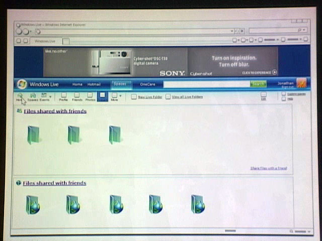
Looks can be deceiving, especially a two-dimensional JPEG image of a three-dimensional object. Sheridan Jones, responsible for group marketing in the Microsoft Mac Business Unit wrote a great comment in response to the Office Mac 2008 packaging image I had blogged about a few days ago. I’m glad she did because she corrected a lot of assumptions I had. It appears the dull brown box is actually an environmentally-friendly metallic silver box. 😉

She writes and I quote,

I think you’ll find the boxes are really beautiful in person, and very Mac-like – for example – the brown color you see is actually metallic silver. The white boxes are actually a deep pearlescent. The blind emboss of the logos adds depth that is hard to show online. The design is very simple, elegant, with more attention to user experience and detail than you can really pick up from the RGB images shown. We’ve tried to take out everything that was superfluous (you won’t find flap after flap of extraneous information on these boxes.) The size will fit perfectly on your bookshelf – the boxes are about the same size as a mid-sized book.

MUCH more important, and what I’m much prouder of, is how much more environmentally friendly these boxes are than our previous boxes, which were thermoformed plastic. Our new boxes are much smaller, and made from recyclable paper rather than the plastic of Office 2004 or Office 2007 for Windows. For every 1000 boxes, we’ve reduced our carbon footprint from Office 2004 substantially. I’ll be talking about this is a future blog posting on http://blogs.msdn.com/macmojo.

For those who aren’t loving the new boxes yet – check ‘em out when they’re in stores on January 15th – you may change your mind (or not, we’re all entitled to our own sense of design. 🙂 For those who already like them – I think you’ll LOVE the finished product.

I can’t wait to see exactly how much carbon footprint these boxes save compared to the clamshell Vista-generation boxes.

Someone was a big fan of orange…

Microsoft Forefront website

Manager: I want the website to stand out as much as possible. I’m a big fan of orange and robots.
Designer: Get this. First, the whole page is pure orange. Then a robot will appear, but not for long. It will then fade to reveal more orange. My inspiration is the sun.
Manager: Is your last name da Vinci cause that’s brilliant! Implement it right away.