Segoe UI gets a subtle facelift in Windows 8

The hallmark Windows font, Segoe UI, has gone under the knife for its appearance in Windows 8 with a handful of changes and improvements. Some obvious – styling of particular characters of numbers, and others not so obvious – addition of OpenType stylistic sets, ligatures and international character sets.

Thanks for a heads up from David Warner, Microsoft has been slowly bumping up the version number of Segoe UI from 5.01 in Windows 7 to 5.12 in Windows 8’s Developer Preview and more recently 5.16 in the Consumer Preview.

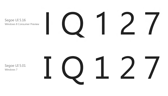
The most obvious changes out of the box are in the characters “I, Q, 1, 2, 7” where the serifs in I and 1 are removed in favor of a more genuine san-serif look, the tip of the Q straightened but 2 and 7 more curved.

The new Segoe UI also adds support for OpenType stylistic sets and ligatures which increases variation across the standard character set. In fact, the old variations of the characters above are included in the alternative style set.

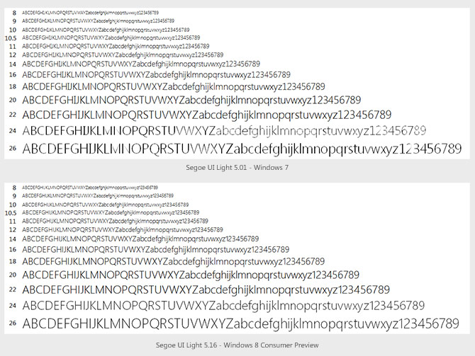
Microsoft’s fonts team has also worked on improving the hinting of Segoe UI, especially the Light variant which was never properly hinted. The new version has much more consistent hinting across the entire range of font sizes, especially at sizes 20pt, 24pt and 26pt. Just take a look at the “X” in the image below to see what I mean.

With over 2000 extra glyphs and 800 extra characters, the new versions of Segoe UI also broaden internationalization support with additional language character sets for Armenian, Hebrew, Georgian, Thai, Lisu and various Indian and African language.

For a side by side comparison between the two versions, take a look at the image below kindly provided by David Warner.
Windows 8’s application SmartScreen: speed bump for desktop apps

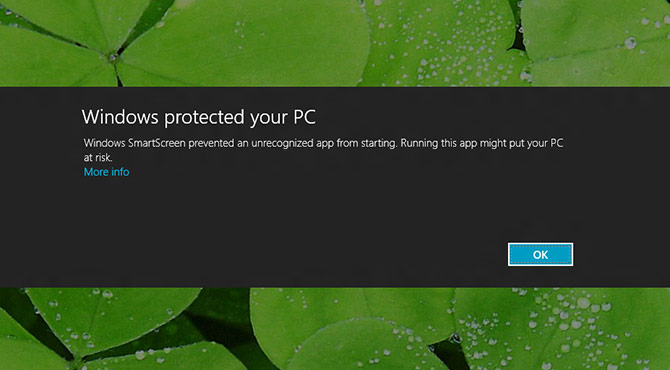
After installing the Windows 8 Consumer Preview, one of the first things I tried was to install and run MetroTwit Loop. To my dismay, my screen darkened. “Windows protected your PC” it read. “Oh good” I thought, that is before I realized it stopped me from running my own application.

I knew I could click “More info” and then “Run anyway”, but most common users are probably going to see this and freak out. After all, “Running this app might put your PC at risk”.

Ironically I should have known this might happen because I first uncovered the existence of “Windows SmartScreen” almost a year ago when the first builds of Windows 8 leaked. Of course it didn’t actually work then so it was hard to say what the impact is. Having seen it in action now, this is quite worrying from the perspective of a desktop app software developer.

Microsoft has been integrating SmartScreen into various products including Windows Live Messenger, Internet Explorer 9 and now Windows 8 to protect users from malicious links, content and now apps.

It all works on “reputation”, which is about as transparent as a brick wall. Microsoft briefly explains it is assigned to unique downloaded files and your digital certificate, but how you gain reputation, how quickly you gain reputation and the current reputation of any app or certificate is unknown.

As I’ve also found, the act of signing your installer & application with a code signing certificate (which costs up to $499 a year from Microsoft’s recommended certificate authority Verisign) doesn’t automatically grant you “enough” reputation either.

In comparison, Apple recently stirred up a bit of controversy for its new “Gatekeeper” feature in OS X Mountain Lion. It too is a new security feature that limits what “non-Store” apps you can run. The difference however is that any registered Apple Developer could get a free Developer ID to sign their apps with and be granted permission. Code signing on Windows 8’s SmartScreen doesn’t seem to have such an (immediate) effect.

Although I understand one day, MetroTwit and our company’s digital certificate might/will earn “enough” reputation for it to be automatically accepted. But until then, it’s not a good feeling your application will prompt such a strong disheartening message to an unknown number of users.

This also raises a chicken-and-egg issue, would lesser known apps ever gain enough users to trust it with such an intimidating roadblock for new users? It’s hard to tell behind the smokescreen that is Windows SmartScreen.

Update: How-to Geek has an article on how to disable Windows 8’s SmartScreen, however the fact is it’s still enabled by default for the common user.

Delivering on “Seamless computing” vision: presentation app for Surface, Windows & iPad

It’s always nice to see conceptual software demos realized with shipping code. Half a year after the Australian software firm nsquared demoed their visionary “seamless computing” concept at Microsoft Teched Australia 2011, they’re now delivering on their vision with a solution that aims to make group collaboration easier.

Their new presenter software allows people in a meeting room to collaboratively create, annotate and deliver presentations. It runs on a combination of Microsoft Surface (1st and 2nd generation), Windows PCs (laptop and slate), OS X and iPads devices for maximum compatibility.

As an example of what it can do, files can be flicked from device to device, presentations can be created by grabbing images, slides and pages from existing documents, and content can appear on any of the assigned projector screens by a simple drag and drop gesture.

What I find comforting about the video of their product above is the ability to browse the filesystem for real documents and files, with an interesting A-Z carousel view. No this isn’t a scripted demo where the right files always magically appear at the right time, this interacts with real pictures and real Office documents, as you would.

Although this isn’t quite feasible for most home users, nsquared says they’ve already received interest from a number of businesses and large enterprises to deploy this in offices around Australia and the US.

Visual Studio 11’s secret weapon for designers: PowerPoint Storyboarding

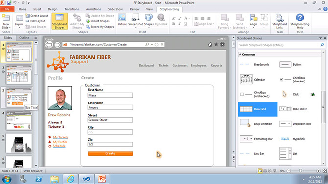
During today’s sneak peek announcement of the monochromatic Visual Studio 11 Beta to be released next week, Microsoft slipped in a new screenshot of the PowerPoint Storyboarding tool that will ship as part of Visual Studio 11.

The tool which ships as an add-in for PowerPoint will allow designers and developers to quickly mock up wireframe-based prototypes of their application using familiar presentation tools and animations, along with a host of UI controls which they can drag and drop to replicate a real application experience.

Windows desktop, Windows Phone mobile and web applications are all supported with a range of templates and controls suited to each scenario.

In contrast to Expression Blend SketchFlow which builds XAML-ready prototypes with real controls stylized to look like sketches, I think PowerPoint is a much easier tool for earlier stages of the design process. The fact that Expression Blend is dog slow, difficult to use and makes crappy XAML doesn’t help its cause either.

Since it’s been revealed internally at Microsoft they use PowerPoint to prototype designs, it’s no surprise a need for such an add-in exists. The only catch however is that so far all signs of the availability of this tool has been tied to the enterprise-focused “Team Foundation Server” edition of Visual Studio.

The designer in me hopes this tool will make its way down to all SKUs of Visual Studio 11 since it’ll make our job of making beautiful Windows applications that much easier.

Side note: I’m holding my breath to see the availability of .NET Framework 4.5 Beta which was also announced today. WPF applications like my MetroTwit would benefit from performance and memory usage improvements but the word is still out whether it will support all the current OSes – XP, Vista and 7.

Microsoft offers touch guidance to Windows 8 Metro-app developers

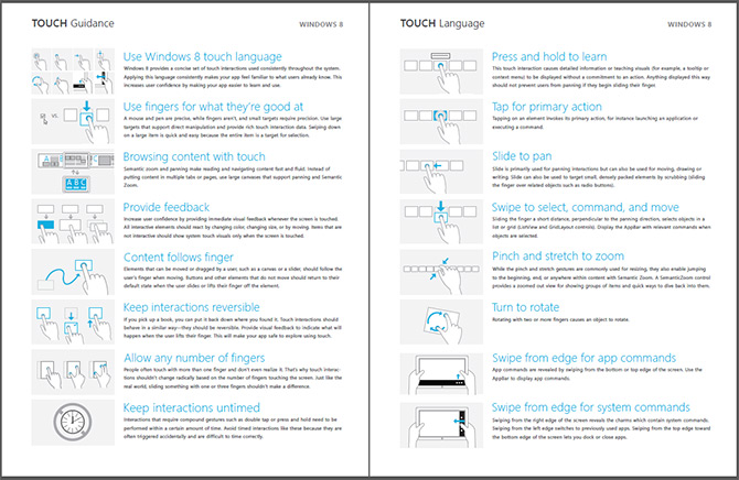
Since Metro-style applications for Windows 8 should all have a touch-first experience, Microsoft has recently released a brief but useful “Windows 8 Touch Guidance” documentation on how developers should think about touch in their applications.

The four-page PDF touches (pun) on some interesting touch characteristics of Windows 8 – including but not limited to drag-down/up for select/deselect, semantic zoom and panning and swipe from edge.

The document also establishes some useful guidelines on content and interactive element placements for different grip positions – landscape and portrait, and positions – one hand, two hand, rested on surface or on stand. Through user research, Microsoft has also found a 7x7mm touch target optimal for the average index finger width of 11mm.

If you’re designing or developing a Metro-style app for Windows 8, make sure to add this document to your required reading list.

Dear Microsoft, please listen to the people who designed your new Windows 8 logo

I think it’s fair to say opinion is still divided on the new Windows 8 logo, or at least Microsoft’s version. As I briefly noted in an update to my original post, it turns out the logo the prestigious design studio Pentagram proposed to Microsoft is actually different enough that I think it warrants some extra attention.

As they say, design is in the details.

The issue in question comes to light from the Pentagram website where they exhibit and explain their work with Microsoft on redesigning the Windows logo. One paragraph in particular highlights one of the fundamental features of their proposal, perspective.

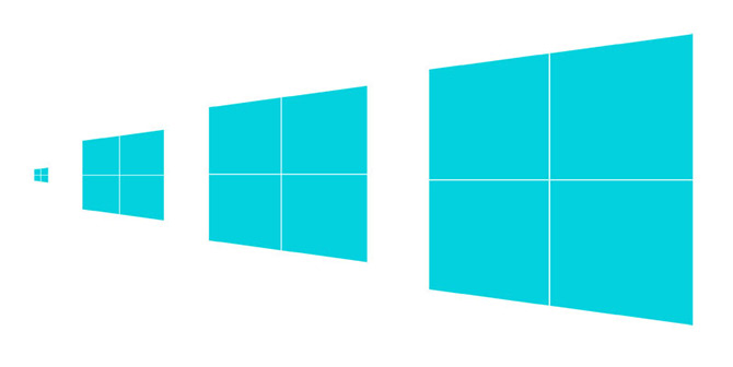
The perspective drawing is based on classical perspective drawing, not computerized perspective. The cross bar stays the same size no matter the height of the logo, which means it has to be redrawn for each time it increases in size, like classic typography.

Even though the crossbars are just a line, the end result is a logo that is unique at different “sizes”. In retrospect, this is actually quite an interesting and thoughtful design choice that demonstrates extra attention to detail to an otherwise simple shape.

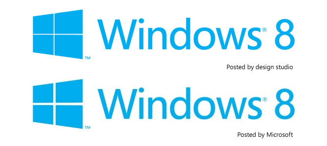
“Now why does this matter” I hear you ask. This matter because the logo Microsoft has shown off and since trademarked on the 17th of February 2012 does not inherit this feature as the trademark and following example illustrate.

Windows 8 logo difference

To be completely anal-retentive, Pentagram’s design is a single trapezoid (trapezium) overlaid with a fixed-size crossbar, whereas Microsoft’s design is four trapezoids arranged in a two-by-two grid. There’s scale and perspective in Microsoft’s crossbar when there shouldn’t be.

Even if you disregard the difference in principle, the logo will look very different when applied to the all the various print and online materials when Windows 8 is released.

I don’t expect Microsoft to pull a GAP in their rebranding exercise and go back to the drawing board – it seems like they are already committed down this path. But I hope they’ll come to accept the one aesthetically-witty aspect of Pentagram’s proposal to heart. After all, they’re the experts Microsoft probably paid millions for.